
Text description provided by the architects. The programme of the residence is relatively extensive, although common. The ample site, about 700m² (around 7.500ft²) in area, is located in a neighbourhood ruled by a specific set of laws that demanded larger-than-average setback in all sides, decreasing by much the total uplifting area.


The family’s fundamental need, however, was not in the programme’s dimensions, but in how its many parts were organised. After many conferences, we had noticed the paramount point for the coming years of the house’s usage was the existence of spaces capable of catalysing the union of the family; the house as a physical realisation of the gathering of their children and grandchildren, a sort of physical grounds in which the ever-expanding and dividing family may reunite and commune. As we reached this fundamental point, we understood that our responsibility was the creation of a space consistent with our architectural language, but that would also promote the subliminal ideal of a space that in its own excellence would be the physical reference for the family, a place to which all would return whenever as possible.

With that in mind, we came up with what we judged to be fundamental qualities for the success of our endeavour: integration between spaces, privacy from the streets and neighbours, glazed flexible-use spaces for use in events, leisure as the core of the programme and the garden as an overall protagonist.

However, as we tried to organise said concepts on the site, we came across an even larger problem – the site itself being a 17-degree slope made us separate the social and leisure uses in different levels, in a gesture contrary to the intended integration.

In order to solve the slope versus integration puzzle, we inverted the logic of the typical paulista (adj.: natural of the state of São Paulo, Brazil) sobrado (noun: typical Brazilian city-house with two or more storeys). That means placing the living quarters in the lowermost part of the site, used as a retainer for the creation of a plateau upon which the other uses rest.

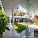
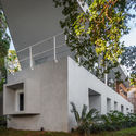
The private areas were organised within a concrete monolith cut by precise notches facing the large back setback-turned-intimate garden, allowing for more privacy and quiet. This volume opposes the “weightlessness” present in the ground floor – bound by a steel framing and a large marquee that protects the glazed rooms, balconies and service areas. This marquee occupies the limits of the site and bounds a central negative volume, to which the built spaces converge, as a Mexican central patio in a more contemporary approach. At this level, the spaces are visually intertwined, further stimulating familiarity. The casing here is minimal, composed mostly by glazed surfaces and some wood from the living and service quarters.

The house’s main access and the open-air garage, both at street level, are located above the overall project’s level. This solution is the cause of a positively uncanny feeling, because only the house’s roofing is visible to the passer-by. It is, however, a result of the client’s desire to have a house well-integrated to its garden whilst having its intimacy protected from outsiders.

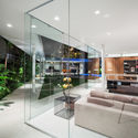
The interior design should approach the same points as architectural design did from the very start. Light and simple furniture, with a more contemporary look, a floating fireplace, smooth cement floors bearing a look akin to that of the intimate monolith, and the tile panels designed specifically for this house, work with the architecture design to further strengthen the presence of both the patio and the gardens, that frames the life of the family as it unfolds along the years in a generous space with infinite possibilities.


