-
Architects: Estudio Larrain
- Year: 2014
-
Photographs:Guy Wenborne, Rodrigo Larraín Illanes
-
Manufacturers: Arquiglass, Bercia, Brimat, CHC, Hunter Douglas, Kone

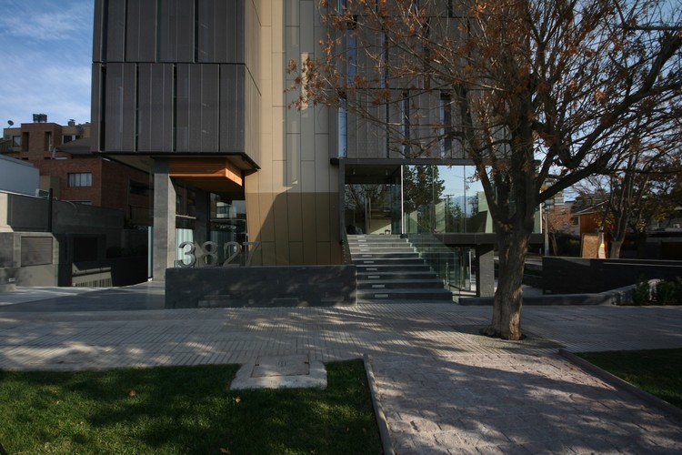
Text description provided by the architects. The building is located in Alonso de Cordova at the corner with El Coihue in Vitacura, a sector that has a particular characteristic in Santiago, as it is inserted in the middle of the urban fabric in a largely residential sector, with a scale that can accommodate pedestrians, with wide, tree-lined sidewalks.

The street has the role of a promenade, between a waterfront and a bazaar, where there are stores, cafes, restaurants and green areas.
This commercial area took shape by the transformation of houses into shops which resulted in a mixture of styles and architectural elements, and where the urban space is interspersed with low-rise houses and new residential buildings.

It was important for us that the architecture of the new building was generated as a response to the characteristics of the environment, and to reinforce its relationship with the urban space.
The question was how to insert the project within this framework. How to avoid the building from getting separated from its surroundings due to the change of use and scale, and how to incorporate it in urban and formal terms. In analyzing the place we realized that we can distinguish three levels or visual scales.
- pedestrian (base)
- neighborhood (medium height)
- new buildings, which are seen from a distance (upper part and top)

Also relevant was the fact that the building is located in a corner of great importance within walking distance from Vitacura (and the church) in an area of high pedestrian and vehicular traffic. The commission was to design an office building for rent, LEED certified and with an identity.
Volumetric Design
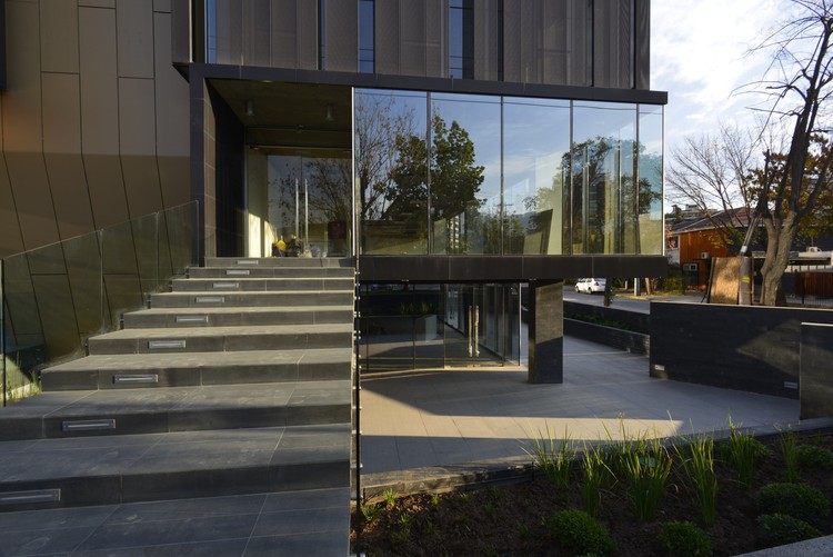
The challenge of intervening a space like this for us meant to find the keys and work with them to establish a relationship between the building and the public space, reinforcing this circumstance, so the building was raised half a level to create two levels of commercial spaces, one half sunken and the other ½ a level over the sidewalk, forming an intermediate semi sunken space or square easily accessible from the building and from the public space.

But it wasn't enough to create this permeability, this interaction, it was also important to pick the language of the local shops and give the project a different treatment on the base, keeping the average heights of neighboring shops and collecting the intermediate scales of the neighborhood and the top of the building, so volumetrically we recognized in the building the base, the intermediate body and the top.

Facade treatment
The building required LEED certification, and as the main facades overlook east and west, their treatment was fundamental. The treatment needed to comply with a series of apparently contradictory objectives such as avoiding sun exposure and glare, and at the same time keep the views from the offices to the outside. We knew that technically the openings shouldn't be over 15% of the surface area of the facade.

After completing a series of studies, we designed along with Hunter Douglas a perforated translucent screen, for which we made diverse trials to see the sizes and distances between perforations, and to determine their color.

But the chosen color not only achieved the optimum in not blocking the views from inside, but also its thermal performance and how this allowed us to achieve the required standards for LEED certification, by optimizing the use of HVAC equipment.
We finally achieved for the color to contribute with the necessary thermal barrier for summer, and additionally, when this double skin heats up, the air between the windows and the screen heats up, thus reducing considerably the need for heating in the offices.


