-
Architects: Pedra Silva Arquitectos
- Area: 3370 m²
- Year: 2014
-
Photographs:Fernando Guerra | FG+SG
Text description provided by the architects. The brief was to create a space that would enable ideal working conditions for staff while also reflecting the company’s dynamic, relaxed and youthful spirit. The project space occupies an entire floor of Imperia Tower, a skyscraper in Moscow City.
The first challenge arose when initially visiting the site and realizing that some of the tower floors were previously built to be a hotel. This explained the short floor to ceiling height and inexistence of raised floors that would be ideal for office use. So we set out to answer the question…” How do we make a space look taller than what is actually is?”
So how do we make a space look taller?
While searching for an answer to this question,we ended up solving our initial problem and a series of others by rethinking the ceiling. We created an innovative and unique ceiling that not only makes the space feel larger but also removes unappealing elements that make up the traditional ceiling.
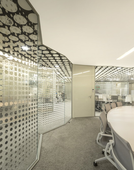
The result is a horizontal “visual filter” that is laid out on a matrix made up of discs where lighting and air outlets are placed according to need. Behind this filter we have all the technical mechanisms that are hidden from sight such as fire detectors, air ducts and other gizmos.
The ceiling is made up of white circular elements that form a continuous surface embracing the space and reflecting natural light. Artificial light is achieved by clicking in light discs according to the amount of light required around a particular space. You do the same by placing equivalent diameter air-conditioning vents that become fully integrated in the ceiling system. The result is a flexible system of interchangeable suspended disks, allowing for easy access to the upper infrastructure while minimizing the effect of a lower ceiling.
If we had used a regular office ceiling, the space would have felt cramped and claustrophobic, but instead it feels big and airy while still ticking all the boxes of the performance you need from a regular office ceiling. From initial prototypes in Innsbruck, Austria to actual production in Ankara, Turkey the result is a bespoke answer to the initial problem resulting in the main aesthetic element of this space.
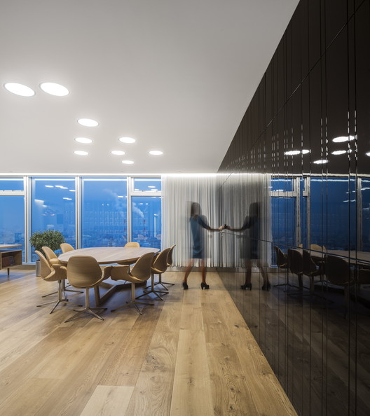
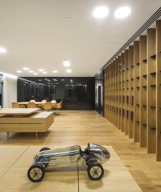
As for the space itself, the office is arranged around the central service core of the building, working as a distribution nucleus between departments. The circulation route around this core is emphasized by a continuous wood surface that is randomly cut so it secretly hides storage units and doors.
Besides the aesthetic nature of the space, key spaces were provided for staff to promote well-being and productivity. Spaces such as silent rooms to improve concentration, small rooms for unplanned meetings, noise removing elements for the open space and a large coffee lounge where staff mingle and share their experiences.
The space is occasionally interrupted by “glass bubbles” that contrast in nature to surrounding circular references. These ”bubbles” contain team leaders and noisy rooms within a sound proof environment. The pictograms add a splash of colour in an otherwise calm and neutral environment.
A project with bespoke solutions, from ceiling to special spaces culminating in a comfortable working environment that promotes happiness and productivity.