-
Architects: Studio Kuadra
- Area: 6570 m²
- Year: 2013
-
Photographs:Alberto PIOVANO

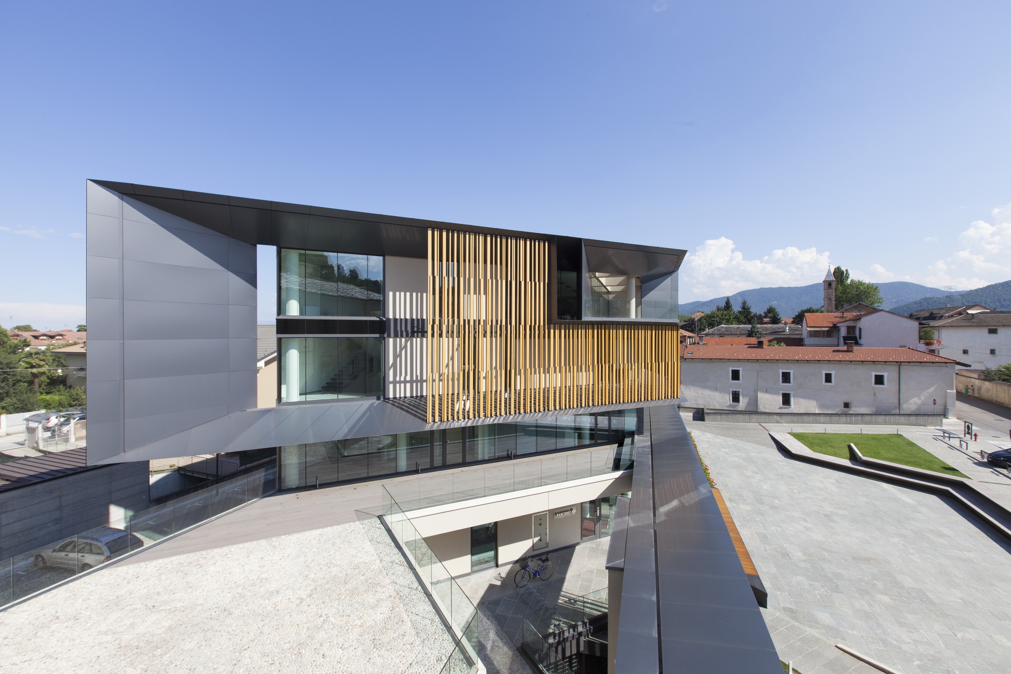
Text description provided by the architects. The new headquarters are the product of an addition to the overlooking eighteenth century Palazzo del Fucile, left in a total abandonment until 2005, when it was acquired to be renovated by the bank. The project completes the trapezoidal lot defined by the pre-existing structures and creates a new public square called “of Cooperation”.

The entire project is inspired by the pursuit of environmental quality. The exterior spaces work in harmony with the existing; the gate to the fortress is one again given meaning as a privileged element of pedestrian access; the urban furnishings attract people looking for a place to spend time and interact. The square is paved in Luserna stone, typical of the Piedmont region and traditionally employed in local constructions. The design of the external space is instead closely related to the undeniably contemporary and dynamic façade.

The ground floor of the new Bank is fully glazed. This same material is used to connect the ground floor with the historic palazzo del fucile. The low rectangular volume, which constitutes agraft between the new and the old, starts out perpendicular only to expand to make room for a reception area hosting another stair. A connective filter mediates the passage between the old and new structures, with the lateer hotsting the bank's commercial offices.
.jpg?1426040970)
The elevation of the new construction privileges the use of glass, screened by fibreglass brise soleil finished in wood treated to resist the elements. The elevation facing Piazza della Cooperazione is characterised by a dark floor marker that delineates different spatial situations: gate, roof, cornice, brise soleil, as well as the autonomous first floor terrace/courtyard. On the short side, the floor marker pulls away from the upper floors at a 45° angle with respect to the direction of the elevation facing Palazzo del Fucile.

This band renders the new construction attractive, perfectly aligned with our contemporary era, symptomatic of the “corporate image” chosen by the bank when it chose to adopt a similar architectural language.


.jpg?1426040970)
.jpg?1426040960)

.jpg?1426040949)

