-
Architects: Studio Woodroffe Papa
- Year: 2014
-
Photographs:Jan Bitter

Text description provided by the architects. The project lies north of Plymouth city centre located in North West Quadrant. It is the first phase of the integration of the North West Quadrant with the future plans for Derriford Hospital. Derriford Hospital is one of the largest and most important hospitals in the Southwest. The Bircham Park Transferium improves the patient’s and staff’s experience on arrival. It removes the majority of on-grade parking to release land for further development phases of the masterplan and also delivers important facilities to the approximately 11,000 staff and visitors that move through the hospital every day.

Design and Layout. We have called it a ‘transferium’ (dutch word) because it is more than a car park. This is a hybrid building that explores the possibilities of two types of apparently contradictory operations into a new combination; an office and retail building with the utility of a car park building to form a compact typology. This provides constant activity, making it a full-time working building. The building forms part of the entrance and visitor hub that can deliver convenience, services, and amenities to staff and waiting for patients or relatives as well as creating a safe parking environment for 600 cars.

The pronounced topography with its southerly aspect drove the design and layout of the Transferium as the significant change in levels led to a series of constraints in layout and opportunities to reduce the bulk of the building. The constraints that include the high-pressure gas main to the west and the existing steep levels of the site restrict the size of the footprint. The natural slope allowed the more densely developed plots such as the ‘Transferium’ to be at the bottom of the slope and the low-density predominantly residential plots to be at the top of the slope. This allows long views for all and lessens the impact of larger development across the wider area.

The slope also drives the overall typological design. To reduce the cost of excavation the car park is a scissor layout that climbs up the hill following the topography. This allows for the possibility of dual entrances; the main one being at the south on Morlaix Drive, combined with a management suite, and the other being at the north on the new High Street. This delivers cars at different levels and subsequently avoiding congestion.

Where active frontage is not possible, there is high-quality green walls and permeable elevations. A large amount of car parking is located at the bottom of the site. This ‘hides’ the 6 storeys of car parking in the valley. The offices, retail, and food and beverage are located at the top of the site where the topography is at its flattest. This presents a more modest 3 storeys onto a new public street. A glazed lobby space on the north-eastern corner gives access to offices and car parks and is strategically located to offer direct access from the hospital and clear orientation when arriving.

Appearance and Scale. The building sits below the height of the adjacent hospital. The mass is reduced by grouping floors into pairs, These step in section and shift in a plan to accommodate the slopes of the awkward site. In doing so, they create walkways, terraces, and areas of shelter around the building. One dominant level extends north and west to form ground-floor shops and cafes. This activates the main street, leading pedestrians to Outlook Terrace, a sunny public belvedere overlooking Bircham Valley local nature reserve and future park space. splits the building mass further reducing the mass where it will interface with future phases.

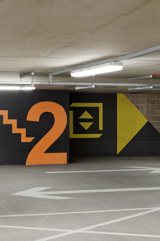
Subsequently, its appearance takes the topographical and layered form as a starting point for a series of differentiated ‘landscape’ treatments; a forest-like lattice, of metal, tree trunks, and ivy. The base of the building emerges as one moves from the High Street south to Morlaix Drive. Here a green facade optimises the planting possibilities and environmental opportunities. Ivy is planted that climb over a lattice of stainless steel wires. These provide protection from the sun in summer, allow solar penetration in winter, and help in the convection cooling of air. The commercial and retail spaces are clad in a curtain wall of aluminium and glass that incorporates lighting and signage. Moving away from the street this transforms into the forest-like lattice of powder-coated metal bars. Graphics and colour were defined to give clear orientation at entry points and around the deep plan of the car park

The upper level is a wooden screen made of pine logs with varying degrees of density to give an undulating appearance. The middle section of the roof is planted with low maintenance, non-accessible grasses, and mosses to provide a rich and diverse wildlife resource and aid water retention, absorption of CO2, and runoff. The Transferium Court is the natural sloping landscape on the western façade below the Outlook Terrace and is to be implemented at a future phase.


