-
Architects: +tongtong
- Area: 3000 ft²
- Year: 2014
-
Photographs:Lisa Petrole Photography
-
Manufacturers: Ceramiche Refin, Duravit, Alfa, Bend Goods, CB2, Cabano, Cinca, Cobalt Fabrication, DVHA, EcoSmart Fire, Elumanation, Global Spectrum, Intra Lighting, Juno Lighting, LG Hausys, Magis, Maher Sign Products, Peronda, Provenza Floors, Toto, +2
Text description provided by the architects. The mostly-subterranean space evokes the intimacy and vibrancy of Barcelona, where tapas restaurants emerge from the most unexpected places. Both the client and the designer John Tong have spent a considerable amount of time in Gaudí’s city, and shared the excitement of capturing that energy in the creation of Barsa.

“In Spain, there’s this way of making things work no matter the conditions,” Tong says. “For instance, you might have to walk under stairs and pass a press kitchen to get to the dining room, the kitchen is half the size it should be, and the washrooms might be located down an alley. However, these seemingly difficult site conditions really contribute to the authentic feel of a tapas bar.”
Fittingly, the original site had its own challenges. Located in a historical building across from the world-famous St. Lawrence Market, the 3,000-square-foot site was dingy with low ceilings, and was so dark the only way to explore the space was by flashlight. In fact, part of the space is under the sidewalk. And because of the site’s historical status, Tong and his team had numerous restrictions to work around – the windows, mason stone walls, and main door all had to remain untouched.

Designing within these parameters, +tongtong transformed the derelict space by injecting animation while maintaining the site’s historical integrity. The result is a sleek, edgy interior that balances freeform expression and modernist architectural language.
To capture the essence of Barcelona’s tapas culture, where patrons can often pick their own tapas straight from the kitchen, the prep area was moved forward and outwards. Chefs prepare charcuterie and cheese platters out in the open, surrounded by jars of produce, hanging chili peppers, cast iron pans, and meat slicers.
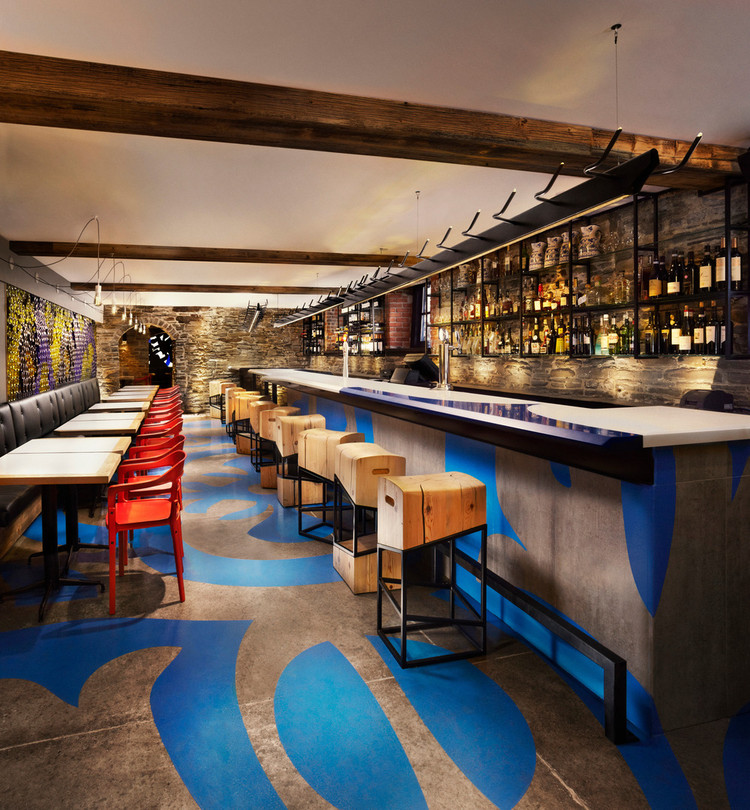
The bar area is defined by a swirling, vibrant blue graphic floor pattern, a design that was extrapolated from the Gaudí-influenced tile in the main dining room. A computer-generated adhesive stencil was laid down on the new concrete floors, and then coated with epoxy paint. The design runs up the sides of the kitchen walls and the bar, which integrates a blown-up version of the same pattern.

Enclosing the two-tone Corian bar, which eventually becomes two-sided, are custom-designed stools made of salvaged, old-growth pine with an oblique powdered coated steel frame. Dubbed the “little pest,” or in Spanish “becho mio” the stool has three variations, all of which look different depending on their orientation. With tops resembling worn butcher blocks and carved-out handles that riff on the forms of old wine crates, the stools are a nod to the ingenuity featured in traditional tapas eateries, where seats are fashioned out of old wine barrels, wooden crates, or whatever is available. They appear especially unruly when positioned across the room from the straight and proper red chairs. Above the bar, three custom-designed LED light fixtures hang. With a motif of bullhorns, the armatures resemble a charging bull caught under a strobe light, frozen in a stop motion sequence.

On the other side of the bar area, the red chairs encase custom-designed tables that feature a laminate top with a wooden edge. Above the banquet seating is a glass wall made of 1,500 coloured wine bottles, all painstakingly hand-cut by the client’s friends, and inspired by the floor tile’s natural forms. Old stone archways differentiate the grotto-style dining area, a very tight, dark and windowless space with low ceilings and wooden beams. To conserve the limited space, +tongtong knew they needed to integrate a light source into the project spatially. The main light source is a rear-lit mural, a collaboration between local graffiti artist Pascal Paquette and Tong. And like the armatures above the bar, the running of the bulls is the central theme.

“Bulls are massive, bulky and when they’re charging through, it’s chaos and threatening. It’s like a hurricane.” Tong says. “We art directed with Pascal to create something that represented that cultural ritual.” The mural transforms the space into a fresh, bright and energetic room.
The tile running throughout the space is purposefully laid to draw attention to the nonlinear nature of the space. The mason wall that separates the bar area from the rear dining room is in fact angled, “a kind of character you find in a lot of older, medieval cities in Europe,” Tong explains. “We wanted to accentuate that by installing the tile off-square from the main space.” Meanwhile, the tile pattern itself is a modern take on traditional patterns from the art nouveau and gothic periods.

In the warmer months, a large, 75-seat patio runs the whole length of the restaurant. As part of the Market Street revitalization, a project that restored designated heritage buildings and reanimated the neglected street, Barsa’s patio will act as an anchor in the rejuvenated thoroughfare.


