-
Architects: Plan9
- Year: 2011
-
Photographs:José Luque

Text description provided by the architects. The project arises from the need to transfer the Bambi Early Childhood Educational Center to a new site, which was located in a single family house that had adapted to the needs imposed by the building code, leading to the construction of a new pavilion, generating interstitial spaces that allowed the well differentiated development of the various activities of the center, linked to abundant vegetation, which made the center a pleasant place for children, giving it an added value that differentiated it from the other centers in Cordoba. It was imperative to translate this concept to the new site.

The site overlooks three streets and a gardened area. It had certain conditions with respect to the layout of the program, the steep topography and the need to respect the existing oak trees.


These conditions that seemed like difficulties became allies. The topography allowed the two levels of the building to be accessible from the street, and the play areas to remain at the level of the classrooms. Respecting the oak trees allowed for a less rigid and more integrated distribution in plan, as the trees were part of the design.

As we needed to comply with educational regulations and to preserve the character of the old center, the building thus resulted in: three classrooms for first year, three classrooms for second year in the east wing, dining/kitchen, teachers area, and administration in the west wing, play areas differentiated by year and parking.

The building is designed in two V shaped volumes, adapted to the topography and the existing vegetation. The program is distributed through open galleries, avoiding the normal typologies of educational centers, seeking the spirit and environment of the old center, where the classrooms were in direct contact with the open areas.

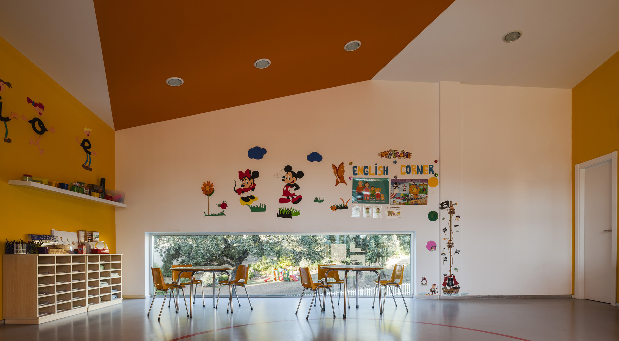
We have avoided the image of traditional centers, at language, functional, and constructive levels, through industrialized systems. In contrast, we designed a color pattern in warm tones for the facade, whites, oranges, yellows, colors that encourage learning, attention, and relaxation, turning into blues in the administration area.

The broken roof and the non-orthogonal layout of the building and rooms were designed with metal porticos.

We designed carefully the joinery between panels by designing an ad-hoc system of folding façade panels, as well as the tops of the openings, avoiding the image of a warehouse.


