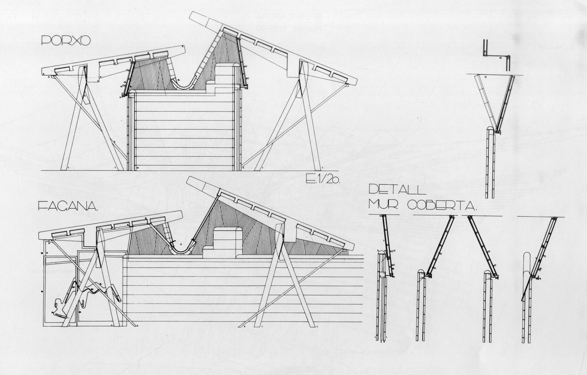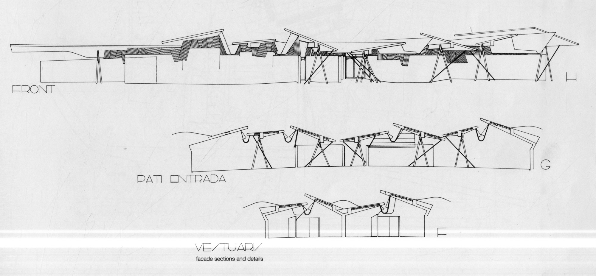
For architects, it is a project perhaps more recognizable in plan than in photograph. The dazzling rhythmic complexity of the construction drawings for Barcelona’s Olympic Archery Range, completed in 1991, brought more fame to the 1992 Olympic event than any arrow shot from the buildings’ shadow. The drawings show an overlay of organic curves and rectilinear shapes working in sublime harmony, producing a composition that clearly conveys both the architects' concept and the process through which it was developed. Amazingly, the project is no less spectacular in person than on paper, and its completion helped launch the husband-and-wife partnership of Enric Miralles and Carme Pinós into international stardom.
Located in the hilly outlying neighborhood of La Valle d’Hebron in Barcelona, the site chosen for the competition was previously a crowded athletic park of flattened rugby and soccer fields. The winning design submitted by Miralles and Pinós added two new archery facilities to the complex--a competition pavilion and a training pavilion--separated by the length of an archery range. The two buildings are visually distinct but are united by a shared design process that takes into careful consideration the building’s place in the landscape. Neither obeys a rationally ordered programmatic or tectonic system, and the buildings are instead the products of an imaginative and expressive architectural method.

The competition pavilion is composed of two principal elements: an exposed concrete wall system overlooking the archery range, and a retaining wall nestled into the hill from which the building emerges. According to the architects, the plan was derived from extrapolations of the preexisting topographical contour lines and take into account programmatic demands for athletic facilities and changing rooms.

Because the competition was won by Miralles and Pinós as late as 1989, the project required a quick turnaround on design and construction. The architects accordingly specified a prefabricated modular wall system consisting of a repeated curved concrete panel, perforated with holes to allow light in. It was intended to be easy to assemble and take down, and unfortunately, it ultimately was; a few years ago, the pavilion was disassembled to make room for an expansion of the city’s underground Metro, and the concrete units were put into storage. Interestingly, Google’s current satellite view of the site shows these once-proud modules lying inert on their sides as they await removal.


The modules are central to the way in which the competition pavilion beautifully moderates the intake of natural light into the interior spaces. Their triangular and circular perforations choreograph a stunning dance of light and shadow on the exposed interior concrete. The architects manipulate light on the exterior façade as well, where it is filtered through louvers and screens affixed to the roof in an entirely different but complimentary architectural technique.


Whereas the competition pavilion is an expressive reading of the site’s topography, the form of the training building is intended to be evocative of the movements of the athletes within it. Indeed, there is a directionality to the training pavilion that is not present in the competition building. The projecting roof slabs seem to emerge from the hillside like arrows from a quiver, and they overhang the walls below them as if to project the directional gesture infinitely into the space beyond. These roof sections then lift up from the walls at varying angles, creating space for clerestory windows and adding to the building's dynamic and visually complex composition.


The plan drawings for the training pavilion are particularly spectacular. They overlay at least three distinct architectural languages incorporating both rectilinear shapes and organic curves in a thoughtful and balanced but ultimately arbitrary way. Programmatic requirements are worked into the resulting spaces, and include everything from bathrooms to an archery supply store.

Today, the training pavilion stands out of place against the backdrop of a soccer field, where it serves as nothing more than a changing room for the players. With its partner facility now disassembled, it reveals to the passerby little of its proud past as a much-lauded Olympic archery facility, and the setting seems distinctly unbefitting for one of Barcelona’s architectural treasures. As a result, the legacy of the building survives not through glamour shots of the building’s profile or the first-hand accounts of visitors, but through the articulate drawings Miralles and Pinós created that reveal their unique approach to process-based design.


-
Architects: Enric Miralles & Carme Pinos
- Year: 1991
-
Photographs:Dieter Janssen, DJA, Flickr user Cecilia


