-
Architects: bob-architektur BDA
- Area: 15750 m²
- Year: 2012
-
Photographs:Nikolay Kazakov
-
Manufacturers: Hagemeister
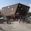
Text description provided by the architects. The new mall with a size of 15750 m² at the end of the pedestrian zone of Kamp-Lintfort, integrates itself in the urban context and opens to the forecourt in the pedestrian zone. By a raise of the head building at the main entrance, the exposed urban location is accentuated and make urban building reference to oposite buildings. The cut of the entrance in the structure refers to the pavillion, which plays a major role on this forecourt and at the same time it is an intersection between two urban orientation lines, through which the entrance into the shopping arcade is clearly visible defined for passers.
The patio – the heart of the mall
Even if the first building – the so-called "three white giants"- had to give way on the plot, there existance is nevertheless noticeable in an abstract way. As cross-references to the position of the former skyscrapers, formal incisions inside the building were made.
On the one hand the voluminous body was limbered up, on the other hand references to the fragmented urban structure and the special features of the location were created.
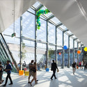
One of these cuts marks the entrance of the shopping arcade on the Moerser Road and connects the mall with the pedestrian zone. A second decisive point gives rise to the heart of the EK3 – a generous courtyard. In this patio, three indigenous oaks were plant, which take up the theme of the three white giants symbolically again. A piece of nature in the middle of the city on a site with formerly huge residential buildings.
This basic idea was taken up in the entire building and the tribute to the three white giants was made so tangible. The glass facade, which orients on the patio is strewn with an oak leaf structure as a pictorial reference. Through that, it produces an exciting play of light and shadow in the light flooded areas of the mall. For visitors, the patio is freely accessible from the mall and invites to linger under shade-giving trees.
The kinetic publicity
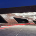
Architecture, publicity and the appearance in public space are coherent connected threw so-called kinetic Puclicity. The special feature here is, that advertising space could be integrated in the brick strucure innovatively, instead of beeing placed on the facade conventionally. Taking into account the flowing traffic and the perception of the car drivers, the brick was layed in an up breaking "zig zag" structure at this point. In this way a three dimensional structure out of a plane facade was created, which could be covered with publicity.
Dynamic light- and shadow play
Maroon Hagemeister clinker "Oregon" with pearly shimmering parts cases the shopping mall from the shopping areal to the parking level with 400 pitches into a multicolored changing building cover. The facade clicker receives the impressing building material of Kamp-Lintfort and gives the building a dynamic light and shadow play with its silvery shine.
"The clinker is typical for the conditions of the lower rhine area and the leaking Ruhr area with its historical industry buildings, made of brick", Robert Wetzels establishes, why he decied to use Hagemeister facade clinker. Silvery parts of the maroon brick interrupt the massiveness of the facade in interaction with seemingly random interspersed shining elements and windows, which make reference to the different sizes of the surrounding development. For the marking corner, Hagemeister manufactured cinder block. Outstickings and inclined planes were built as massive clinker laces.