-
Architects: Nakasai Architects
- Year: 2013
-
Photographs:Syouichi Uchiyama

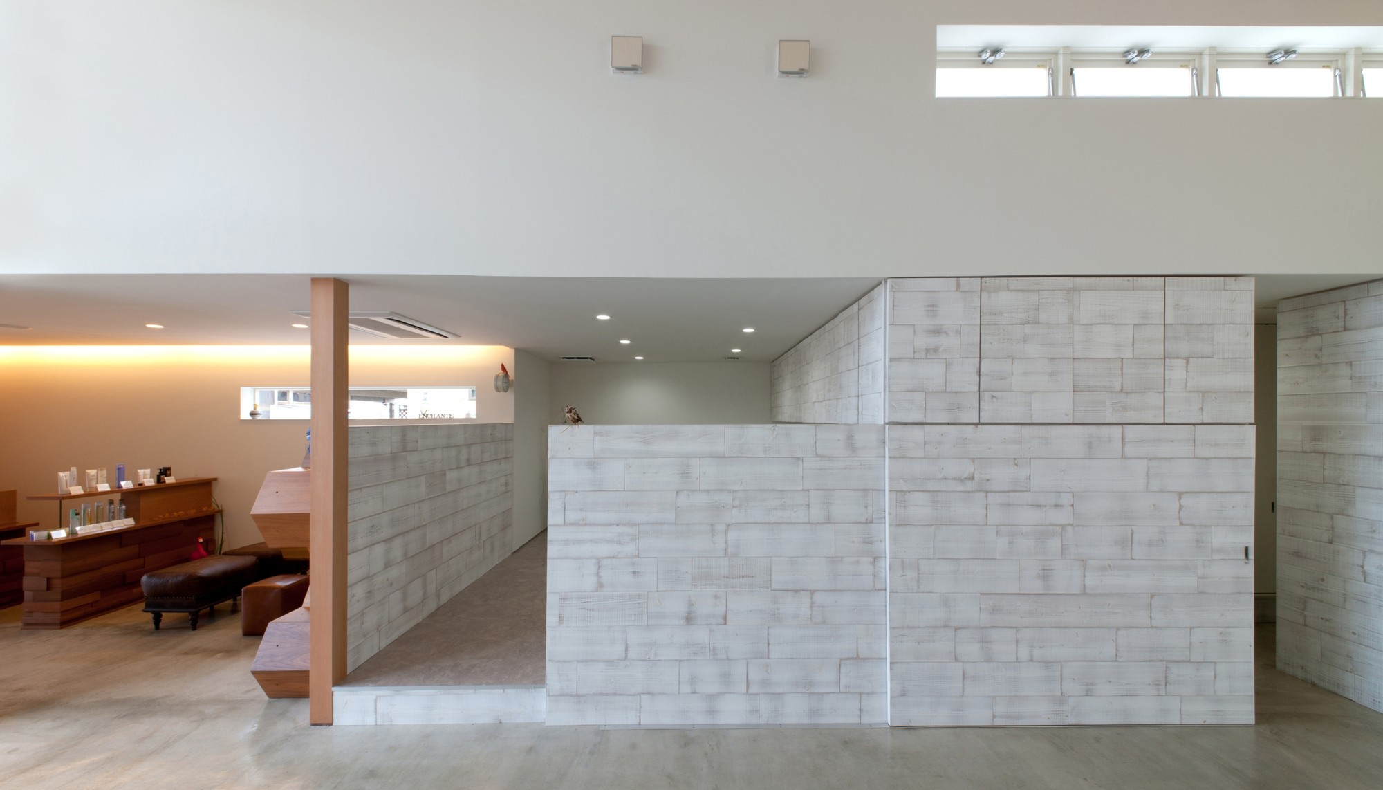
Text description provided by the architects. The basic color of the interior and exterior is white as the owner has requested. Using white color makes it easier to bring the concept of "simplicity" to the design. However it could also make the building "faceless" and "boring". That Is why I have used various kinds of material in white such as aging cedar boards and bricks so that certain characteristics would be added to the building while maintaining a certain degree of composure.

The highlight of this design is cutting space. It is a big space with high ceilings and has a 3.6 × 4.5 window with wooden sash facing north, which takes in plenty of sunlight all day. On contrast, other spaces has somewhat cave-like private taste that makes the cutting space like a "stage". Unlike ordinary hair salons where cutting chairs are positioned side by side in one big space, each cutting space is divided by manipulating the amount of light and air volume.


