-
Architects: Gabriel Verd Arquitectos
- Year: 2007

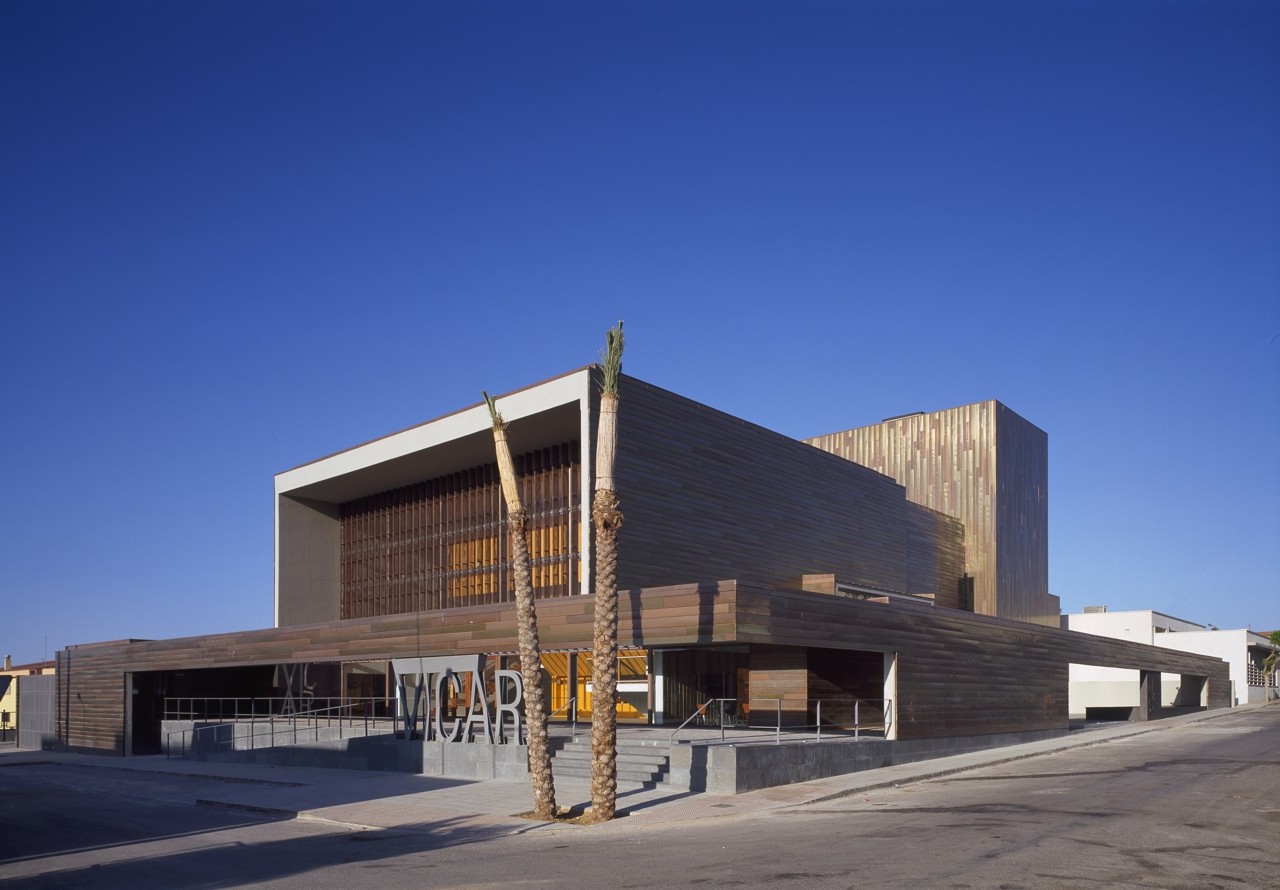
The project for this theatre is located in Vicar, a typical town in Campo de Dalias in Almeria, occupied by settlers in the Alpujarras in the 60s. It is an unmistakable flat landscape at the foot of the Sierra de Gador, a peculiar extension of plastics, an artificial sea of greenhouses that blends at its boundaries with the real landscape.

The site is a void located between two public buildings: the College, the Town Hall, the Health Center, and the Market. The urban space it conforms is the result of the free way in which each building is located on the site, a space without shape, scattered, arguably residual, unlike the urban layout around it. Establishing a new, friendlier order, under the conditions of this inhospitable place, has been one of the basic intentions of the project.

Thus, given the large size of the site, we designed an organization for the set of buildings that would locate the theatre logically, and generate generate public spaces available to the public, an occupation that will contribute to a programmatic versatility, allowing flexible use of spaces, rehearsal rooms, patios, exhibition hall-plaza, cafeteria, etc.

More than a freestanding building, like the adjacent constructions, it is an urban piece where the public penetrates, integrates, and complements the theater. Given the characteristics of the building and the particular weather conditions of the place, we put special emphasis on creating transitional spaces between outside and inside, spaces between and under the building which enable meeting and participation.

The building rests on a raised plinth, in the classical manner, with the intention of placing it on a higher plane that emphasizes its uniqueness and reduces the excavation required for the basement as much as possible. The transition between levels is carried out by a system of ramps and wide staircases.

Public accesses occur under the large front porch of the NE facade, from the front square, a place that allows on one hand the necessary distance from the surrounding buildings, and on the other for people to gather at showtimes, a free space advisable in any public building, a representative space that enhances its qualities as a unique building. Areas of sun and shade, paved or landscaped, where one can meet or transit during the day, or cross them to access the interior spaces and multipurpose area. The ticketing office is located next to the main atrium.

We have prioritized crossed views, always offering a variety of viewpoints. The vehicle ramp is at the SE end, at the lowest point of the site.
On the other side, the loading and unloading area also allows access to the backstage and stage. Next to it, from Homero Street, is an access restricted to pesonnel, that leads to a courtyard hidden from the outside that organizes and distributes all semipublic or private areas of the theater: rehearsal room, backstage, administration.

The lobby is asymmetrical due to the organization of the theater. It is under the bracket of the stands, and invites users to be there, displaying the large orange volume of the theatre. A lattice filters light and the relationship with the square across. On the sides are stairs, toilets and a cafeteria, designed with the possibility of operating independently. Spatial sequences and visual relationships are critical elements in its articulation. We also sought to reduce galleries as far as possible, designing instead wider and better lit access spaces.
The theatre has a four hundred spectator capacity. Continuous stands were designed (with a variable slope), considered optimal for reasons of visibility as well as acoustic behavior, since it avoids causing deaf areas created by amphitheaters and sections of similar theaters. On it and around the entire perimeter is a technical floor and the projection and control booth.

The stage area, like a factory of imagination, requires a correct operation, this implies specific dimensions of its elements and a particular organization which should not be ignored.

The structure of screen walls and reinforced concrete slabs is designed as a large sheet folding in all directions shaping the built spaces. Above it is a second, thinner, lighter copper structure, parallel to the first. Special care was devoted to control the size of the pieces, orientation, texture, brightness and oxidation. Two alloys were used in conjunction with natural copper. A material that changes with light and with the passage of time giving the building its own character. During the dawn copper colors are colder; throughout the day shadows are cut on hard surfaces and reflections are very powerful, while at sunset colors become warmer and red, changing yet again at night into green - blue. The noble use of the material enhances the representativeness of the building in a place like this, where the collective nature is reflected on its institutions.


