-
Architects: Design Guild
- Area: 294 m²
-
Photographs:Hyo Chul Hwang

Text description provided by the architects. At the first client meeting, the sketch shown below was the architect inspiration that answers to client’s wandering imagination. Then, it has only taken 6 months until its realization.
Looking back on process, the project has been through numerous issues, mainly from the chosen contractor’s lack of experience on Wood frame construction as well as under-estimating at constructability of gable roofs with various angles. In the end, all became history leaving such a complimentary residue of feeling.

Reinforced Concrete structure and light wood frame structure were mixed-used. Because it appeals to both generation since the first generation prefers solidity from concrete structure and the other prefers natural friendly idea from wood structure.
The decision was able to be made based on the experience from the previous project which designed ground floor with steel frame structure and the second and third floor with wood frame structure.

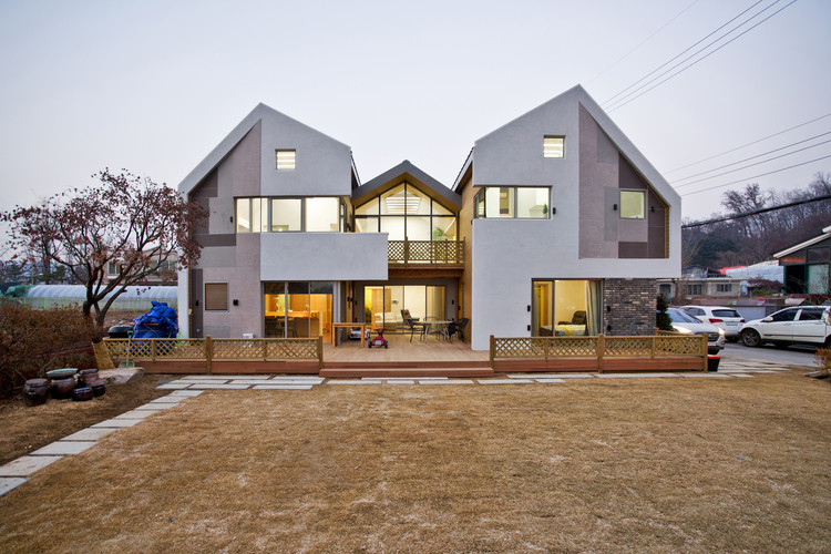
The design can be statically misinterpreted as a house between two houses. First sketch well support the initiative concept which intended one house for each generation and common space between. Knowing the family, the program has changed from vertical group to horizontal strategy which means the program separation by floors. The lower level was provided for older generation, considering minimizing their physical restraint. Each house would carry functional means, one with room, the other with kitchen and the living room between.

The building was planned to optimize area space as possible, considering future generation. Under the circumstances, the Parking lot in backyard and privacy through the front-yard carefully added spice on this simplified, function-oriented triplet house.
In order to minimize the volumetric weight, the far end’s roof line was lowered. Also the street-side façade was subdivided into the first, second floor and the roof. The ‘used brick’ is used on first floor façade, providing steady atmosphere. The projected second floor is to emphasize the façade’s segmentation as well.

The variety of angles on its gable-roof design was intended to compromise loft space underneath, so that the loft area can have sufficient ceiling height. Another design goal was to introduce more natural light into the loft area. However, skylight needed to be reconsidered based on the probability of common mistake on skylight construction. The different angle on roof design reveals tri-angular windows which allow timely sunlight into the house. In the end, the client also earned additional balconies they liked to have.

The design is user-friendly, mainly focused on its function. The logic flows coherently. The mass was relocated for parking location and privacy. The following volumetric balance needed to be manipulated. Then, the loft introduced new look on roof line. After all, natural light illuminate this house in various way. The design was progressively developed based on the given circumstances, and also through the communication with client’s need. The house design is not only architect’s trophy but also the result of accumulated ideas by interactive communication.


