-
Architects: inSpace
- Area: 4500 m²
- Year: 2013
-
Photographs:Herve Abbadie

Text description provided by the architects. The project assumes entirely its orthogonal geometry and, simple and direct morphology without getting into a minimalism tendency. Its morphology does not show in a first view, its real hidden constructive complexity; where all spaces, relations, details and materials had been thought, drawn and executed with one only measure, the human scale.

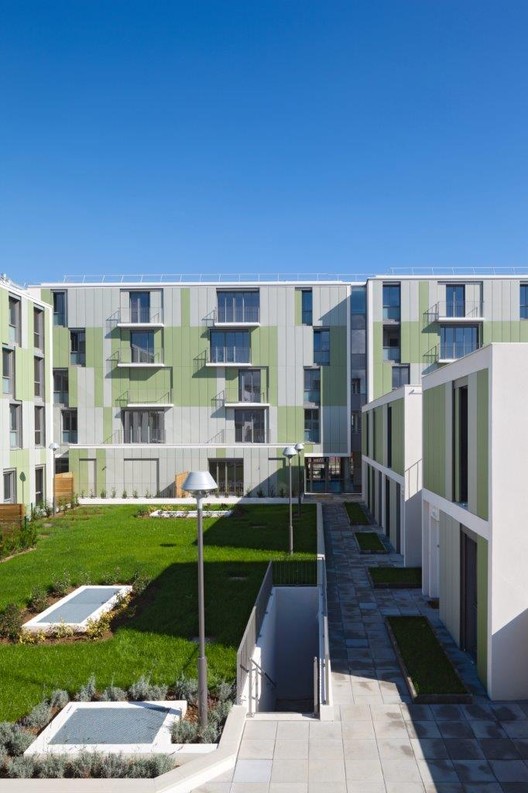
The organization of the 11 individual houses and the 30 apartments follow parallel the limits of the site in order to liberate the maximum surface on the center of the plot. The aim was to create a collective garden to all inhabitants, as a place of identification, to rest, to play and to meet.

Distributed in different volumes, the houses vary between ground floor and one floor level volumes placed in the south angle of the site. In the north side, the apartments find their place in four independents volumes with three and four floor level height. This composition allows the arrival of natural light in the central garden at all hours of the day, every day a year. At the same time, shadows between the different volumes are inexistent.

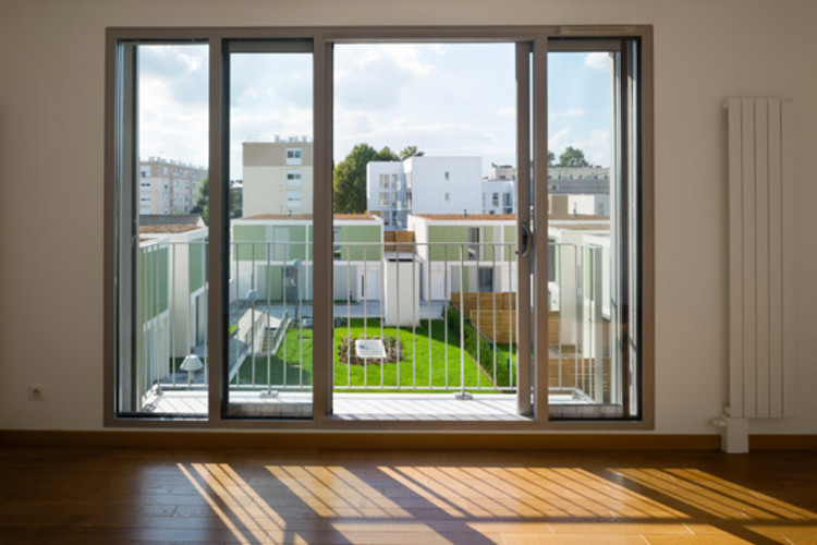
All housing units are double oriented, and the great majority has views towards the street and towards the central garden. All collective circulations are naturally lighten and open large views to both urban surroundings and inner garden.

In the conception of each house/apartment unitit had been extremely important to well distinguish the social zones from the night and private room zones in order to facilitate a traditional family appropriation.On the other hand, all units have a private exterior space, a terrace, a garden or a balcony.

The image of the project is a global unify image represented through a horizontal balanced vertical multiple reading. All façades are composed by “ethernite natura’ regular and systematic 3 colors tones panels. Horizontal bands are determined by one color tone,where a punctual variation agitates the regularity of the total image. This mosaic in smoothly movement is accentuated by the sliding windows panels.

Towards the street, the color tone choice was neutral, almost anonymous in order to concentrate the view in the ground level – into the different treatments, the granite base, the grids, the border private gardens, and the multiple visual perspectives towards the inner garden.Towards the innergarden, warmer welcome tones are placed, a green tonality in direct dialogue with the vegetation of the garden resulting in an immediate green ‘scenario’ environment.

Behind the flat aspect of the façades, almost minimal, is hidden a complex, rigorous concept, drawing and realization, where the sliding door windows mechanism are turnout invisible; where the windows and balcony’s find meticulous it’s places.


