-
Architects: Rolf Ockert. Architect.
- Year: 2011

Text description provided by the architects. In 2011 we were approached by a client we had built a house for to design the new office for his company. In his opinion the house we had designed for him is still "the best house in the world" and he expected nothing less for his new office fit out. Indeed the only design brief other than the number of workstations to be accommodated was that it had to be "funky".

The new office was to be on levels 2 and 3 of an old heritage listed warehouse in the centre of Sydney. Both levels were to be connected internally by a new stairs to be cut into the heritage fabric. While this was not an easy idea to get past the heritage authorities we did in the end convince them that a modern stair will only enhance the heritage character of the building and received planning approval.

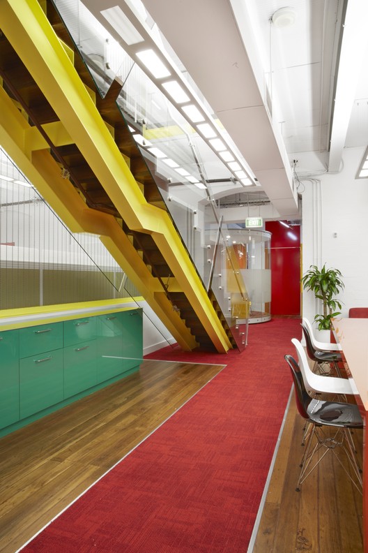
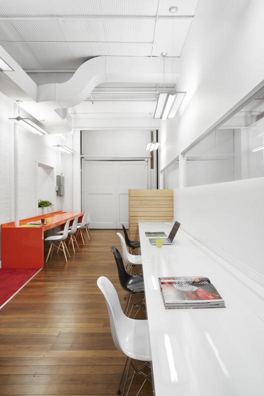
The existing warehouse structure featured prominent, strong brick arches, painted white, enormous 1900s steel beams, all still imported from England at the time, also painted white, and hardwood floors. Our approach to building in a heritage context is generally to make all new elements clearly legible as new while treating the existing with all the respect it deserves. Together with the requirement in the brief to be "funky" we therefore developed a bright colour concept for all new elements, from the stairs to joinery, carpets, workstation dividers and meeting room finishes. This was to serve as a contrast to the white and wood heritage background as well as a way to distinguish various functional areas from each other. Red had a particular role in this colour scheme as the company is called "Red Rock Consulting" and obviously had adopted red as its signature colour.

At a point when the stairs, carpet and joinery were installed but workstations and other furniture were still missing we received a very concerned phone call from our client who was extremely worried that the colour concept was more suitable for a pre-school than for his office. We asked him to give us the benefit of the doubt until all, mainly white, additional furniture was installed and the office was filled with all the usual elements of office live, from computers to files, paper, trinkets etc. Thankfully we did receive another phone call from the client when the office was fully occupied, stating that he was absolutely ecstatic with the result.

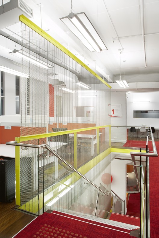
Within that strong white and wood heritage space with its bright insertions a number of elements had been designed as particular highlights. The stair, with its bright yellow steel stringers and pronounced zig-zag timber tread line and its bright red carpet cover runs like a lightning bolt through the space, linking the two levels.

Several meeting rooms are designed as free standing glass pods, some curved, some square, with bright acoustic pinboard material and polychromatic carpet to set them apart from the other, circulation or workstation areas. These meeting rooms have their own ventilation system to ensure climatic comfort even during long meetings.

The Boardroom is pronouncedly simple, thus distinguished from the more multihued working areas. A soft coral type carpet is matched with an aluminium aeroplane wing style table and light fitting and bright red chairs to embody the company's slogan of "having fun, seriously".

Another meeting room, on the upper level, was suddenly given at some time during the design process the new brief by the vibrant CEO that any visitor taken to that room for the first time had to involuntarily exclaim "What the F..." or something to that effect. We responded with a big, continuous, curvy ribbon of joinery that meanders its way through the heritage room without touching it. This ribbon changes from forming a sheltering backdrop to a comfortable seating area to becoming a canopy to a screen surround to finally a table to seat six. This ribbon element is of course red. The room is officially known as the "WTF Room".


