Text description provided by the architects. The Docklands precinct has been transformed into a modern residential, commercial and visitor destination in the heart of Melbourne. The client wanted to deliver a fresh authentic pizza offering for a discerning business clientele wanting a fast but quality lunch or dinner.
Eleven Inch Pizza in Melbourne’s Docklands precinct incorporates second generation branding for an existing food concept initially developed for a Melbourne CBD laneway. The design for the space incorporates playful referencing and a bold interior enlisting simple colors and graphic forms.
Using the 11” branding as the starting point for the design, the walls reflect the logo back to the customer through ply cut-outs and repetition. A neon logo sits proudly atop of the graphic wall, playfully reminiscent of a brightly lit fast-food outlet.

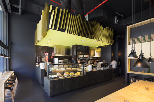
Opposite the feature wall, the bulkhead over the kitchen is lined with angled, luminous green aluminium fins. These reflect the angular perspective of the graphic wall and, with the bursts of lime throughout the space, provide an alternative focal point.
Surfaces are dominated by plywood which is continually reinterpreted throughout the space, although remaining primarily in a large sheet format. The selected plywood is Queensland plantation grown hoop pine. It is minimally treated with sealant only. The intention being that at the end of the designs’ lifespan the sheets can easily be re-used.
The Emiliana designed Naoshima stools used within the tenancy are reflective of the design, with timber once again redefined - this time folded and curved, and appearing as a continuous object.

The stripped-back design approach leaves the ceiling exposed with minimal tenancy lighting, allowing the space to maximise the natural light through the shop-front. Staggered black Nord pendant clusters light the communal tables and continue over the bench seating in a regular repeated pattern.
As a project, Eleven Inch Pizza, demonstrated the ideal synergy between designer, client and customer. The design needed to recognise and maintain the integrity of the existing brand whilst responding to the specific target market representative of the Docklands precinct.

In addition to this, enlisting a fresh approach to compliment both the food offering and maintain currency in the rapidly evolving location was a welcome challenge for Zwei. The outcome resulted in a stripped-back yet creative space where quality materials were used sparingly. The tenancy has individuality whilst leveraging the existing 11” brand strength.
The design translated the client's vision of communicating the fast, fresh food offering within an exciting and dynamic environment.


.jpg?1372397407)


