-
Architects: RichardHO Architects
- Year: 2010
-
Photographs:Vineyard Production

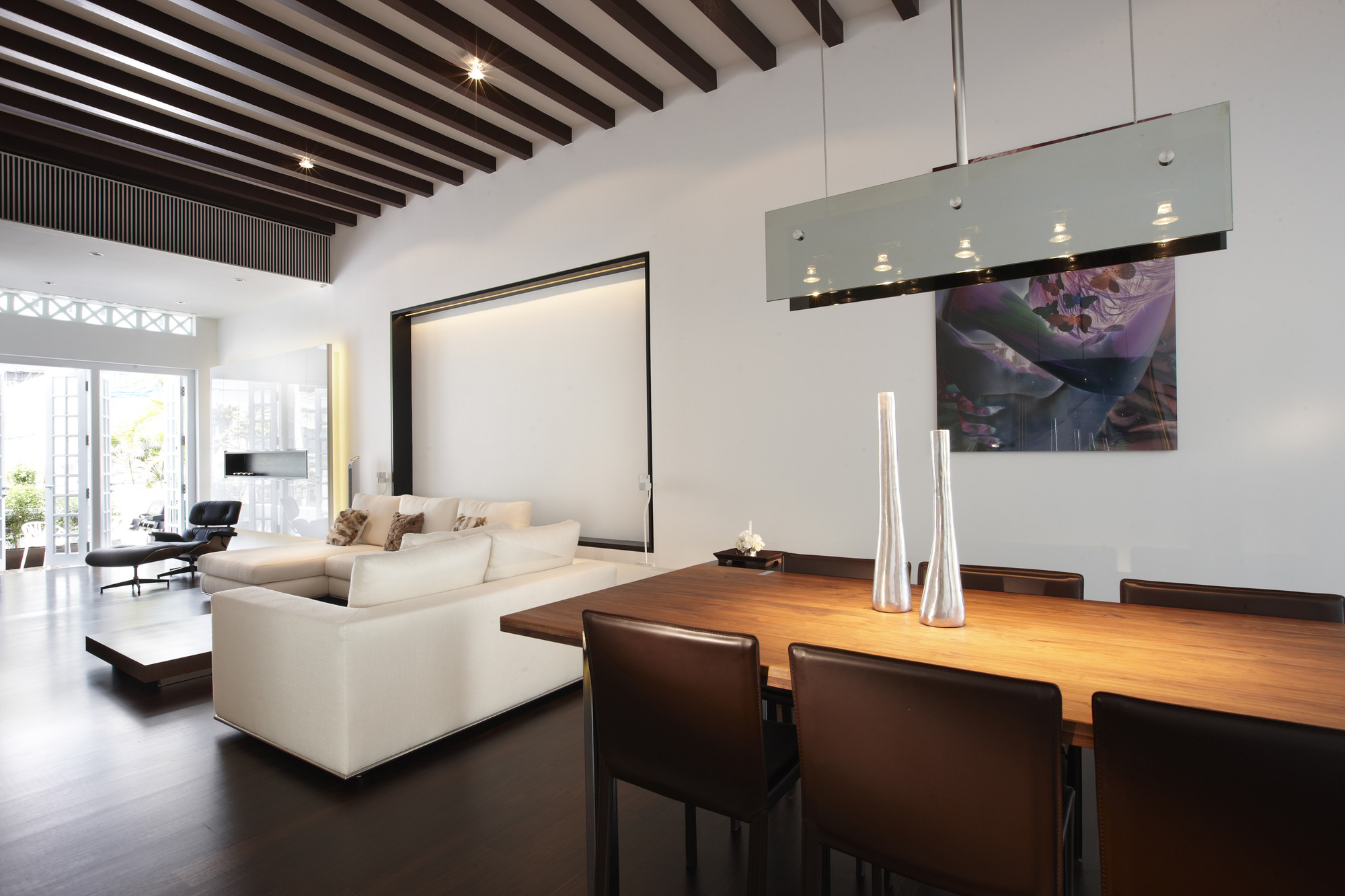
Text description provided by the architects. Our initial survey of the property revealed the building's good bones. The house's original condition was quite good but its configuration did not suit modern living. A primary concern was that the kitchen and bathrooms were located at the back of the house, away from activities of the living and dining rooms and inappropriate for entertaining.

We retained the building envelope and reconfigured the layout to create a single, seamless living-dining-kitchen volume, taking special care to maintain the hierarchy of space so central to the design of pre-war shop house. The resultant scheme is a distinctly modern take on a traditional shop house. It received an instant stamp of approval from the owners. “I love the fact that when you enter, you can see straight through the back, but know that the various areas are designed for specific purposes,” says the owner.

To recreate the shop house essence, we redefined two characteristic features of shop house architecture – the skylight and the air well. To emphasise the importance of this space as the fulcrum of the house, we introduced a water feature and koi pond and made the staircase wind around this water feature. Where the air well was once exposed to the elements, it is now equipped with a retractable glass roof and independently operated blinds that reflect 75 percent of the heat back into the atmosphere, keeping the internal temperature comfortable. Depending on the extent to which the blinds are retracted, the time of the day and the intensity of the sun, the shaft of light streaming in cast shadows in varied patterns. On moonlit nights, the glass roof can be fully retracted to take in the view.

The second storey has one wing housing the master bedroom and ensuite bathroom, and the other containing the nursery and daughter's bedroom. We custom-designed and installed a series of child safety doors at strategic locations, which can be removed once the owner's daughter comes of age. The master bedroom is a self contained volume reminiscent of a luxury hotel suite: a divider at the entrance doubles up as the bed's headboard, while a bank of wardrobe in a high-gloss white finish line walls on either side. The piece de resistance is the master bathroom, with its view of lush greenery that whisk one away from the hustle and bustle of city life.

The guest room on the attic level functions as the owners study when there are no visitors. Here, an enormous 4m high glass door and glass wall are used in place of the usual timber and brick counterparts. We wanted to enhance the sense of space. If you open the door, air can flow through and ventilate the space. Our rationale resonated well with the client, who picked this as his favourite room in the house. The room is large with high ceilings and a real 'loft' feel. Sitting at my desk, I can look down into the kitchen and my family room”, says the owner. A surprise awaits intrepid visitors who make the journey all the way up to the rooftop: an outdoor terrace with an infinity edge pool and a panorama of green, the same view shared by the master bathroom.

This is one of the most contemporary shop house we have done so far. But it has the unmistakable feel of a shop house, because we do not believe in creating space in a conserved house that does not have memories of its past. It would be like a person with amnesia. The owner agrees. “I love the clean feel and while the house is very modern, there is no question about its origins:, he says. Asked if the house suits his family's need, the owner replies, “Very much so. There are spaces we can do things as a family, and there are spaces we can do things separately. It is great for entertaining but also quite intimate at the same time.”

ALL COPYRIGHTS RESERVED by RichardHO Architects


