-
Architects: Bureau de Change Design Office
- Area: 210 m²
- Year: 2012
-
Photographs:Eliot Postma

‘HomeMade’ is the first residential scheme by London-based design studio Bureau de Change. The project takes two neighbouring properties and merges them into a single family home with a new extension providing a kitchen and living space at the rear of the property.The first design step was to connect the two properties by opening up many of the dividing walls and creating openings to give visibility, access and a more unified feel.

“By changing the plan form in this way, we fundamentally altered the flow of the houses. We didn't want to be constrained by the old format - we wanted to address it as a single family space. A key part of this was identifying a new 'heart' for the home.” said Billy Mavropoulos, architect and Bureau de Change partner.

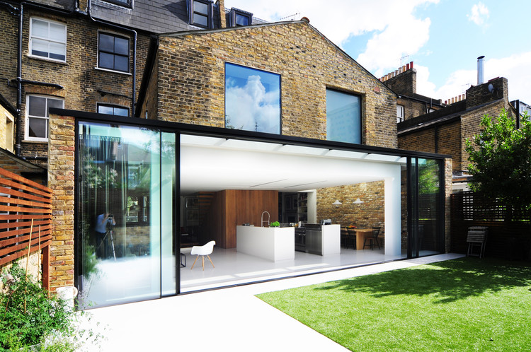
This 'heart' is created through an oak-wrapped box which sits at the meeting point between the original house and the new family space. Within this box is contained storage, partitions and a new cloakroom. At its edge sections of timber are peeled at right angles to form an open staircase leading to the floors above./ Beyond this core sits the new kitchen and dining space – created by wrapping the entire rear facade in glass, as though the two buildings are being physically pulled together by the glazing.

This 11 metre-long façade consists of tall sliding glass doors which blur the boundary between the inside and outside. At the edges, the glass doors ‘climb’ over the original building, creating skylights and windows with the same finish and detailing. Inside this space, the steel kitchen islands are hidden within two oversized resin shells which appear to have been pulled up from the floor.

Inside the house, original features have been retained or reused wherever possible. But at the rear, the character of the new extension is also adopted in the first floor where new windows form large glass walls in the bathroom and at points, are extruded to create seating. Throughout the house the differences between old and new, light and dark are celebrated.

“We were very sensitive to how materials and colour were used to create a coherent identity for the house and balance between the old and new. In the extension, the coolness of the polished resin floor is warmed by the large reclaimed brick walls and the routed oak core. Elsewhere in the house bright white walls are set against dark timber floorboards. The result are rooms which have a unique character, but a house with a unified story.”


