-
Architects: Natalie Dionne
-
Photographs:Marc Cramer
Text description provided by the architects. The E3 House offers an interior environment that is almost monastic in its uncluttered serenity. The delineation of the volume through the multi-level concept accentuates the luxuriousness of light and space. This urban house is at once a living, creative, and gathering place designed for an inspiring family.
The E3 House is located in a bustling neighbourhood near the very popular Jean-Talon Market in Montreal. It was designed for a family with a deep attachment to the neighbourhood; the parents work in theatre, film, and television, and the children are young adults.
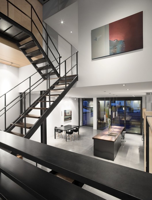
The exterior geometry of the residence is a simple parallelepiped defined by two largely fenestrated walls on the east and west sides and party walls to the north and south. The orientation of the lot inspired the design of a multi-level house that enables natural light to penetrate. The floors are staggered on either side of the 12-metre-high central atrium that divides the house into two volumes, front and back; a staircase, topped with a skylight, links the different levels.
The large windows situated at both ends of the house and the central skylight allow the sun to reach deep into the interior to create ever-changing plays of natural light and shadow. Thus, the interior environment modulates according to the time of day and the season. Large wooden shutters slide in front of the windows in each room to filter the light at dawn and sunset. To ensure natural ventilation, the windows are facing each other and they all open, as do those in the skylight. The shutters also protect the house from summer heat.
The house is called E3 because it is organized around the cross section of the building. The cross-sectional drawing resembles a capital E linked to a backward E by the intersecting staircase. Each living space and room is on a separate level. The staircase links the six rooms in the house, leading ultimately to a mezzanine studio and a terrace with a view of iconic Mount Royal. On the other side, the skylight looks out on a green roof system, where a small field of lavender will be planted.
The bedrooms open onto the central space through wide pivoting or sliding doors, which expand the space, allow light to enter, and create a depth of perspectives. When the doors are closed, the space is withdrawn, allowing for isolation, privacy, and contemplation.
The volume is structured by integrated architectural elements and finishes that contribute a graphical and sculptural quality to the space. The central staircase, light and airy, and the impressive kitchen island both feature steel and walnut. Cabinets, wardrobes and storage spaces, made with maple-veneer plywood, are vertically arranged to create multi- functional, multi- level monoliths. Outside, marine-grade plywood stained to a dark espresso colour lines the walls and ceilings of large alcoves to mark both front and back entrances. The project’s program includes a code of materials with simple, repetitive colours: polished concrete, natural steel, wood and blue tiles. The interplay of these materials creates stunning graphical compositions that resemble abstract paintings.