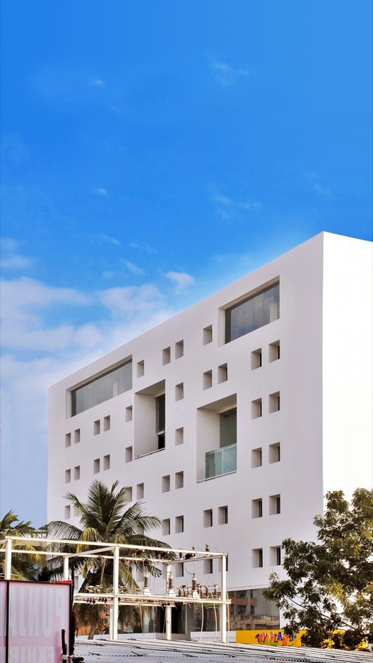
Text description provided by the architects. Contextualised by its location in a peripheral yet rapidly urbanising part of the city, the silent quadrangular volume of voids is conceived to provide momentary respite in the visual chaos created by incidental excesses. The building is defined by the stark precision of its dimensions.

Against a matrix of surface punctures, the large voids created by the verandahs consciously break the monotony of an underlying pattern in depth and sizing. The differing fenestration sizes and transparencies not only provide consistent natural lighting and ventilation, but also reflect variation in use of internal space. The underlying matrix enhanced by the repetitive window opening accentuates the flexibility of interior distribution.

The cubic volume rests on an elevated plinth designed as a public podium. The movement that traces through the podium into the seamless forecourt unites the building with its larger public context. This forecourt, generated out of the large setback from the road, contributes to a better appreciation of the building's geometric purity.

Internally the spaces are conjoined to a linear service core along the east-west direction spatially divide the building into two halves. The entrance aisle spanning a double height sinks deep into the retail spaces hinging together the commercial zones. A dense volume of office space is supported above. As you reach the terrace at the top, white walls intentionally block out the excesses of the city below and provide a breathing space from polluting noise and views.

The building, in an urban setup that has become a backdrop to architecture pacing towards over-design is deliberately contrived to be blank and a silent non-statement.


