-
Architects: Arq. Álvaro Borrero, Diez + Muller Arquitectos
- Area: 3700 m²
-
Manufacturers: Er Servicios, FV, Indumadera, Inmadec, RAMA Studio, Termikon
The building and the city. We are aware of the importance and responsibility that every new project has in relating and contributing in some way to the city. The Torre Bonica building seeks permeability, opening the project towards the street. We shape and give meaning to the empty space through a small plaza, a bench, and abundant vegetation. These few elements mark the entrance, invite people to pass by, and enrich the neighborhood.
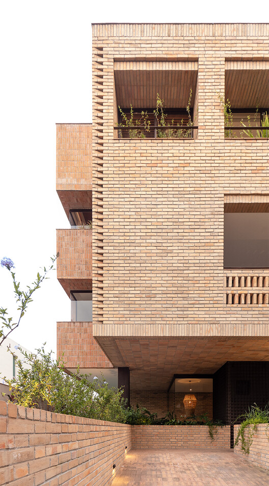
Volumetric/spatial proposal. Having a wide frontage and few floors, the volume feels disproportionate and heavy. As a solution, a central "crack" divides the volume into two parts. This gesture lightens and proportionates the volume, generating volumetric/spatial clarity. The two defined volumes contribute to the good functioning of the housing units, creating efficient floors with abundant natural lighting, ventilation, and views. The central crack becomes a longitudinal axis that defines the communal circulations of the building and a visual endpoint towards the ravine.
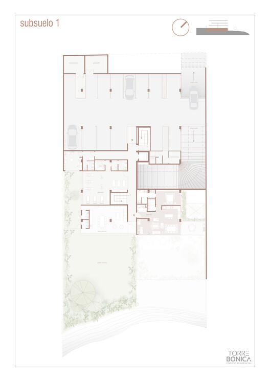
The site. The plot had a house built one floor below street level and a painting workshop one level below the house. This particular situation generated two gardens on different levels. Appealing to the memory of the place and the people who previously inhabited the property, it was decided to accommodate the project's levels in such a way that they could be preserved. It was essential for us to leave memories and evidence of the pre-existing and for the project to benefit from a mature and consolidated garden.
Architecture and human relationships. The commission arises from the desire of the heirs of the land (two siblings) to make a project on the land where their parents' house was. A building with 9 units is projected, which has certain specific values and attributes. (1) The building as a community. The importance of meeting and interacting with neighbors. It is essential to share and feel accompanied. (2) Green areas are prioritized for communal use and enjoyment, not private. (3) Open, integrated, and healthy spaces (light, ventilation, and vegetation). (4) The search for domesticity. Warm spaces that make you "feel at home."
Sustainability. The main decisions and guidelines of the design are loaded with common sense and sensitivity towards the environment: permeable natural floors, local materials, and labor, consideration and care with sunlight, passive climate systems, solar panels, etc.
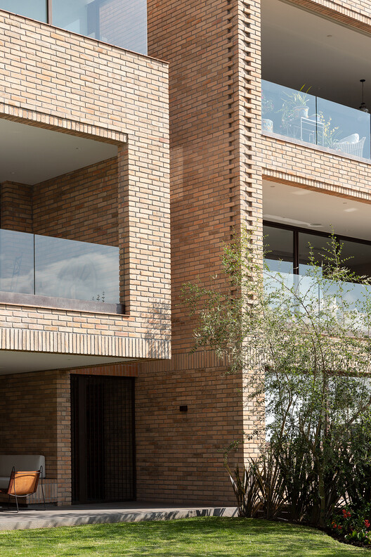
Material. Bricks and other clay derivatives are chosen for the project. We value their low maintenance, timelessness, and good aging. The project seeks to enhance this material, which is also characterized by its versatility. This is how we manage to use it for walls, handrails, lintels, gutters, screens, furniture, floors, and ceilings.
We recognize its artistic attributes and how they contribute to sculpting spaces and achieving strong sensory experiences. But above all, true luxury lies in the details.