-
Architects: Studio Motif
- Area: 210 m²
- Year: 2023
-
Photographs:Yongjoon Choi
-
Lead Architect: Park Sung Ho
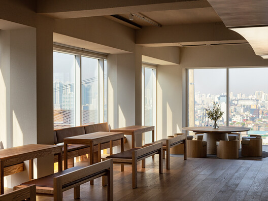
Text description provided by the architects. The site of this project was on the top floor of the building located in Huam-dong, Seoul. The site covers an area of 200㎡, made as a rectangular plane. Furthermore, three faces among an elevation of the site were built up of curtain walls, which put itself into a favorable position with Seoul City view from a high place. We proceeded to design this site by boosting and maximizing its appeal.
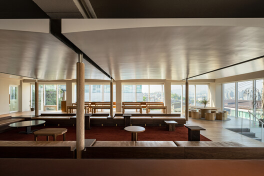
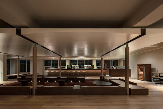
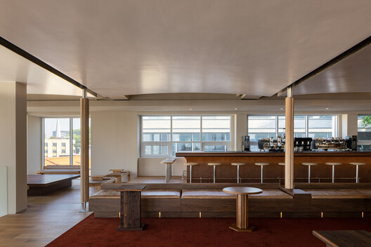
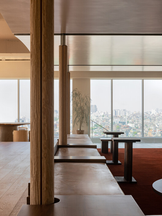
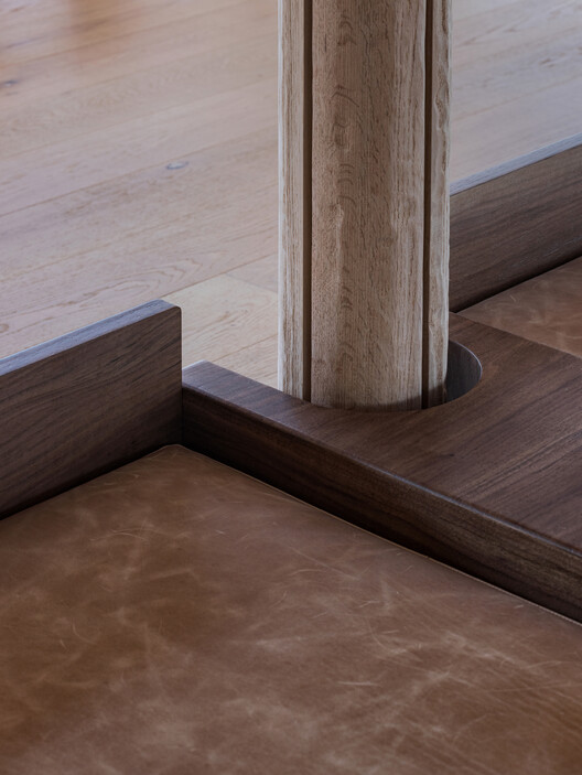
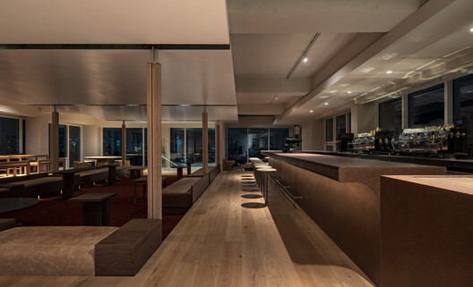
The floor plan was compactly constructed, forming a rectangular area in the center by setting the standard from an axis outside the building and drawing the line. Due to this, the internal space formed the pivot, balancing the area by making visitors' attention spread outward from the center. The six pillars in the center of space lightly divide the outer and inner areas, supporting the curved roof. Unlike the wall, which creates clear boundaries, the roof and pillar make the space flexible through obscure lines.
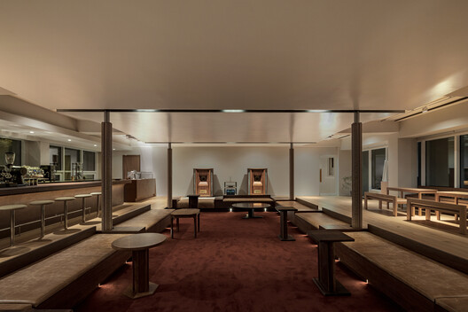
Furthermore, the roof was made of a curved form with white satin paint, breaking the monotony of the space. As a result, the stuffy atmosphere in the center has been banished by dimly reflected light on the ceiling. In addition, we created a higher floor surrounding the center of the space. This higher floor gives stability to the space, making space for visitors, seats, and counters.
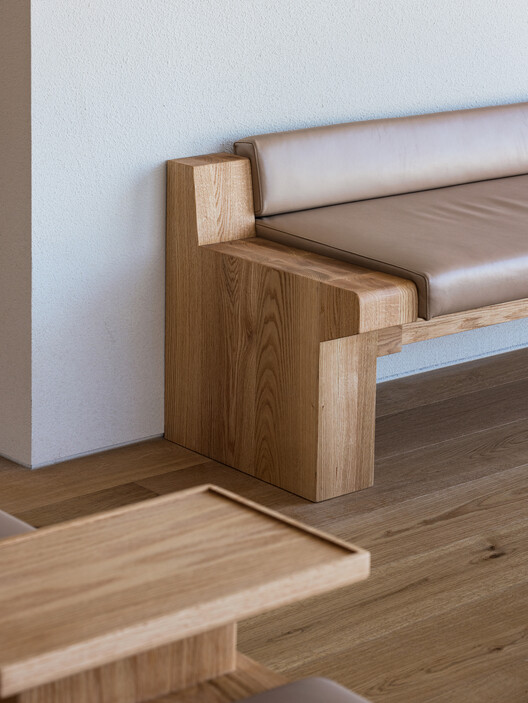
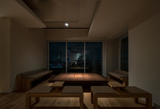
Giving color separation by using red carpet and dark walnut wood, the center of the space contrasts with the surroundings. Hence, we finished the floor beside the window with bright wood and wooden furniture with light red oak and oil. We chose relatively low and wide seats so that visitors can easily enjoy a 3-sided view. We arranged the counter on the right side and four seats on the left side. Moreover, we lowered the floor, placing the low chairs and tables so as not to block the scenery on the front side.
We hoped that customers could freely choose their seats in the place where they first met. Before arranging the seats when characteristics of the site and the café as the program overlapped, we deeply considered how to define ‘seat’, which includes a concept of area. Various seats help users to experience this space in a variety of ways.