1. ArchDaily
  2. Interior Design

Interior Design: The Latest Architecture and News

Color Beyond Aesthetics: The Psychology of Green in Interior Spaces

How many changes have you done to your interior space during this past year? Whether it was a change of furniture layout, repainting the walls, adding more light fixtures or perhaps even removing them, after spending so much time in one place, the space you were once used to didn’t make sense anymore. We could blame the overall situation for how we’ve been feeling lately, but as a matter of fact, the interior environment plays a huge role in how we feel or behave as well. However, if you were wondering why some neighbors seem much more undisturbed and serene even in the midst of a pandemic, it could be because the interior is greener on the other side.

Color Beyond Aesthetics: The Psychology of Green in Interior Spaces - Image 1 of 4Color Beyond Aesthetics: The Psychology of Green in Interior Spaces - Image 2 of 4Color Beyond Aesthetics: The Psychology of Green in Interior Spaces - Image 3 of 4Color Beyond Aesthetics: The Psychology of Green in Interior Spaces - Image 4 of 4Color Beyond Aesthetics: The Psychology of Green in Interior Spaces - More Images+ 21

Monochrome Interiors: Color at the Forefront

We know that colors can influence our sensations and cause different perceptions of a space, which confirms the benefits of designing a consistent color palette and its importance in architectural projects. The impact of color on a space and on the people who use it becomes even more perceptible when the whole environment is covered with just one color. In these cases, the selected shade can be applied to countless architectural elements. Floors, ceilings, walls, furniture, or even pipes and electrical conduits can have a specific hue to match the monochromatic environment.

Monochrome Interiors: Color at the Forefront - Image 1 of 4Monochrome Interiors: Color at the Forefront - Image 2 of 4Monochrome Interiors: Color at the Forefront - Image 3 of 4Monochrome Interiors: Color at the Forefront - Image 8 of 4Monochrome Interiors: Color at the Forefront - More Images+ 6

Brazilian Interiors With Exposed Structures

Many architects tend to prefer using materials and architectural elements in their natural or raw state. It is common to remove ceilings and finishings, especially in renovation projects, to expose a building's structure. This process of reclaiming the natural materials of construction - without incorporating elements to cover the framework, pipes, tubes, and cables - transforms these spaces into places that have nothing to hide.

Brazilian Interiors With Exposed Structures - Image 1 of 4Brazilian Interiors With Exposed Structures - Image 7 of 4Brazilian Interiors With Exposed Structures - Image 10 of 4Brazilian Interiors With Exposed Structures - Image 12 of 4Brazilian Interiors With Exposed Structures - More Images+ 8

Quality Spaces in Small Areas: Brazilian Apartments Below 50m2

Solutions for small-scale apartments are becoming more and more needed due to the increasingly smaller apartments being built in the centers of Brazil's major cities. The high price of land, combined with the current laws and regulations, has boosted the construction of gradually smaller dwellings - which can often translate into lower quality of life for its residents. 

However, that is not always the case, while architecture can play a fundamental role in transforming a small concrete and masonry box into a pleasant home that fulfills the needs of its dwellers. We have gathered 10 examples of apartments in Brazil, between 24m2 and 48m2, that transform small areas into quality spaces.

Quality Spaces in Small Areas: Brazilian Apartments Below 50m2 - Image 1 of 4Quality Spaces in Small Areas: Brazilian Apartments Below 50m2 - Image 2 of 4Quality Spaces in Small Areas: Brazilian Apartments Below 50m2 - Image 3 of 4Quality Spaces in Small Areas: Brazilian Apartments Below 50m2 - Image 4 of 4Quality Spaces in Small Areas: Brazilian Apartments Below 50m2 - More Images+ 6

Miró Rivera Architects: Building a New Arcadia

The acclaimed studio Miró Rivera Architects has published a 448-page monograph, entitled Miró Rivera Architects: Building a New Arcadia. Designed by the award-winning architects, the book features 20 of the firm’s most remarkable projects brought to life through 230 color photographs and 95 drawings. Featuring essays by notable thinkers and cutting-edge practitioners in the fields of architecture and urban design, Building a New Arcadia situates the firm’s diverse portfolio in a global context related to concepts of nature, sustainability, history, and urban design.

Bringing the Outdoors Inside: The Benefits of Biophilia in Architecture and Interior Spaces

If a person were to imagine a setting of complete relaxation, odds are the first image that comes to mind is a place surrounded by nature, be it a forest, the mountains, the sea, or a meadow. Rarely does one imagine an office or a shopping mall as a source of comfort and relaxation. Still, the majority of people spend almost 80-90 % of their time indoors, going back and forth from their houses to their workplaces.

Architects and designers are now searching for design solutions that will resonate well into the future, turning to 'biophilia' as an important source of inspiration that promotes well-being, health, and emotional comfort.

Bringing the Outdoors Inside: The Benefits of Biophilia in Architecture and Interior Spaces - Image 1 of 4Bringing the Outdoors Inside: The Benefits of Biophilia in Architecture and Interior Spaces - Image 2 of 4Bringing the Outdoors Inside: The Benefits of Biophilia in Architecture and Interior Spaces - Image 3 of 4Bringing the Outdoors Inside: The Benefits of Biophilia in Architecture and Interior Spaces - Image 4 of 4Bringing the Outdoors Inside: The Benefits of Biophilia in Architecture and Interior Spaces - More Images+ 10

Pikler Pedagogy in Architecture: Wooden Furniture and Spatial Freedom

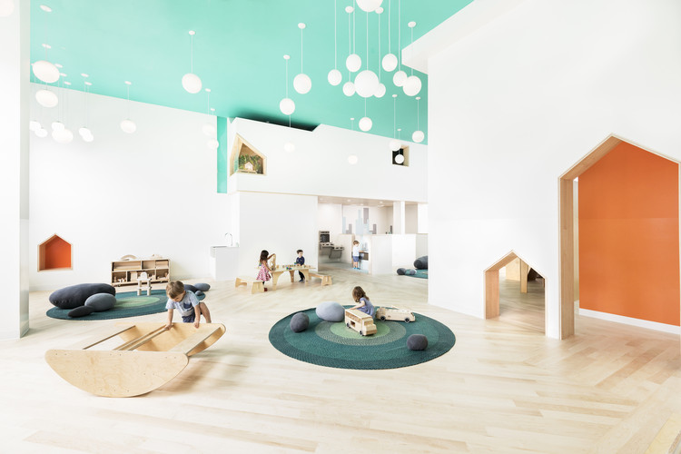
Emmi Pikler was a Hungarian pediatrician who introduced, in the years after World War II, a new philosophy on early childhood care and learning for children up to the age of 3. It was after the birth of her first child that she began to question: what happens when a child is allowed to develop freely? The observed results culminated in the introduction of a new methodology.

The Pikler approach facilitates the free development of children by caring for their physical health and providing affection but largely respecting their individuality and autonomy. Following this logic, intervention by adults becomes mostly unnecessary. Rather, for the child to experience space while moving freely, certain care must be taken in the preparation of the environments themselves.

High-Rise Living: 7 Houses Under 65m² in Rooftops and Attics

When it comes to attics, we often imagine underused spaces in homes and buildings, such as warehouses or rooms that are exclusively used to shelter infrastructure systems. However, reflecting on the reuse of traditional attics in 19th-century Parisian buildings as housing, which is happening nowadays, one realizes that these spaces can be reinvented and, with a little creativity, they can provide impressive living spaces.

Aláfia Apartment / Studio Clarice Semerene

Aláfia Apartment / Studio Clarice Semerene - Interior Photography, Apartment Interiors, Kitchen, Table, ChairAláfia Apartment / Studio Clarice Semerene - Interior Photography, Apartment Interiors, Table, ChairAláfia Apartment / Studio Clarice Semerene - Interior Photography, Apartment Interiors, Kitchen, Table, ChairAláfia Apartment / Studio Clarice Semerene - Interior Photography, Apartment Interiors, Kitchen, TableAláfia Apartment / Studio Clarice Semerene - More Images+ 23

  • Area Area of this architecture project Area:  70
  • Year Completion year of this architecture project Year:  2020
  • Manufacturers Brands with products used in this architecture project
    Manufacturers:  Electrolux, Deca, Docol, Franke, Goiarte, +1

Decoration Deserves to Be Celebrated for What It Is, Rather Than Dismissed for What It Isn’t

Beginning with the moral indignation expressed in Adolf Loos’s 1910 lecture “Ornament and Crime” and Le Corbusier’s 1925 The Decorative Art of Today, decoration has been attacked from every possible angle. Driven by the heroic male architect, Modernist dictates of good design—functionalism, truth to materials, purity of form—quickly took over and continue to be the dominant ideology today in the way architecture and interiors are taught and practiced. If Modern architecture was rational, masculine, and structural, then decoration was considered emotional, feminine, and shallow. Or, according to Loos, it was flat-out degenerate.

Polycarbonate for Interiors: 8 Examples of Translucent Architecture Indoors

Polycarbonate for Interiors: 8 Examples of Translucent Architecture Indoors - Image 1 of 4Polycarbonate for Interiors: 8 Examples of Translucent Architecture Indoors - Image 2 of 4Polycarbonate for Interiors: 8 Examples of Translucent Architecture Indoors - Image 3 of 4Polycarbonate for Interiors: 8 Examples of Translucent Architecture Indoors - Image 4 of 4Polycarbonate for Interiors: 8 Examples of Translucent Architecture Indoors - More Images+ 30

Diversifying the materials of an interior space can greatly improve its depth and visual interest. At the same time, adding partitions or other delineations of internal space can help organize flow, circulation, and visibility. Polycarbonate, a type of lightweight, durable thermoplastic, is an excellent medium for both functions.

In its raw form, polycarbonate is completely transparent, transmitting light with nearly the same efficacy as glass. However, it is also lighter and stronger than glass and tougher than other similar plastics such as acrylic, polystyrene, ABS, or nylon, making it a good choice for designers seeking durable, impact and fire resistant materials that still transmit light. Like glass, it is a natural UV filter and can be colored or tinted for translucency, yet it is also prized for its flexibility, allowing it to be shaped into any size or shape. Finally, it is easily recyclable because it liquefies rather than burning, making it at least more environmentally friendly than other thermoset plastics. For example, recycled polycarbonate can be chemically reacted with phenol in a recycling plant to produce monomers that can be turned back into plastic.

Blurring the Line Between Architecture and Furniture

An emerging design trend is filling the gap between furniture and architecture by shaping space through objects at the intersection of the two, creating a dynamic and highly adaptable environment. Either a consequence of the increased demand for flexibility in small spaces or the architectural expression of a device-oriented society, elements in between architecture and furniture open the door towards an increased versatility of space. Neither architecture nor furniture (or perhaps both), these objects operate at the convergence of the two scales of human interaction, carving a new design approach for interior living spaces.

Blurring the Line Between Architecture and Furniture - Films & ArchitectureBlurring the Line Between Architecture and Furniture - Films & ArchitectureBlurring the Line Between Architecture and Furniture - Films & ArchitectureBlurring the Line Between Architecture and Furniture - Films & ArchitectureBlurring the Line Between Architecture and Furniture - More Images+ 5

Hinges and Slides: Mobile Mechanisms to Take Advantage of Tiny Spaces

At the 2014 Venice Biennale, celebrated architect and curator Rem Koolhaas chose an unusual curatorial theme. Rather than exploring the major issues that plague modern society or their manifestations in the profession of architecture, the event's theme, "Fundamentals," and its main exhibition, "Elements of Architecture," examined in detail the bare fundamentals of buildings, simple elements used by everyday architects for everyday designs. According to Koolhaas, “Architecture is a profession trained to put things together, not to dismantle them. Only by looking at the elements of architecture under a microscope can we recognize cultural preferences, technological advances, changes triggered by the intensification of global exchange, climatic adaptations, local norms and, somewhere in the mix, the architect's ideas that constitute the practice of architecture today.”

Biophilia: Bringing Nature into Interior Design

Interior design begins with human experience. Considering the physical, mental, and emotional needs of people, interior designers use human-centered approaches to address how we live today. Creating novel approaches to promoting health, safety, and welfare, contemporary interiors are increasingly inspired by biophilia as a holistic approach to design.

Biophilia: Bringing Nature into Interior Design - Image 1 of 4Biophilia: Bringing Nature into Interior Design - Image 2 of 4Biophilia: Bringing Nature into Interior Design - Image 3 of 4Biophilia: Bringing Nature into Interior Design - Image 4 of 4Biophilia: Bringing Nature into Interior Design - More Images+ 3

Interior Design Trends That Will Shape the Next Decade

Interiors are taking center stage in 2020, as more people are spending more time at home. Architects and designers are increasingly aware of their responsibility in improving their clients’ well-being and even helping them in the prevention of diseases, as they search for the best solutions for their interior design projects.

ArchDaily’s featured monthly topic for March was dedicated to Interiors and the articles related to this topic accumulated over 1 million pageviews, surpassing by 240% the number of pageviews achieved in other months in the same semester.

Merlot Apartment / Studio Clarice Semerene

Merlot Apartment / Studio Clarice Semerene - Interior Photography, Apartment Interiors, TableMerlot Apartment / Studio Clarice Semerene - Interior Photography, Apartment Interiors, Door, Table, ChairMerlot Apartment / Studio Clarice Semerene - Interior Photography, Apartment Interiors, Table, ChairMerlot Apartment / Studio Clarice Semerene - Interior Photography, Apartment Interiors, Kitchen, Sink, CountertopMerlot Apartment / Studio Clarice Semerene - More Images+ 26

  • Area Area of this architecture project Area:  1291 ft²
  • Manufacturers Brands with products used in this architecture project
    Manufacturers:  Ana Neute, Arquivo Contemporâneo, Brastemp, Carminati tapetes, Corian, +11