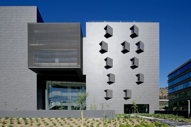
London’s Design Museum has announced the category winners of the prestigious “Design of the Year” award. The winner of this year's Architecture Category is the Anacleto Angelini UC Innovation Center designed by Alejandro Aravena.
Alejandro Aravena's UC Innovation Center awarded "Design of the Year" by London's Design Museum
AD Round-Up: 9 Projects That Make Creative Use Of Cor-Ten Steel

One of the most interesting trends in architectural materials of recent years is the increase in use of weathering steel - more commonly referred to by its trademark name, Cor-Ten. Thought the material has been around for decades, first being used for architectural purposes in the Eero Saarinen-designed John Deere Headquarters in 1964, the material has seen a surge in popularity in the last decade or so, being used in everything from individual houses and tiny kiosks, to SHoP's design for the Barclays Center in Brooklyn, which used a staggering 12,000 weathering steel panels.
To celebrate this material we've rounded up nine of the most innovative and striking uses of weathering steel from recent years: Haworth Tompkins' tiny Dovecote Studio; Feilden Clegg Bradley Studios' offices and student housing at Broadcasting Place; the perforated facade of IGC Tremp by Oikosvia Arquitectura; the rusted ribbons of Ron Arad's Design Museum Holon; vertical striations on The Corten House by DMOA Architecten; Tony Hobba Architects' Third Wave Kiosk and its corrugated Cor-Ten walls; striking patterned facades in Santiago's Gabriela Mistral Cultural Center by Cristian Fernandez Arquitectos, Lateral Arquitectura & Diseño; weathered facades and louvers in Guillermo Hevia's Ferreteria O´Higgins; and finally the folding garage-style doors of Origin Architect's Refurbishment of the Offset Printing Factory.

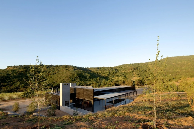
Terraza Offices / Gonzalo Mardones V Arquitectos
-
Architects: Gonzalo Mardones V Arquitectos
- Year: 2014
-
Manufacturers: CHC, MK, Nuprotec
Houses 10 & 10 + 10 / Gonzalo Mardones V Arquitectos
La Florida Metropolitan Hospital Clinic / Murtinho+Raby Arquitectos (Pedro Murtinho, Santiago Raby) + BBATS Consulting & Projects SLP (Silvia Barbera, Jorge Batesteza, Cristóbal Tirado)
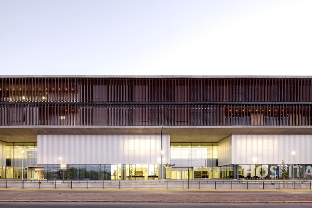
- Area: 67504 m²
- Year: 2013
-
Manufacturers: Cave, Grupsa, Lamp Lighting, Mathiesen, Parex-Group, +1
-
Professionals: CRL Ingeniería, DLLD, GyZ Ingenierìa, ICG Ingenierìa, PVT Ingenierìa, +1
FAT And Crimson's 'A Clockwork Jerusalem' To Be Exhibited In London

A Clockwork Jerusalem, the exhibition showcased in the British Pavilion at last year's Venice Biennale, will make it's UK debut at London's Architectural Association (AA) next month. Commissioned by the British Council and curated by Sam Jacob, co-founder of FAT, and Wouter Vanstiphout, partner at Dutch practice Crimson Architectural Historians, the exhibition shines a light on the large scale projects of the 1950’s, 60’s and 70’s by exploring the "mature flowering of British Modernism at the moment it was at its most socially, politically and architecturally ambitious - but also the moment that witnessed its collapse."
G House / Ariel Furman + Daniela Garcia-Huidobro

-
Architects: Ariel Furman, Daniela Garcia-Huidobro
- Area: 208 m²
- Year: 2013
-
Professionals: ENERGIZARQ
Lateral Office's 2014 Venice Biennale 'Arctic Adaptations' Exhibition To Tour Canada
Lateral Office's Arctic Adaptations exhibition, which was recognised with a Special Mention at the 2014 Venice Biennale, will travel make its debut in Canada at the Winnipeg Art Gallery this week before heading to Whitehouse, Vancouver, and Calgary. The exhibition "surveys a century of Arctic architecture, an urbanising present, and a projective near future of adaptive architecture in Nunavut" though interactive models, photography, and topographical maps of the twenty five communities of the area, as well as Inuit carvers’ scale models of some of the most recognised buildings in the territory. In addition, it proposes a future of adaptive and responsive architecture for Canada's northern territories.
The 14 Stories Behind the 2015 Building of the Year Award Winners

With our annual Building of the Year Awards, over 30,000 readers narrowed down over 3,000 projects, selecting just 14 as the best examples of architecture that ArchDaily has published in the past year. The results have been celebrated and widely shared, of course, usually in the form of images of each project. But what is often forgotten in this flurry of image sharing is that every one of these 14 projects has a backstory of significance which adds to our understanding of their architectural quality.
Some of these projects are intelligent responses to pressing social issues, others are twists on a well-established typology. Others still are simply supreme examples of architectural dexterity. In order that we don't forget the tremendous amount of effort that goes into creating each of these architectural masterpieces, continue reading after the break for the 14 stories that defined this year's Building of the Year Awards.
AD Round Up: Classics in Brick

As one of the most ubiquitous forms of construction, it can sometimes be easy to overlook the humble brick. However, this prosaic building method can also be one of the most versatile materials available to architects, thanks to the experimentation of countless architects who, for centuries, have worked to create new forms of expression with the simple material. In this round up, we celebrate architects who, with their architectural classics, have expanded the possibilities of brick craft: Antoni Gaudí's fantastical vaulting at Colònia Güell and Alvar Aalto's experimental brick patterning at his house in Muuratsalo; the powerful brick piers of Kevin Roche and John Dinkeloo's Knights of Columbus Building and the Catalan vaults of Porro, Garatti and Gattardi's National Arts School of Cuba; and finally, what brick round up would be complete without the brick-whisperer himself - Louis Kahn and his all-brick fortress for the Indian Institute of Management.

MVRDV and Interior Urbanism: An Interview With Winy Maas

In the late 20th and early 21st centuries, one of the major changes within cities around the world has been the rise of so-called "privately-owned public space," a development which has attracted the attention of many urbanists and is still being widely debated. However, for MONU Magazine, the increasing prevalence (and arguably, acceptance) of such privately owned spaces for public use gives us an opportunity to discuss another aspect of public space: interior urbanism. With the rise of the shopping mall and the increasingly diverse functions required by buildings such as libraries, interior spaces now resemble exterior public spaces more and more.
The following interview is an excerpt from the 21st issue of MONU Magazine, in which MONU's Bernd Upmeyer and Beatriz Ramo interview MVRDV founder Winy Maas, discussing the concept of interior urbanism in the work of MVRDV, in particular in their Rotterdam Markthal, Glass Farm and Book Mountain projects.
El Carmen Hospital Maipu / Murtinho+Raby Arquitectos (Pedro Murtinho, Santiago Raby) + BBATS Consulting & Projects SLP (Silvia Barbera, Jorge Batesteza, Cristóbal Tirado)
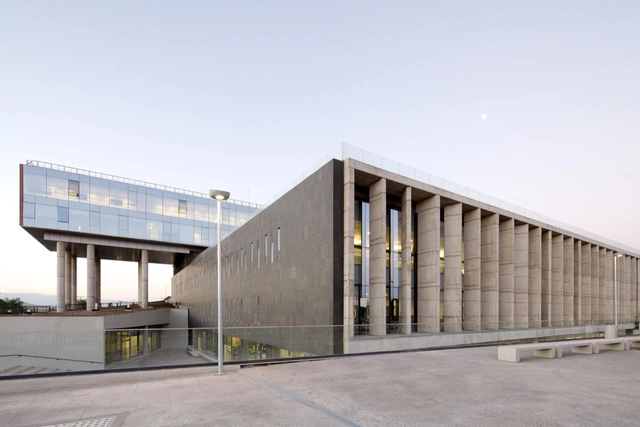
- Area: 70 m²
- Year: 2013
-
Professionals: CRL Ingeniería, DLLD, GyZ Ingenierìa, ICG Ingenierìa, PVT Ingenierìa, +1
The Work of SelgasCano, the 2015 Serpentine Pavilion Designers
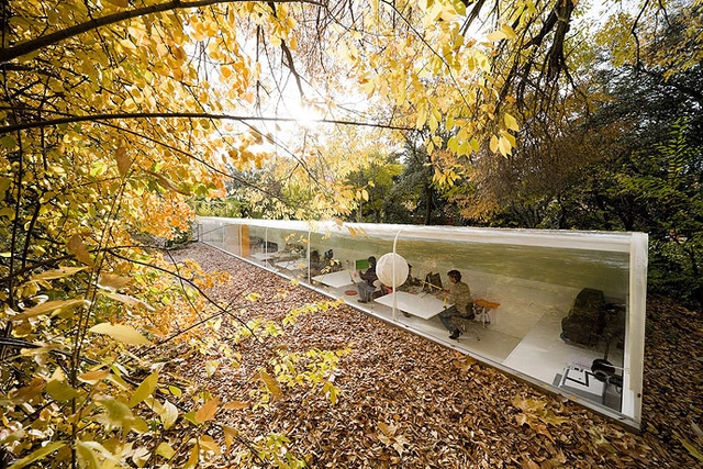
The latest designer of the prestigious Serpentine Gallery Pavilion has been named as SelgasCano, the Spanish practice known for their use of the latest synthetic materials and new technology. The Serpentine Pavilion, which has grown to become one of the most visited annual architecture attractions in the world, aims to provide architects who have never built in the UK their first chance to do so. In the past, this has led to pavilions by globally-recognized names such as Frank Gehry, Zaha Hadid, Rem Koolhaas, Oscar Niemeyer, and Peter Zumthor, but in recent years the Serpentine Gallery seems to have changed course a little, instead bringing lesser-known, emergent stars to a much wider audience. This was true of Smiljan Radić and his 2014 pavilion, and will likely prove true for the duo of José Selgas and Lucía Cano.
Although designs for the 2015 pavilion will not be released until February, SelgasCano have promised "to use only one material... the Transparency," adding that "the most advanced technologies will be needed to be employed to accomplish that transparency." This coy description perhaps calls to mind the design of their own office, a partially sunken tube of a building with one side made entirely of curved glass, which won them widespread recognition in 2009.
To give a better idea of the design style that SelgasCano will bring to the 2015 Serpentine Pavilion, we've rounded up a number of their major projects for your viewing pleasure, after the break.
The 2014 Venice Biennale, Socially Ranked

At a time when everyone is constantly interacting with the digital social universe, it's becoming increasingly easier to gather informal data on how well received, recommended, liked (or disliked) an event or exhibition is. Compiled as a series of diagrams for Domus, Maria Novozhilova examines the 'social ranking' of the 2014 Venice Biennale by dissecting the three core exhibitions (Fundamentals, Monditalia and Absorbing Modernity) and revealing the apparent 'winners and losers' as far as social engagement is concerned. Noting that "it is only by starting from the end and working backwards, like a salmon swimming against the current, that we can see more exhaustively how things went,", Novozhilova's visualisations reveal a number of fascinating results. See all the diagrams here.
Reflections on the 2014 Venice Biennale

Fundamentals, the title of the 2014 Venice Biennale, will close its doors in a matter of days (on the 23rd November). From the moment Rem Koolhaas revealed the title for this year’s Biennale in January 2013, asking national curators to respond directly to the theme of ‘Absorbing Modernity 1914-2014’, there was an inkling that this Biennale would be in some way special. Having rejected offers to direct the Biennale in the past, the fact that Koolhaas chose to act not only as curator but also thematic co-ordinator of the complete international effort, was significant. This announcement led Peter Eisenman (one of Koolhaas' earliest tutors and advocates) to state in one interview that “[Rem is] stating his end: the end of [his] career, the end of [his] hegemony, the end of [his] mythology, the end of everything, the end of architecture.”
AMO Invites Dutch Architects to Discuss their Future at the Venice Biennale

On November 20-21, AMO is hosting a discussion event at the Venice Biennale focusing on the past, present and future of Dutch architecture in which 30 young architects will be invited to present their agenda for architecture in the Netherlands for the next 10 years. Over the course of the two days, each participant will present will deliver a 7-minute presentation looking at architecture in 2024 to answer the question "where will you be and will you be doing?" Find out more about the event, and how you can be a part of it, after the break.
Markthal Rotterdam / MVRDV
First Look: MVRDV Completes Largest Covered Market in the Netherlands

Rotterdam’s very own, MVRDV has completed the Netherlands’ first covered market: the Markthal Rotterdam. Unlike any other market in the world, the Markthal presents a new urban hybrid that unites a market hall with housing.
Within the hollow core of the 228-unit, “horseshoe-shaped” residential building is an expansive, 40-meter-tall public market, offering 96 fresh food stalls, 8 restaurants and supermarket. Colorful murals cover the arch’s vaulted interior, peering through the largest single glazed cable net facades in Europe, which enclose the market.
This sense of transparency and openness was key, as the Markthal is the driving force to the rejuvenation of the Laurenskwartier area and hopes to attract thousands of visitors each year.
A look inside, after the break.


