1. ArchDaily
  2. Editor's Choice

Editor's Choice

How a Novel Saved Notre-Dame and Changed Perceptions of Gothic Architecture

This article was originally published by Common Edge as "It’s a Book. It’s a Building. It’s a Behavioral Intervention!"

A few years ago, while visiting, or rather exploring, Notre-Dame, the author of this book found, in an obscure corner of one of the towers, this word carved upon the wall:

'ANÁΓKH

These Greek characters, black with age, and cut deep into the stone with the peculiarities of form and arrangement common to Gothic calligraphy that marked them the work of some hand in the Middle Ages, and above all the sad and mournful meaning which they expressed, forcibly impressed the author.

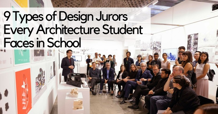
9 Types of Design Juror Every Architecture Student Faces in School

Design juries undoubtedly form the very foundation of architecture school. Their success or failure, however, largely lies in the hands of the jurors who are assigned to review student work. While architecture is an inter-disciplinary subject with wide-ranging consequences, most jurors are specialists in a singular sub-field. This makes design juries a terrifyingly unpredictable affair; students don’t just battle against their nerves and sleep-deprivation, but are also required to be on their toes to ensure that they can handle anything that the jurors might throw at them.

However, this is easier said than done. As a student, defending your work against criticism from an easily-offended know-it-all juror will probably do you more harm than good. Similarly, it’s hard to impress a building services expert by harping on about the probable positive sociological impacts of your design proposal. Being able to correctly identify the academic or emotive leanings of a juror can go a long way in helping students present their work strategically, thus ensuring that they make the most of their jury experience. Here’s a compilation of nine types of design jurors every architecture student will probably face at some point in school:

Time-Lapse Shows the Roof Installation at Madrid's Wanda Metropolitano Stadium

On Thursday, July 29th, the Estadio Wanda Metropolitano's roof was officially completed. This new stadium, a renovation of the old Peineta athletics stadium, is the new home ground of Spanish football club Atlético Madrid.

In this video, FCC Construcción captures the intense work on the roof which was designed and constructed by engineers Schlaich Bergermann Partner. The milestone marks four months of intense work since the installation of the first of the 96 PTFE radial panels at the north end of the stadium.

The Serenity and Community of White Arkitekter's Hasle Harbour Bath

Completed in 2013 on the western coast of Bornholm—a small Danish island located south of Sweden—the Hasle Harbour Bath by White Arkitekter is one of a number of waterfront bathing facilities appearing in Denmark. Structures such as the Hasle Harbour Bath, the Kastrup Sea Bath, also by White Arkitekter, and the Copenhagen Harbour Bath by BIG + JDS, evoke images of a bracing coexistence with natural elements. If hygge, the Danish art of cosiness, has been one of the country's most successful cultural exports in recent years, the idea of a refreshing dip in the Baltic Sea offers a counterpart—a ying to hygge's yang.

The Serenity and Community of White Arkitekter's Hasle Harbour Bath - Image 1 of 4The Serenity and Community of White Arkitekter's Hasle Harbour Bath - Image 2 of 4The Serenity and Community of White Arkitekter's Hasle Harbour Bath - Featured ImageThe Serenity and Community of White Arkitekter's Hasle Harbour Bath - Image 3 of 4The Serenity and Community of White Arkitekter's Hasle Harbour Bath - More Images

A Virtual Look Inside the Case Study House #23A by Killingsworth, Brady & Smith

Only three of the Arts & Architecture Case Study Houses were built outside Los Angeles, and those three formed a united concept. The Triad Houses in La Jolla, a seaside suburb of San Diego, share a single driveway, motor court, and design vocabulary, while being created to meet different needs.

In keeping with the Case Study mission, all three houses used open-plan design, affordable modern materials (such as aluminium and concrete with wood frames), and plenty of glass to create a fresh and open mood. The emphasis was on strong geometric forms, careful detailing, horizontal lines (with perfectly flat roofs) and – this being the Californian coastline – dramatic views and outdoor living space, creating the illusion of more interior space than was actually present.

AD Classics: Neviges Mariendom / Gottfried Böhm

Standing like a concrete mountain amid a wood, the jagged concrete volume of the Neviges Mariendom [“Cathedral of Saint Mary of Neviges”] towers over its surroundings. Built on a popular pilgrimage site in western Germany, the Mariendom is only the latest iteration of a monastery that has drawn countless visitors and pilgrims from across the world for centuries. Unlike its medieval and Baroque predecessors, however, the unabashedly Modernist Mariendom reflects a significant shift in the outlook of its creators: a new way of thinking for both the people of post-war Germany and the wider Catholic Church.

AD Classics: Neviges Mariendom / Gottfried Böhm -         Memorial Center, FacadeAD Classics: Neviges Mariendom / Gottfried Böhm -         Memorial Center, FacadeAD Classics: Neviges Mariendom / Gottfried Böhm -         Memorial Center, FacadeAD Classics: Neviges Mariendom / Gottfried Böhm -         Memorial Center, Facade, HandrailAD Classics: Neviges Mariendom / Gottfried Böhm - More Images+ 17

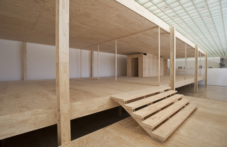
How an Artist Constructed a Wooden Replica of Mies' Farnsworth House

In December 2010, Manuel Peralta Lorca completed the work "Welcome Less Is More," a wooden reconstruction of Mies van der Rohe's Farnsworth House that was installed inside the Patricia Ready Gallery in Santiago, Chile. This September, a new version of this work will be mounted in the hall of Santiago's Museum of Contemporary Art, under the name "Home Less is More."

In the following story, the artist tells us about the process of reinterpreting this icon of modern architecture in wood and how a team of carpenters—who agreed to immerse themselves in the philosophy of Mies—was fundamental to completing the challenge.

What's Stopping Urban Designers From Creating Walkable Neighborhoods From Scratch?

What's Stopping Urban Designers From Creating Walkable Neighborhoods From Scratch? - Image 1 of 4
A walkable street in Washington, DC. Image © Flickr user dewita-soeharjono licensed under CC BY 2.0

This article was originally published by Common Edge as "Why Can’t We Create Brand New Walkable Communities?"

I have lived in neighborhoods where you can walk around, to a store, a movie, a restaurant, for 40 years, counting my college days. I grew up in a ranch house with a driveway, but came to adulthood in foot-based parts of cities.

Others have also rediscovered the joys and benefits of walkable places. They have done this first in a trickle, then in a flood. While in total numbers it may still be a minority taste, it’s a fashionable taste now, one heralded in movies and TV shows. Fewer people aspire to live in the big house with the three-car garage.

9 Important Photoshop Tips for Architects

9 Important Photoshop Tips for Architects - Image 2 of 4
Image created using render by InHAUS licensed under CC0

This article was originally published by RenderPlan as "9 Powerful Photoshop Tips for an Effective Workflow."

A powerful software like Photoshop can turn an average looking image or drawing into a stellar asset for a project. The trick is to learn to use some of its best features and optimize your workflow for maximum efficiency.

Over the years Photoshop has become the go-to tool for architects for any kind of image-based editing. The software has become indispensible thanks to its versatile features. It is a powerful tool for tweaking renderings or create them from scratch. Some of the most renowned visualization artists rely heavily on Photoshop and use very crude masses done in 3d programs as a starting point. From photorealistic renderings to editing photographs of built projects and beautifying line work, Photoshop can be an architect’s best friend.

11 Architect Salary Negotiation Tips

This article was originally published on Brandon Hubbard's blog, The Architect's Guide.

Many people cringe at the idea of having to negotiate their salary. Often this can result in thousands of lost income opportunity if not handled correctly.

I am not advocating you ask for an outrageous sum, but you should be clear about the value you bring to the table. You need to be aware what your skills and qualifications are worth in the current marketplace. For your reference, I covered those variables in greater detail in a previous article, 5 Factors Affecting Your Architect Salary.

Most of the following tips refer to a new job offer but some also apply to renegotiating your current architecture salary.

The 80 Best Architecture Drawings of 2017 (So Far)

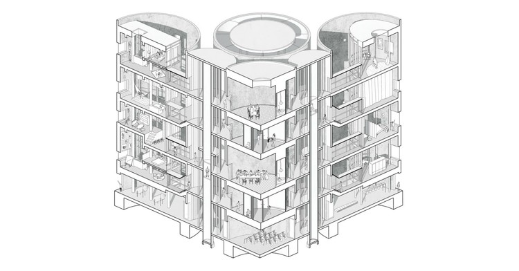
When it comes to forms of architectural representation, there is no method more expressive or foundational than the drawing. The series of decisions—drawing utensil, paper type, line style, hand versus digital—combined with the choices of what an architect includes (or excludes) in their drawings reveal the true intentions behind the design of a project in perhaps the noblest and purest fashion.

In previous years, we've published round-ups of our favorite images from our database of selected projects (which we will do again this winter!), but this year, we wanted to do something a little different to engage with our community: we asked our readers to submit their own best drawings. The response was overwhelming – we received more than 1200 drawings from our network of readers across the globe, ranging from atmospheric perspectives to interpretive sketches to highly-technical sections.

From those submissions, the ArchDaily team has selected 80 of our favorites, organized into 7 categories: Visualizations, Axonometric - Isometric, Sections, Collages, Context, Sketches and Plans.

Check them out, below.

The Top 5 Virtual Reality and Augmented Reality Apps for Architects

This article was originally published by Archipreneur.

Virtual reality and augmented reality tools for the AEC industry are getting increasingly better and more optimized. As prices keep dropping, there are fewer reasons why every architect, engineer, contractor, and owner shouldn’t use some form of VR/AR in bringing their projects to life.

From being a novelty a few years ago, VR/AR solutions are slowly becoming a medium that’s transforming the way professionals in the AEC industry communicate, create and experience content. Offering a more immersive experience of architectural designs, but also products and areas related to space building, VR and AR tools are becoming an industry standard that offers rapid iterations and opportunity to refine designs in collaboration with clients and colleagues.

This Stone Vault Prototype Creates Almost No Material Waste

Italy-based New Fundamentals Research Group recently designed and built a full-scale prototype of an experimental barrel-vaulted stone structure for SNBR, a French company that specializes in cutting-edge stone construction. The structure is named Hypar Vault in a reference to the geometry of its constituent blocks; it uses two types of prefabricated stone modules—one type is the mirror image of the other—whose designs are based on the hypar (hyperbolic paraboloid), one of the only "doubly-ruled" surfaces in geometry. The use of these configurations allowed the vault to be constructed with almost zero wasted stone.

This Stone Vault Prototype Creates Almost No Material Waste - Image 2 of 4This Stone Vault Prototype Creates Almost No Material Waste - Image 5 of 4This Stone Vault Prototype Creates Almost No Material Waste - Image 6 of 4This Stone Vault Prototype Creates Almost No Material Waste - Image 8 of 4This Stone Vault Prototype Creates Almost No Material Waste - More Images+ 24

#donotsettle Visits MAD’s "Out-of-this-World" Harbin Opera House

Welcome to the latest installment of #donotsettle extra, the series in which Wahyu Pratomo and Kris Provoost accompany some of their #donotsettle videos with in-depth textual analysis of the buildings they visit.

After last month’s visit to OMA’s first building in Shanghai, we stayed in China and headed north—far north. We are happy to take you to a building that has been high on our “to-do list.” Harbin, a provincial capital city in the north-east of China, has previously only been known for the large-scale ice sculptures that appear during the winter months. In the past two years, this has changed, at least for the architecture geeks spread around the world.

Ma Yansong and his team at MAD Architects designed and built the Harbin Opera House in a new part of the city. First announced in 2013, the building was completed at the end of 2015. Since then, an endless stream of breathtaking photos has been shared on the internet. We had to see this project with our own eyes! We ventured out to Harbin and spent a day at the Opera.

#donotsettle Visits MAD’s "Out-of-this-World" Harbin Opera House - Image 1 of 4#donotsettle Visits MAD’s "Out-of-this-World" Harbin Opera House - Image 2 of 4#donotsettle Visits MAD’s "Out-of-this-World" Harbin Opera House - Image 3 of 4#donotsettle Visits MAD’s "Out-of-this-World" Harbin Opera House - Image 4 of 4#donotsettle Visits MAD’s Out-of-this-World Harbin Opera House - More Images+ 8

The Power of Architectural Drawing: The Sketches That Saved St. Mark's

This short essay, written by the author and critic Jonathan Glancey, coincides with the launch of the inaugural Architecture Drawing Prize – a competition curated by the World Architecture Festival, the Sir John Soane's Museum, and Make. The deadline for the award is the 18th September 2017 and successful entries will be exhibited in both London and Berlin.

For John Ruskin, Venetian Gothic design in the guise of polychromatic gasworks in Brentford, ornate factory chimneys in Croydon, glistering gin palaces in Bloomsbury and even the well-meaning Reform Club in Manchester was nothing short of anathema. Even at their risible best, these flamboyant Victorian buildings were idle travesties of the influential 19th Century critic’s beloved Ca’ d’Oro and Palazzo Ducale adorning the Grand Canal.

Rereading Jane Jacobs: 10 Lessons for the 21st Century from "The Death and Life of Great American Cities"

This article was originally published by Common Edge as "10 Lessons Learned by Rereading Jane Jacobs."

Last week I was in the middle of packing and came across a well-thumbed copy of The Death and Life of Great American Cities. I don’t remember when I read the book, but it was way more than twenty years ago (and predates my professional involvement with cities). As a very belated tribute to the anniversary of her 100th birthday, I decided to dip back into that remarkable book. Here’s ten takeaways from the godmother of the American city.

Norman Foster Is 84 And He Instagrams Better Than You Do

Looking at the Hearst tower made out of Lego

A post shared by Norman Robert Foster (@officialnormanfoster) on

Norman Foster only began to casually upload photos to Instagram in 2017. But don’t be fooled by his short tenure on the thirteen-year-old social media platform. At the ripe old age of 84, the British architect has demonstrated that his talents go far beyond designing buildings.

What makes Norman Foster’s Instagram feed more charming than Bjarke Ingels’, or more impressive that Richard Branson’s, is a complex mix of je ne sais quoi, athletic prowess, and a taste of the “he’s just like us!” Architects love that the photos provide behind-the-scenes insight into the life of one of the most prolific and revered professionals of our time. Behind the accolades and behind the Barony, we discover a man swimming, biking, rowing, and helicoptering his way into his eighth decade. It’s reassuring to see that an architect who has always sought to stand at the vanguard of the innovative and the bold doesn’t show signs of letting up anytime soon.

Lord Foster’s Instagram posts show us positive, human endeavors that we should respect as a profession: spending time with family, taking a vacation, and, most importantly, enjoying his work as an architect – a creative passion, or way of living, that permeates everything we do. If we are indeed moving beyond the age of “cults of personality” cultivated by the media, it’s fascinating to see that Norman Foster is taking full advantage of the one-to-one relationship between public figure and the public by openly showing us what he enjoys, treasures, and strives to achieve.

Álvaro Siza and Others Imagine Possible Scenarios for a Reconstructed Syria

Sketch for Syria, a project initiated by by Marco Ballarin and Jacopo Galli at IUAV, Venice, has brought together 150 architects from 26 nations in a large-scale effort to "imagine, trace and share possible scenarios" for Syria, following the recent devastation of the lives of its citizens and a significant amount of its architectural heritage.

In response to the United Nations' (UN-ESCWA) drafting of an agenda on July 14th, 2016 to consider ways of reconstructing the country, this drawing project has attracted contributions from the likes of Álvaro Siza, Philippe Rahm, Peter Wilson, and Francisco Aires Mateus.

Álvaro Siza and Others Imagine Possible Scenarios for a Reconstructed Syria - Image 1 of 4Álvaro Siza and Others Imagine Possible Scenarios for a Reconstructed Syria - Image 2 of 4Álvaro Siza and Others Imagine Possible Scenarios for a Reconstructed Syria - Image 3 of 4Álvaro Siza and Others Imagine Possible Scenarios for a Reconstructed Syria - Image 4 of 4Álvaro Siza and Others Imagine Possible Scenarios for a Reconstructed Syria - More Images+ 14

You've started following your first account!

Did you know?

You'll now receive updates based on what you follow! Personalize your stream and start following your favorite authors, offices and users.