1. ArchDaily
  2. Editor's Choice

Editor's Choice

Balkrishna Doshi: Architecture for the People

Balkrishna Doshi: Architecture for the People - Image 1 of 4Balkrishna Doshi: Architecture for the People - Image 2 of 4Balkrishna Doshi: Architecture for the People - Image 3 of 4Balkrishna Doshi: Architecture for the People - Image 4 of 4Balkrishna Doshi: Architecture for the People - More Images+ 24

With the exhibition »Balkrishna Doshi: Architecture for the People« (30 March to 8 September 2019), Vitra Design Museum presents the first international retrospective about the 2018 Pritzker Prize laureate Balkrishna Doshi outside of Asia.

The renowned architect and urban planner is one of the few pioneers of modern architecture in his home country and the first Indian architect to receive the prestigious award. During over 60 years of practice, Doshi has realized a wide range of projects, adopting principles of modern architecture and adapting them to local culture, traditions, resources, and nature. The exhibition will present numerous significant projects

Will Snøhetta's Redesign Calm the Outcry From Its Original Controversial Proposal?

Labeled as "vandalism" and "murder" of an icon of postmodernism, Oslo-based firm Snøhetta's redesign proposal for Phillip Johnson and John Burgee's AT&T Headquarters was received with instantaneous backlash across the architectural community last year. Architect Robert A. M. Stern, marched alongside a protest outside 550 Madison Avenue, and even critic Norman Foster, who never claimed to have any sympathy for the postmodern movement, still vocalized his sentiments that "[the building] is an important part of our heritage and should be respected as such."

A rejection of the bland and cold functionality of Midtown's crystal skyscrapers, the AT&T building was intended to encourage a more playful approach architecture in the corporate world; the crazy socks beneath a three-piece suit. It was not without controversy. Upon its completion, the building was derided for its decorative and outsized pediment and occasionally dark interior spaces. Indeed, the building's arched entry spaces were among the only architectural elements to be met with praise from both critics and the public. 

Will Snøhetta's Redesign Calm the Outcry From Its Original Controversial Proposal? - Image 1 of 4Will Snøhetta's Redesign Calm the Outcry From Its Original Controversial Proposal? - Image 2 of 4Will Snøhetta's Redesign Calm the Outcry From Its Original Controversial Proposal? - Image 3 of 4Will Snøhetta's Redesign Calm the Outcry From Its Original Controversial Proposal? - Image 4 of 4Will Snøhetta's Redesign Calm the Outcry From Its Original Controversial Proposal? - More Images+ 1

The ArchDaily 2018 Gift Guide

The holiday season may be one of joy, but there's always a little panic involved as well. You want to treat your loved ones to a gift they'll treasure and appreciate, but where to start?

Readers, ArchDaily has you covered. This year we've separated our choices in sections to help you find that perfect gift for the picky (budding) architect in your life. Our choices - and links to where you can find them - after the break: 

The ArchDaily 2018 Gift Guide  - Image 1 of 4The ArchDaily 2018 Gift Guide  - Image 2 of 4The ArchDaily 2018 Gift Guide  - Image 3 of 4The ArchDaily 2018 Gift Guide  - Image 4 of 4The ArchDaily 2018 Gift Guide  - More Images+ 36

The Do-It-Yourself Vertical Village on the Fringes of London

The Do-It-Yourself Vertical Village on the Fringes of London - Featured Image
The Gantry at HERE EAST / Hawkins Brown. Image

This article was originally published by Autodesk's Redshift publication.

In East London, The Trampery on the Gantry is doubling down on the “creative” aspect of creative reuse. Part of the massive broadcast center used during the 2012 Olympic Games, the former HVAC gantry structure has been retrofitted by architecture firm Hawkins\Brown as an arts and media innovation hub.

How to Judge a Building: Does it Make you Feel More, Or Less Alive?

This extract was originally published on Common Edge as "The Legacy of Christopher Alexander: Criteria for an Intelligent Architecture."

In his monumental four-volume book, The Nature of Order, Christopher Alexander talks about an intelligent architecture, responsive to human needs and sensibilities through adaptation to existing buildings and nature. This is a new way of viewing the world—a way of connecting to it, and to ourselves—yet it is very much the same as the most ancient ways of connecting.

Is Clean Water a Challenge for Architects? Dutch Studio Ooze is Betting On it

On a small strip of land between the Emscher River and the Rhine Herne Canal in Germany sits a rest stop whose colorful appearance belies its radical purpose. The structure’s artful design consists of pipes leading from two toilets and the Emscher (the most polluted river in Germany) that converge at a small community garden and drinking fountain. The garden is, in fact, a manmade wetland that collects, treats, and cleans the effluence from the toilets and river—making it drinkable.

Zaha Hadid: Maker of the 21st Century

This article was originally published by Autodesk's Redshift publication as "Respect: Architect Zaha Hadid, Queen of the Curve."

In March 2016, when world-renowned architect Zaha Hadid died of a heart attack at age 65 in a Miami hospital, the news sent shockwaves through the architecture community.

The flamboyant British designer—born on October 31, 1950 in Iraq, educated in Beirut, and known as the “Queen of the Curve” for her swooping, elegantly complex designs—was a legend in her time. She had design commissions around the world, been awarded the Pritzker Prize in 2004 and the Royal Institute of British Architects’ gold medal in 2016, and transcended the old-guard strictures of a staunchly male-dominated profession.

Zaha Hadid: Maker of the 21st Century - Image 1 of 4Zaha Hadid: Maker of the 21st Century - Image 2 of 4Zaha Hadid: Maker of the 21st Century - Image 3 of 4Zaha Hadid: Maker of the 21st Century - Image 4 of 4Zaha Hadid: Maker of the 21st Century - More Images+ 13

WOHA's Kampung Admiralty Singapore Named 2018 Building of the Year at World Architecture Festival

WOHA's Kampung Admiralty Singapore in Singapore has been named the 2018 World Building of the Year at the World Architecture Festival, concluding this year's three-day event in Amsterdam. The building, which combines dedicated senior-housing facilities with a broad mixed-use program and a lush green roof, was selected from a strikingly broad shortlist that included works from offices such as Sanjay Puri Architects, Koffi & Diabate Architectes, Heatherwick Studio, Spheron Architects, and INNOCAD.

WOHA's Kampung Admiralty Singapore Named 2018 Building of the Year at World Architecture Festival - Image 1 of 4WOHA's Kampung Admiralty Singapore Named 2018 Building of the Year at World Architecture Festival - Image 2 of 4WOHA's Kampung Admiralty Singapore Named 2018 Building of the Year at World Architecture Festival - Image 3 of 4WOHA's Kampung Admiralty Singapore Named 2018 Building of the Year at World Architecture Festival - Image 4 of 4WOHA's Kampung Admiralty Singapore Named 2018 Building of the Year at World Architecture Festival - More Images+ 11

Revolutionary Nature: the Architecture of Hiroshi Sambuichi

Revolutionary Nature: the Architecture of Hiroshi Sambuichi - Image 3 of 4
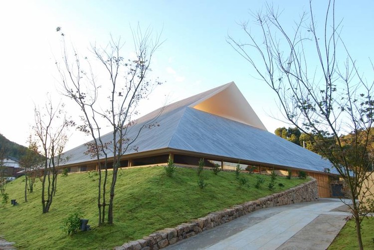
Naoshima Hall. Image © Sambuichi Architects

Our world revolves. Not just literally, as it does around the sun, but in nature’s every aspect. Seasons cycle into each other (though more erratically each year), waves trace and retrace the beaches with the shifting tide, flowers open, close, and turn to follow the path of the sun. Even we are governed by these circular natural systems. Maintenance of our circadian rhythms, a human connection to light, is so essential to our health that it is a required element in many contemporary building codes. 

Design Criticism Ignores the Places that it Could Help the Most

This article was originally published on CommonEdge as "The Design Media Needs to Examine its Own Privilege."

Kate Wagner grew up in rural North Carolina. As a kid, her mom, who never went to college, worked in a grocery store deli and later in childcare. Her dad had a steady government job with a pension, and his time in the military meant he had the resources and benefits needed to get a college degree. Wagner describes her economic background as “one foot in the working class and one foot in the middle class, and it was always a negotiation between those two classes.” They were, she says, “just normal-ass American people.”

The Project in a Small Japanese Village Setting the Standard for Zero-Waste Architecture

Nestled in the steep gorges and river valleys of Japan’s Tokushima prefecture is Kamikatsu - a small town seemingly like any other. But Kamikatsu, unlike its neighbors (or indeed, most towns in the world), is nearly entirely waste-free.

Since 2003 - years before the movement gained widespread popularity - the town has committed to a zero-waste policy. The requirements are demanding: waste must be sorted in more than 30 categories, broken or obsolete items are donated or stripped for parts, unwanted items are left in a store for community exchange. But the residents’ efforts over the years have paid off- nearly 80% of all the village’s waste is recycled.

The Project in a Small Japanese Village Setting the Standard for Zero-Waste Architecture - Image 1 of 4The Project in a Small Japanese Village Setting the Standard for Zero-Waste Architecture - Image 2 of 4The Project in a Small Japanese Village Setting the Standard for Zero-Waste Architecture - Image 3 of 4The Project in a Small Japanese Village Setting the Standard for Zero-Waste Architecture - Image 4 of 4The Project in a Small Japanese Village Setting the Standard for Zero-Waste Architecture - More Images+ 15

This Week in Architecture: Reduce, Reuse, Rethink

It's easy to feel overwhelmed by the massive production of architecture today. Scroll through ArchDaily for more than a minute and even we'd forgive you for losing track of it all. But what seems like an endless scroll of architectural production doesn't quite fit with the popular movements surrounding resource sharing and community. 

Hidden among the mass production that has defined architecture in the last century is a germ - one that seems to be marching to the forefront of practice today. More and more designers seem to be taking on locally-focused and/or adaptive reuse works. Award shortlists today highlight not icons by recognizable names, but sensitive international works that are notable for their process as much as their product. 

The common image of the architect may be of one obsessed with ego and newness, but practice today doesn't bear that out as much as it used to. This week's news touched on issues of reduction, reuse, and a radical rethink what architecture is in the 21st century. 

"The Future is a Spreading Matrix": In Conversation with Sou Fujimoto

This interview was originally published in Metropolis Magazine as "Inside the Mind of Sou Fujimoto."

Hokkaido-born Sou Fujimoto’s breakout masterpiece, the playful and cloud-like 2013 Serpentine Pavilion says a lot about who Fujimoto is and how he thinks about architecture. But even more so do the 100-plus sometimes painstakingly refined, sometimes roughly executed exploratory models that dot the minimalist gallery space of Japan House Los Angeles. This, his retrospective show, Futures of the Future, neatly reflects on Fujimoto’s career, which began when he opened his own Tokyo-and-Paris-based firm in 2000.

"The Future is a Spreading Matrix": In Conversation with Sou Fujimoto - Image 1 of 4"The Future is a Spreading Matrix": In Conversation with Sou Fujimoto - Image 2 of 4"The Future is a Spreading Matrix": In Conversation with Sou Fujimoto - Image 3 of 4"The Future is a Spreading Matrix": In Conversation with Sou Fujimoto - Image 4 of 4The Future is a Spreading Matrix: In Conversation with Sou Fujimoto - More Images+ 5

Modernism: The International Style that Wasn't

This article was originally published on CommonEdge as "Was Modernism Really International? A New History Says No."

I taught architectural history in two schools of architecture during the 1980s and 1990s. Back then it was common for students to get a full three-semester course that began with Antiquity and ended with Modernism, with a nod to later twentieth-century architecture. My text for the middle section was Spiro Kostof’s magisterial History of Architecture: Settings and Rituals. With many centuries to cover, he spent very little effort in dealing with the twentieth century. In the last third of the course, students read texts such as Towards a New Architecture by Le Corbusier and Reyner Banham’s Theory and Design in the First Machine Age. My colleagues and I felt that we offered students a pluralistic and comprehensive review of key developments in the history of the built environment.

Modernism: The International Style that Wasn't - Image 1 of 4Modernism: The International Style that Wasn't - Image 2 of 4Modernism: The International Style that Wasn't - Image 3 of 4Modernism: The International Style that Wasn't - Image 4 of 4Modernism: The International Style that Wasn't - More Images+ 10

Opinion: A Plea for Architectural History

Opinion: A Plea for Architectural History  - Image 1 of 4
Courtesy of Wikimedia user Quibik PD. ImageAn elevation of the entire Acropolis as seen from the west; while the Parthenon dominates the scene, it is nonetheless only part of a greater composition. ImageCourtesy of Wikimedia user Quibik (Public Domain)

This article was originally published on Metropolis Magazine as "Opinion: We Can't Go on Teaching the Same History of Architecture as Before."

Architectural students of my generation—the last of the baby boomers, starting college in Europe or in the Americas in the late 1970s—had many good reasons to cherish architectural history. Everyone seemed to agree at the time that the Modernist project was conspicuously failing. Late Modernist monsters were then wreaking havoc on cities and lands around the world, and the most immediate, knee-jerk reaction against what many then saw as an ongoing catastrophe was to try and bring back all that 20th-century high Modernism had kicked out of design culture: history, for a start. I drew my first Doric capital, circa 1979, in a design studio, not in a history class (and my tutor immediately ordered me to scrape it, which I did).

What Burning Man can Teach Architecture about Participatory Design

What Burning Man can Teach Architecture about Participatory Design - Image 11 of 4
© Laurian Ghinitoiu

Architecture as a profession today struggles with questions of relevance, with core questions surrounding the issue of whether it can create cultural vibrancy and meaning for the diverse world it serves. Within our own design community, we tend to give a lot of sway to an “exclusive tier” of architects who provide leadership and vision. While this leadership is critically important to the profession, it only corresponds to 2% of what gets built. Take it from Frank Gehry, whose 2014 comment still rings in our ears: “98% of everything that is built and designed today is pure sh*t. There is no sense of design, no respect for humanity."

If we embrace the importance and unique value of all things built on a wider range, we need to ask ourselves: how have we served and rewarded our peers responsible for creating this other 98%?  Where should we set the bar for the emotional-artistic qualities of mainstream architecture?

10 Years Post-Recession, a Resilient Generation Makes Practice Work for Them

This article was originally published on CommonEdge as "The Kids are Alright."

Economics and technology affect every profession. But since World War II perhaps no profession has experienced more technological change than architecture. These shifts occurred, paradoxically, within a well-established professional model of personal development: The guild structure of learning in the academy, then becoming professional via internship leading to licensure, has been the structure of practice for almost two centuries.

Once upon a time manual drafting with graphite or ink was applied by white males, and a single sheet master was reproduced with typed specifications added, and buildings were constructed.

That world no longer exists.  

Philip Johnson: A Complicated, Reprehensible History

This interview was originally published on Common Edge as "Mark Lamster on His New Biography of Philip Johnson."

Philip Johnson lived a long and extraordinarily eventful life. He was an architect, a museum curator, a tastemaker, a kingmaker, a schemer, an exceptionally vivid cultural presence. Mark Lamster, architecture critic of the Dallas Morning News and Harvard Loeb Fellowship recipient, has now written a thoroughly engaging biography of him entitled, Philip Johnson, Architect of the Modern Century: The Man in the Glass House. I talked to Lamster two weeks ago about the book and the bundle of contradictions that was Philip Johnson.

Philip Johnson: A Complicated, Reprehensible History - Arch Daily InterviewsPhilip Johnson: A Complicated, Reprehensible History - Arch Daily InterviewsPhilip Johnson: A Complicated, Reprehensible History - Arch Daily InterviewsPhilip Johnson: A Complicated, Reprehensible History - Arch Daily InterviewsPhilip Johnson: A Complicated, Reprehensible History - More Images+ 6

You've started following your first account!

Did you know?

You'll now receive updates based on what you follow! Personalize your stream and start following your favorite authors, offices and users.