1. ArchDaily
  2. Editor's Choice

Editor's Choice

Seaweed, Salt, Potatoes, & More: Seven Unusual Materials with Architectural Applications

Seaweed, Salt, Potatoes, & More: Seven Unusual Materials with Architectural Applications - Image 29 of 4

The following article is presented by ArchDaily Materials. In this article, originally published by Metropolis Magazine, Lara Kristin Herndon and Derrick Mead explore seven innovative architectural materials and the designers behind them. Some materials are byproducts, some will help buildings breathe and one is making the leap from 3D printing to 4D printing.

When Arthur C. Clarke said that any sufficiently advanced technology is indistinguishable from magic, he was speaking from the spectator’s point of view, not the magician’s. As our list of smart materials shows, technology solves difficult problems, but getting there requires more than just a wave of the magic wand. Each of the following projects looks past easy answers. Whether it’s a new way of looking at old problems, a new material that maximizes the efficiency of an old technique, or a new method to tap the potential of an abundant or underutilized resource, here are seven innovators who take technology out of the realm of science fiction.

Pathé's Video Archive Reveals Great Architectural Moments, 1910-1970

The following article originally appeared on Metropolis Magazine as "Five Architectural Highlights from the Pathé Newsreel Archive." It has been slightly adapted to fit ArchDaily's format. The video above, from 1930, shows the Empire State Building under construction.

Newsreel archives are a goldmine for design buffs—and when you have an archive of the size and scope of British Pathé's, there's hours of compulsive watching in store. The famous film and production company recently put up 85,000 of their videos on Youtube, in high definition, for free viewing.

The Parisian Pathé Brothers pretty much invented the newsreel format at the turn of the century, and established their London base in 1902. From 1910 to 1970 they produced thousands of films on events and trends around the world, including, of course, subjects of significance for architecture and design. It's an unparalleled opportunity to see some great classics in their context—with people using them, reacting to them, commenting on them.

Some videos, like a round-up of skyscraper-inspired hats from the 1930s, might not stand the test of time, but others, like a tour of Le Corbusier's Couvent de la Tourette, are priceless. The latter video seems even more precious because it is marked "unused material"—footage that Pathé shot, but never edited into one of their newsreels—meaning that very few people have had a chance to see it before you do now, on your screen.

More outstanding videos to get you started on your newsreel binge, after the break...

Results of the 2014 European Prize for Urban Public Space

The results of the 2014 European Prize for Urban Public Space have been announced. The prize organized by the Centre of Contemporary Culture of Barcelona (CCCB) rewards both the designers and the facilitators (such as councils or community groups) that have contributed to the best urban interventions of the year. The award is given for ingenuity and social impact, regardless of the scale of intervention, meaning that small, relatively unknown practices can rub shoulders with some of the best-known practices in Europe.

See the 2 Joint Winners and 4 Special Mentions after the break

Results of the 2014 European Prize for Urban Public Space - Image 1 of 4Results of the 2014 European Prize for Urban Public Space - Image 2 of 4Results of the 2014 European Prize for Urban Public Space - Image 3 of 4Results of the 2014 European Prize for Urban Public Space - Image 4 of 4Results of the 2014 European Prize for Urban Public Space - More Images+ 2

City of Imagination: Kowloon Walled City 20 Years Later

Twenty years ago, one of the world’s most unusual and unexpected pieces of architecture was razed to the ground: Hong Kong’s Kowloon Walled City, the most densely populated area on earth. Squalid, dark, and labyrinthine, the informal city was not only a hotbed for organized crime, but also a vibrant community of commerce and hope. Now, the Wall Street Journal has released this short documentary, bringing the city back to life and revealing why it holds a special place in world culture today.

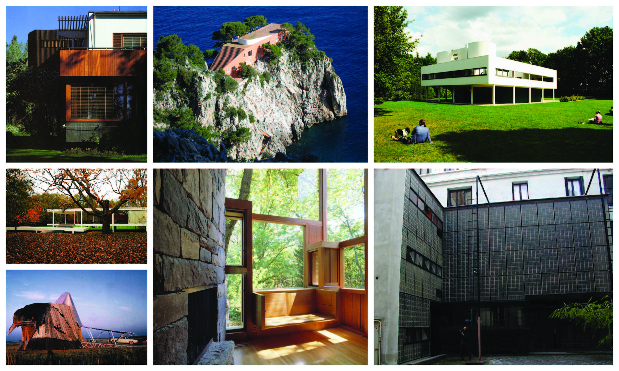
9 Architects Reflect on the Homes That Most Inspired Them

9 Architects Reflect on the Homes That Most Inspired Them - Featured Image
The homes that inspire architects.

Where do you receive inspiration? Nalina Moses asked the question to nine contemporary residential architects, asking each to choose one residence that had left an impression on them. The following answers were first published on the AIA’s website in the article “Homing Instinct."

When nine accomplished residential architects were asked to pick a house—any house—that has left the greatest impression on them as designers, most of their choices ran succinctly along the canon of American or European Modern architecture. Two—Alvar Aalto’s Villa Mairea and Pierre Chareau’s La Maison de Verre—were even tapped twice.

If the houses these designers chose weren’t surprising, the reasons they chose them were. Rather than groundbreaking style or technologies, what they cited were the moments of comfort, excitement, and refinement they offered: the restful proportions of a bedroom, the feel of a crafted wood handrail, an ocean view unfolding beyond an outdoor stair.

Morpholio Project's New App to Measure Human Response to Built Environment

Smart phones are designed to collect a variety of personal data, from location and orientation to sight and sound. But what if these devices were capable of tracking our visceral response to the built environment? 

The architects and academics behind The Morpholio Project have been researching ways in which biometrics, such as EEG, EMG, face tracking and pulse measurement, could be used to quantify the physical impact of an image on the human body. By turning to the medical industry, Morpholio has studied the capabilities of photoplethysmography (PPG) and envisioned ways in which it could be integrated with the smart phone.

With a simple 3D printed fitting, the iphone can be transformed into a miniaturized blood pressure machine that records the heart rate fluctuations of a user while they photograph their surroundings. By tracking an individual’s unique emotional response to what they are seeing and experiencing, Morpholio believes they can unlock new potentials in which technology can evolve of the design process.

More information from the creators after the break...

Does Italy Have Way Too Many Architects? (The Ratio of Architects to Inhabitants Around the World)

Yesterday, Monditalia - one of the three exhibitions currently being prepared for this year's Venice Architecture Biennale - tweeted out a neat little graphic showing the number of architects, per inhabitant, in 36 countries around the world.

The graphic shows that Italy has a shockingly high percentage of architects in its population: for every 414 Italians, one is an architect. According to the graphic, Portugal, Denmark, Germany, Belgium, Spain, and Greece all have ratios of less than 1,000 to one. Of course, there are plenty of other architect-heavy places missing from the list; not even mentioned in the graphic is Chile, a country that - according to its latest census - has one architect per 667 inhabitants, nor Mexico which has about 724 inhabitants per architect. On the other end of the spectrum, China has only one architect for every 40,000 persons.

What If MOMA Had Expanded Underground (And Saved The American Folk Art Museum)?

In January of this year, the latest work by Smiljan Radic, the Chilean architect chosen to design the next Serpentine Pavilion, opened to public acclaim. The Museum of Pre-Columbian Art (Museo de Arte Precolombino), located in Santiago de Chile, is a restoration project that managed to sensitively maintain an original colonial structure - all while increasing the space by about 70%.

Two days before the The Museum of Pre-Columbian Art opened, the Museum of Metropolitan Art (MOMA) in New York issued a statement that it would demolish the American Folk Art Museum (AFAM), designed by Tod Williams Billie Tsien Architects, in order to accomplish its envisioned expansion. Two weeks ago, preparations for demolition began.

Some background: MOMA had hired Diller Scofidio + Renfro a year earlier to design the expansion. The office asked for a period of six months to consider the possibilities of integrating the American Folk Art Museum into the design. After studying a vast array of options (unknown to the public) they were unable to accommodate MOMA’s shifting program needs with the AFAM building. They proposed a new circulation loop with additional gallery space and new program located where the AFAM is (was) located.

What appears here is not strictly a battle between an institution that wants to reflect the spirit of the time vs a building that is inherently specific to its place. It represents a lost design opportunity. What if the American Folk Art Museum had been considered an untouchable civic space in the city of New York, much like the The Museum of Pre-Columbian Art is for the city for Santiago? Then a whole new strategy for adaptive reuse would have emerged.

What If MOMA Had Expanded Underground (And Saved The American Folk Art Museum)? - Image 1 of 4What If MOMA Had Expanded Underground (And Saved The American Folk Art Museum)? - Image 2 of 4What If MOMA Had Expanded Underground (And Saved The American Folk Art Museum)? - Image 3 of 4What If MOMA Had Expanded Underground (And Saved The American Folk Art Museum)? - Image 4 of 4What If MOMA Had Expanded Underground (And Saved The American Folk Art Museum)? - More Images+ 10

The Story of Maggie's Centres: How 17 Architects Came to Tackle Cancer Care

Maggie's Centres are the legacy of Margaret Keswick Jencks, a terminally ill woman who had the notion that cancer treatment environments and their results could be drastically improved through good design. Her vision was realized and continues to be realized today by numerous architects, including Frank Gehry, Zaha Hadid, and Snøhetta - just to name a few. Originally appearing in Metropolis Magazine as Living with Cancer,” this article by Samuel Medina features images of Maggie's Centres around the world, taking a closer look at the organization's roots and its continued success through the aid of architects.

It was May 1993, and writer and designer Margaret Keswick Jencks sat in a windowless corridor of a small Scottish hospital, dreading what would come next. The prognosis was bad—her cancer had returned—but the waiting, and the waiting room, were draining. Over the next two years until her death, she returned several times for chemo drips. In such neglected, thoughtless spaces, she wrote, patients like herself were left to “wilt” under the desiccating glare of fluorescent lights.

Wouldn’t it be better to have a private, light-filled space in which to await the results of the next bout of tests, or from which to contemplate, in silence, the findings? If architecture could demoralize patients—could “contribute to extreme and mental enervation,” as Keswick Jencks observed—could it not also prove restorative?

The Story of Maggie's Centres: How 17 Architects Came to Tackle Cancer Care - Image 1 of 4The Story of Maggie's Centres: How 17 Architects Came to Tackle Cancer Care - Image 2 of 4The Story of Maggie's Centres: How 17 Architects Came to Tackle Cancer Care - Image 3 of 4The Story of Maggie's Centres: How 17 Architects Came to Tackle Cancer Care - Image 4 of 4The Story of Maggie's Centres: How 17 Architects Came to Tackle Cancer Care - More Images+ 6

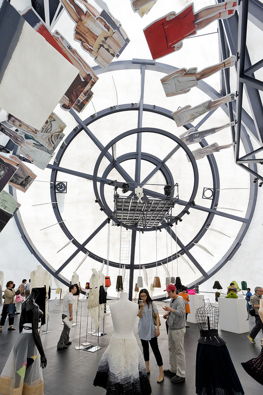
5 Years Later, A Look Back on OMA's Prada Transformer

Today marks the fifth anniversary of the opening of OMA’s Prada Transformer. This fantastical temporary structure, erected in 2009 adjacent to Gyeonghui Palace in Seoul, Korea, is one of Rem Koolhaas’ most popular projects to date. Composed of a stark white membrane stretched across four steel frame shapes, The Transformer was often referred to as an "anti-blob" --a hexagon, a rectangle, a cross, and a circle leaning against each other to create a tetrahedron-like object reminiscent of a circus tent. The name Transformer came from the idea that any one of the pavilion's sides could serve as the building's floor, allowing for four unique spaces in one building devoted to exhibitions of modern art, fashion and design.

The Prada Transformer played host to four such events, being lifted up and repositioned onto a different face each time via crane. The first was a garment exhibition, displayed using the hexagonal floor plan. The second, a film festival that took place on the rectangular floor plan. A fashion show was staged using the Transformer's circular floor plan, and an art installation was shown using the cruciform floor plan. As patron Miuccia Prada stated in an interview with The New York Times, “In my mind they [the arts] may be mixed but I want to keep them separate… So the Transformer concept was not for a generic space, but to be very specific, with all things separate in one building.”

We asked OMA's Vincent McIlduff to tell us more about this project. See his answers, a photo gallery and a time-lapse video of the transformation after the break!

TED Talk: How Public Spaces Make Cities Work / Amanda Burden

Amanda Burden, former animal behaviorist turned New York’s chief city planner, has discovered what makes cities desirable: great public spaces. During her time with the Bloomberg administration, Burden oversaw the fruition of the city’s most transformative public projects, including New York’s beloved High Line. In the video above, she reveals the many unexpected challenges of planning (and maintaining) parks people love, and why it is so important for cities to have great public spaces.

Rodrigo Nino: In Defense of Crowdsourcing and Crowdfunding

Rodrigo Nino: In Defense of Crowdsourcing and Crowdfunding - Image 4 of 4
The 17John Building in New York. Image Courtesy of Prodigy Network

As both crowdsourcing and crowdfunding gather momentum in the architecture world, they also gather criticism. The crowdsourcing design website Arcbazar, for example, has recently attracted critics who label it as “the worst thing to happen to architecture since the internet started.” A few months ago, I myself strongly criticized the 17John apartment-hotel in New York for stretching the definition of "crowdfunding" to the point where it lost validity, essentially becoming a meaningless buzzword.

In response to this criticism, I spoke to Rodrigo Nino, the founder of Prodigy Network, the company behind 17 John, who offered to counter my argument. Read on after the break for his take on the benefits of tapping into the 'wisdom of crowds.'

Where You Work: The Offices of ArchDaily Readers

In 2009 we wanted to find out where our readers work and create. We asked, you responded, and the results gave us a fascinating insight into your daily lives. And so, a few weeks ago, we once again asked our readers to send us pictures of their workspaces. We received submissions from all over the world – from beachside desks to a stark warehouse space to a stunning gallery.

Take a look at these creative spaces - you may even recognize your own workplace, or one quite like it - and keep following and participating by using the #wherewework hashtag on Facebook or Twitter. Thanks for your help!

Where You Work: The Offices of ArchDaily Readers - Image 1 of 4Where You Work: The Offices of ArchDaily Readers - Image 2 of 4Where You Work: The Offices of ArchDaily Readers - Image 3 of 4Where You Work: The Offices of ArchDaily Readers - Image 4 of 4Where You Work: The Offices of ArchDaily Readers - More Images+ 25

The Steel Age Is Over. Has The Next Age Begun?

Andrew Carnegie once said, “Aim for the highest.” He followed his own advice. The powerful 19th century steel magnate had the foresight to build a bridge spanning the Mississippi river, a total of 6442 feet. In 1874, the primary structural material was iron — steel was the new kid on the block. People were wary of steel, scared of it even. It was an unproven alloy.

The Steel Age Is Over. Has The Next Age Begun? - Image 4 of 4

Nevertheless, after the completion of Eads Bridge in St. Louis, Andrew Carnegie generated a publicity stunt to prove steel was in fact a viable building material. A popular superstition of the day stated that an elephant would not cross an unstable bridge. On opening day, a confident Carnegie, the people of St. Louis and a four-ton elephant proceeded to cross the bridge. The elephant was met on the other side with pompous fanfare. What ensued was the greatest vertical building boom in American history, with Chicago and New York pioneering the cause. That’s right people; you can thank an adrenaline-junkie elephant for changing American opinion on the safety of steel construction.

So if steel replaced iron - as iron replaced bronze and bronze, copper -  what will replace steel? Carbon Fiber.

AIA Names Top 10 Most Sustainable Projects in U.S.

In honor of Earth Day, we have complied a preview of the top ten most sustainable exemplars of U.S. architecture selected by the American Institute of Architects (AIA) and its Committee on the Environment (COTE). Each project featured will be honored with a COTE Top Ten Award for “sustainable design excellence” at the 2014 National Convention in Chicago. View them all, after the break...

Mental Health in Architecture School: Can the Culture Change?

The Graduate Architecture, Landscape, and Design Student Union (GALDSU) at the University of Toronto recently published the results of its first mental health survey, which asked students to reflect on their experience at the John H. Daniels Faculty of Architecture, Landscape, and Design. Many past and present students have met the findings, which paint a blatantly bleak picture of the architecture student experience, with little to no surprise. The report brings the issue of poor mental and physical health in architecture schools to the forefront of our consciousness; however, the cool response it has elicited undercuts the initiative and raises important questions. If we were already aware of the problem, why hasn't change already been initiated? Will this always be the accepted, brutal reality of architecture education?

Divine Inspiration: 15 Spiritual Spaces

In honor of those celebrating Easter Sunday, we’ve compiled a list of the most breathtaking places of worship from our Religious Architecture Pinterest board. From vast, open halls, to intimate places of prayer and contemplation, these works are sure to spark your appreciation for divine architecture. See them in all their glory, after the break...

Divine Inspiration: 15 Spiritual Spaces - Religious ArchitectureDivine Inspiration: 15 Spiritual Spaces - Religious ArchitectureDivine Inspiration: 15 Spiritual Spaces - Religious ArchitectureDivine Inspiration: 15 Spiritual Spaces - Religious ArchitectureDivine Inspiration: 15 Spiritual Spaces - More Images+ 10

Mies, the Modernist Man of Letters

This review of Detlef Mertins' book "Mies" - by Thomas de Monchaux - originally appeared in Metropolis Magazine as "Mies Reconsidered". According to de Monchaux, Mertins reveals the modernist master as a voracious reader who interpreted a wide variety of influences to arrive at his stripped-down style.

The quintessential page of the 528 that make up Detlef Mertins’s monumental new monograph on Ludwig Mies van der Rohe—entitled simply Mies (Phaidon, 2014)—is 155. There, you will find a reproduction, a page within a page, of page 64 of Romano Guardini’s 1927 book Letters from Lake Como—a book about modernity and human subjectivity—with Mies’s own annotations penciled in the margins, in a surprisingly ornate and delicate hand.

And there, you will find Mertins’s notes on Mies’s notes on Guardini: “Of all the books in Mies’s library, Guardini’s Letters is the most heavily marked. Mies highlighted passage after passage with bold and rapid margin strokes and wrote key words diagonally and in large script across the first pages of many of the chapters: Haltung (stance), Erkenntnis (knowledge), Macht (power).” Mertins’s vivid marginality, his attention to the divine details along edges, recalls the experience of reading the Talmud, that commentary on Jewish law and scripture in which, by marking and emending earlier readers’ marks and emendations, generations of rabbis enacted an intimate conversation across time and space. 

Read on for more insight into Mies' influences.

Mies, the Modernist Man of Letters - Image 1 of 4Mies, the Modernist Man of Letters - Image 2 of 4Mies, the Modernist Man of Letters - Image 3 of 4Mies, the Modernist Man of Letters - Image 4 of 4Mies, the Modernist Man of Letters - More Images+ 5

You've started following your first account!

Did you know?

You'll now receive updates based on what you follow! Personalize your stream and start following your favorite authors, offices and users.