1. ArchDaily
  2. Editor's Choice

Editor's Choice

The Conflict Between the Global North and South at the 2014 Venice Biennale

The Conflict Between the Global North and South at the 2014 Venice Biennale - Featured Image
A view from the floor of the Latvian pavilion. The sheets of paper carry images of Modernist buildings; the ceiling asks, "There is no Modernism in Latvia", commenting on the lack of historical scholarship. Image Courtesy of NRJA

“Absorbing Modernity: 1914-2014 is an invitation to the national pavilions to show, each in their own way, the process of the erasure of national characteristics in architecture in favor of the almost universal adoption of a single modern language and a single repertoire of typologies.” In this article, originally published on Metropolis Magazine as "Whose Modernity?", Avinash Rajagopal investigates the conflict this mandated theme at the 2014 Venice Biennale unintentionally created between the Northern and Southern pavilions - with Northern pavilions tending to declare sole ownership over Modernism and many Southern pavilions denying that their countries were passive recipients of the North's globalization. For more on how the Southern pavilions challenged the typical conveyance of architectural history, continue reading after the break.

Video: Sheppard Robson Underlines Importance of Hand Sketching

Video: Sheppard Robson Underlines Importance of Hand Sketching - Image 1 of 4

Light Matters: Whiteness in Nordic Countries

The Scandinavian countries have developed great buildings that resonate with both the scarce light in winter and the long summer days. Henry Plummer, Professor Emeritus at the University of Illinois at Urbana-Champaign, has very carefully studied the various daylight phenomena in the Nordic countries, with extensive photo journeys and brilliant writing that combines an analytical perspective with a poetic touch. His view of daylight looks beyond the practical advantages of using reflective white spaces to facilitate bright rooms; the passionate photographer is much more interested in the light effects that play with the local beauty of nature and touch the human soul.

Read on for more about how Nordic light enters white spaces

Artist Mark Lascelles Thornton On His Completed Masterwork: "The Happiness Machine"

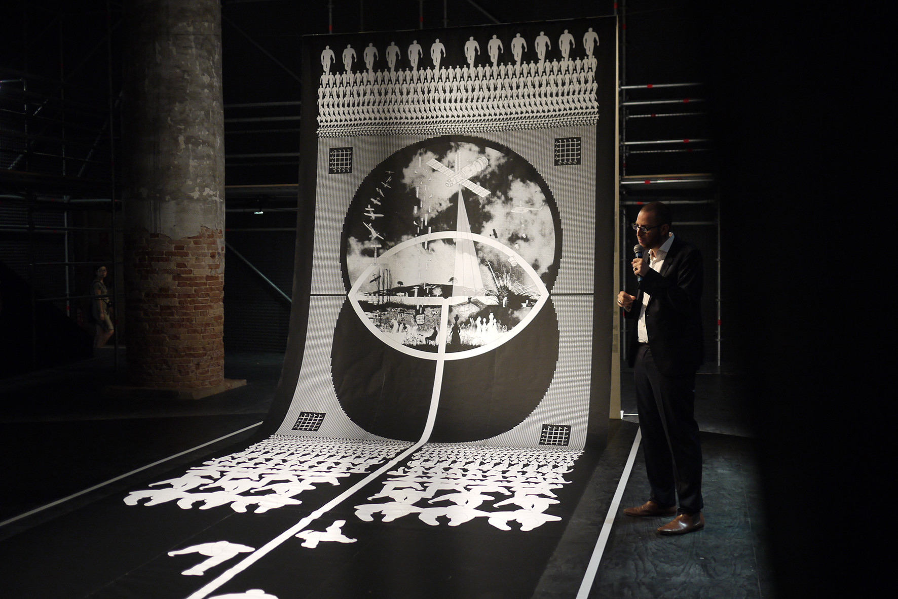
Over a year ago, we shared a work-in-progress drawing project that captured our imagination with its combination of huge size and meticulously small details. Now, "The Happiness Machine," Mark Lascelles Thornton's 8-foot by 5-foot, three year long drawing project is complete, after over 10,000 hours of painstaking work.

Lascelles Thornton, a self-taught London-based artist who describes himself as "one of those kids that was drawing before I was talking," created the artwork as a response to the global financial crisis, focusing on themes of socio-economics, consumerism, globalism, resource shortages, urbanism and architecture. We spoke to Lascelles Thornton about his artwork, discussing the themes of the piece and the commitment - or, as he describes it, "emotional engineering" - required for such a colossal undertaking.

For the full interview - and detailed images of the drawing - read on after the break

Artist Mark Lascelles Thornton On His Completed Masterwork: "The Happiness Machine" - Image 1 of 4Artist Mark Lascelles Thornton On His Completed Masterwork: "The Happiness Machine" - Image 2 of 4Artist Mark Lascelles Thornton On His Completed Masterwork: "The Happiness Machine" - Image 3 of 4Artist Mark Lascelles Thornton On His Completed Masterwork: "The Happiness Machine" - Image 4 of 4Artist Mark Lascelles Thornton On His Completed Masterwork: The Happiness Machine - More Images+ 16

BIG Designs Rejected Again for Kimball Art Center

BIG Designs Rejected Again for Kimball Art Center - Featured Image
Revised design for the Kimball Art Center. Image © BIG

After producing major revisions on a previously rejected design, BIG have had their second design rejected for the Kimball Art Center in Park City, Utah. City Hall rejected the design on the basis of appearance, arguing that it did not relate to the historic city centre "aesthetically, visually or historically." The second design by BIG marked a complete departure from the original that was selected as the winner of an architectural contest hosted by the Kimball Art Center.

OMA's Taipei Performing Arts Center (TPAC) Tops Out

OMA's Taipei Performing Arts Center (TPAC) has topped out in a ceremony including Taipei’s mayor Hau Lung-pin, and OMA's Partners in charge of the project, Rem Koolhaas and David Gianotten. Even in its current skeletal state, the rigidly geometric form is clearly expressed with it's central cube supporting three protruding auditoriums, two cubic and one spherical. The design of the TPAC is in many ways experimental, incorporating a looped public path which shows off the building's backstage areas, and flexible auditoriums which can even be combined, offering extraordinary stage spaces that allow performances which would be impossible in any other theater.

Ahead of the topping out ceremony we spoke to partner in charge David Gianotten, who explained the building's design concepts and the challenges (or rather, surprising lack of challenges) in the construction, and told us "you will only understand it when you have seen it. It's super exciting, we encourage everybody that loves architecture to come and see it because it's spectacular."

Read on after the break for the full interview

OMA's Taipei Performing Arts Center (TPAC) Tops Out - Image 1 of 4OMA's Taipei Performing Arts Center (TPAC) Tops Out - Image 2 of 4OMA's Taipei Performing Arts Center (TPAC) Tops Out - Image 3 of 4OMA's Taipei Performing Arts Center (TPAC) Tops Out - Image 4 of 4OMA's Taipei Performing Arts Center (TPAC) Tops Out - More Images+ 15

Is Bigger Better? HOK’s Acquisition of 360 Architecture and How Mergers Have Changed the Business of Design

Is Bigger Better? HOK’s Acquisition of 360 Architecture and How Mergers Have Changed the Business of Design - Featured Image
World Expo 2020 Master Plan. Image Courtesy of HOK

International design, architecture, engineering and planning firm HOK has recently announced its plan to acquire 360 Architecture, a firm specializing in sports facility design. With HOK’s global influence and 360 Architecture’s expertise, the acquisition could bring about significant advances in sports facility design and expand the market reach for each firm. When it comes to the business of architecture, acquisitions such as this often enable large corporate firms to take on a wider variety of projects, giving them a competitive edge against famous designer names in the industry. But what else can we learn from the growth of the world's largest firms?

What Gentrification Really Is, and How We Can Avoid It

What Gentrification Really Is, and How We Can Avoid It - Featured Image
Photo of Noe Valley, a low-density, high-income neighborhood, by Allan Ferguson

Gentrification is seen as a rising menace in many cities. The process whereby rich "gentrifiers" move into neighborhoods, driving up property prices and thus driving out those unable to afford those prices, has drawn criticism from activists and planners for years. However, this article by io9 writer Annalee Newitz, first published by io9 as "This is What Gentrification Really Is", tells us that the issue is not quite the struggle between good and evil that it first appears to be. Gentrification is a process dependent on economy, political climate, and the mercurial nature of urban development itself - and sometimes fighting against it only serves to exacerbate the problem. Find out what we can do in the face of gentrification after the break.

Invisible Solar Harvesting Technology Becomes Reality

Solar harvesting systems don’t need to be glaringly obvious. In fact, now they can even be invisible, thanks to researchers at Michigan State University (MSU) who have developed a transparent luminescent solar concentrator (LSC) that can be applied to windows or anything else with a clear surface.

LSC technology is nothing new, but the transparent aspect is. Previous attempts yielded inefficient results with brightly colored materials, and as researcher Richard Lunt, an assistant professor of chemical engineering and materials science at MSU, puts it, “No one wants to sit behind colored glass.” To learn how Lunt and the rest of the research team achieved transparency, keep reading after the break.

Rem Koolhaas Sheds Light on Lagos

In this interview conducted by the Brigtje van der Haak maker of the documentary Lagos Wide & Close, Rem Koolhaas discusses his research on the urbanization of Nigeria's largest city, Lagos. While this research is as yet unpublished, Koolhaas discusses external influences on the city’s architecture, how his visits have affected his view of the profession, and Lagos’ future potential. The documentary by van der Haak, released on DVD in 2004, is an interactive exploration of Lagos from a multitude of scales. Now, it has been adapted for the web, and can be viewed in its entirety here!

Wicker Man: An Interview with Salvador Gilabert of EMBT

As one of EMBT's Directors, Salvador Gilabert has helped guide the realization of some of the practice's biggest projects in recent years – including as project director of Spain's 2010 Shanghai Expo Pavilion and the recently completed Barajas Social Housing Block.

Last month, he took a week out of his schedule to lead a project at Hello Wood, where – with an energy and intensity that was almost out of place in the relaxing surroundings of the Hungarian countryside – he led a group of students to construct an ambitious, screw-free elevated platform that emerged from a cluster of trees and offered views of the setting sun. ArchDaily caught up with Salvador Gilabert during the week to find out more about his work.

Read on after the break for the full interview

Wicker Man: An Interview with Salvador Gilabert of EMBT - Image 1 of 4Wicker Man: An Interview with Salvador Gilabert of EMBT - Image 2 of 4Wicker Man: An Interview with Salvador Gilabert of EMBT - Image 3 of 4Wicker Man: An Interview with Salvador Gilabert of EMBT - Image 4 of 4Wicker Man: An Interview with Salvador Gilabert of EMBT - More Images+ 7

NBBJ Creates High Tech Shading System for Buildings

International architecture firm NBBJ has created Sunbreak, a new prototype for user-controlled sunshades that will not only lower energy costs, but also give buildings a dynamic appearance throughout the day.

Technology currently exists for automatically regulating solar gains in buildings, but the downside to these systems is that they often lack manual controls, and one of the most common complaints heard from workers in modern office buildings is that they do not have enough control over their environment. Automatic sunshades go up or down based on the time of day but if it happens to be cloudy outside or if users want natural light in a room when the shades are down there may be nothing they can do.

Excavating the Sky: Syria’s Contemporary Landscape at Monditalia

From August 12-15, architects, filmmakers and activists from Syria and the Arab World gathered in the Arsenale at the 2014 Venice Biennale for “excavating the sky,” a four-day event focusing on Syria and the production of its contemporary landscape from before WWI until today. The event took place in the context of the Monditalia exhibition and one of its key components was a “displaced pavilion” in Syria – a recently dug well providing water for a community of 15,000 people.

“As you know, Syria is currently undergoing a profound, and often violent, transformation, much of which is difficult to fully comprehend. It is my belief that architecture does play a role in this conflict, and that architects, with their disciplinary tools, must act more meaningfully and creatively in these struggles in/of space,” Khaled Malas, a Syrian architect and organizer of “excavating the sky,” told ArchDaily. “The 'displaced pavilion', in the form of a water-well, is an active embodiment of these struggles and our responsible participation as a discipline amongst those who have suffered years of neglect followed by war.”

To represent the "displaced pavilion" at Monditalia, a banner with a drawing of the well was hung in the Aresenale.

Read on after the break to learn more about the other key components of the event and the significance behind its name…

Interview with Qi Xin of Qi Xin Architects and Engineers

Architecture is not important. You can make a microclimate or situation, but you cannot have more influence about life or the urban situation, it’s just a very small operation you are working on, and you cannot control the situation of the city.. But even if you are just working on a single object here, you can always try to have more or less a positive influence on the city, you can always contribute in your way to the city, to the citizens. But in a larger view it’s not that important; it’s you or somebody else. The people are happy or not, their happiness is not relying on your architecture.” - Qi Xin, Beijing, 2013

Shedding light on topics from China's rapid urbanization to the issue of copycat architecture, this interview of Chinese architect Qi Xin conducted by Pier Alessio Rizzardi questions the role of architecture in Chinese society, and reveals the mindset of the modern Chinese architect. Qi Xin's answers challenge many of the myths surrounding Chinese architecture, often through one-line gems such as “what is permanent for Chinese people is the spirit, not material,” and “the most important thing is that we don’t know where we are going... we are making the future cities.”

Studio CTC Imagines Terraced Twin Skyscrapers in Hong Kong

Studio CTC Imagines Terraced Twin Skyscrapers in Hong Kong - Featured Image
© Studio CACHOUA TORRES CAMILLETTI

Skyscrapers have developed a typical form language over the past century—many of them are large, rectangular, and sheathed in glass, but Studio CACHOUA TORRES CAMILLETTI is changing that. Working with the notion that even superstructures should be as varied as the cities they’re built in, the Mexican design firm has created a spectacular vision for a skyscraper in Hong Kong. With two curvilinear towers that support rice paddies on their terraces, the proposal includes cultural context in the very structure of the building.

Studio CTC Imagines Terraced Twin Skyscrapers in Hong Kong - Image 1 of 4Studio CTC Imagines Terraced Twin Skyscrapers in Hong Kong - Image 2 of 4Studio CTC Imagines Terraced Twin Skyscrapers in Hong Kong - Featured ImageStudio CTC Imagines Terraced Twin Skyscrapers in Hong Kong - Image 3 of 4Studio CTC Imagines Terraced Twin Skyscrapers in Hong Kong - More Images+ 7

A City Without Cars: New York's Recovery from Automobile Dominance

Originally published by Metropolis Magazine as “Playing in Traffic“, this article by Jack Hockenberry delves into the relationship between man and vehicle, illustrating the complex dynamic created in New York - a city with over 2.1 Million registered vehicles. Contrary to the car-centric schemes of New York's infamous former Master Planner Robert Moses, Hockenberry argues that the city is the "negative space" while vehicles are obscured by our unconscious.

It is a curiosity of modern urban life that the more cars crowd into cities, the more they become invisible. It’s a great feature that comes standard on any model these days. Unfortunately we can’t control it from the driver’s seat—however much we would like to wave our hands and watch through our windshields as gridlocked cars disappear, liberating us from traffic imprisonment. The invisibility I am speaking about only works if you’re a pedestrian or bicyclist. The number of motorized vehicles parked or driving at any given moment on the streets of New York City is astounding. An estimated 2.1 million are registered in the city, according to the state’s Department of Motor Vehicles. Yet we never fully register them visually when we’re walking on the streets. The city is the negative space and that is how our eyes increasingly navigate urban landscapes. Everything around the cars and trucks gets knitted together by the eye and, even though the vehicles are present, we have gradually learned to ignore them unless we’re standing in the direct line of moving traffic.

A New Architectural Style for the Age of the Individual

As modernist architects broke free from vernacular architecture and developed a homogenized international style, many created sterile spaces and places out of touch with the decorative warmth of historical forms of human inhabitation. Negative reactions to the brutality of Modernist spaces encouraged architectural movements such as post-modernism and deconstructivism, but these never managed to usurp the rational modernist box as a dominant architectural paradigm.

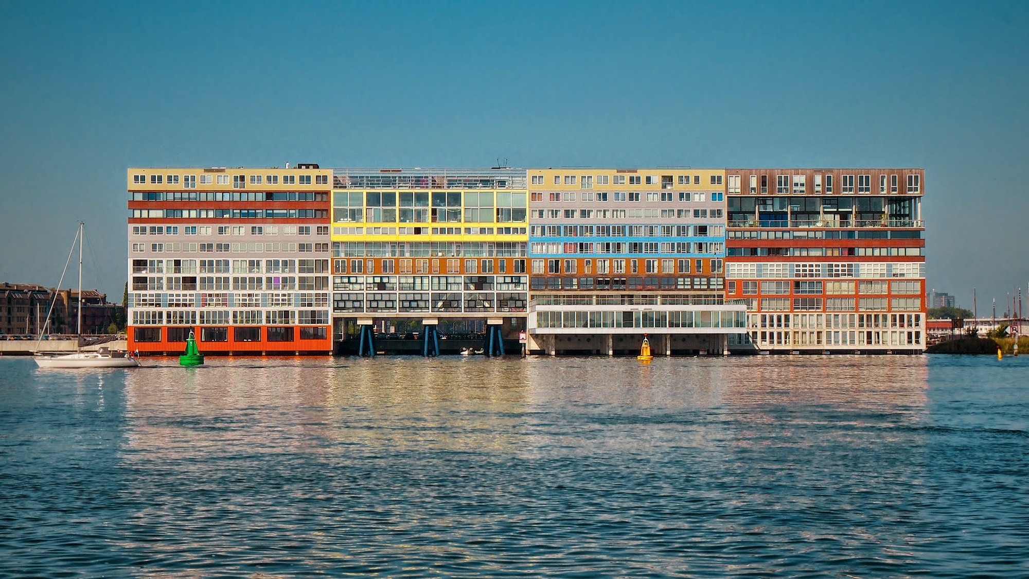
However, the intended machine-like precision of these buildings has often become unintentionally humanized over time, through the addition of curtains, coloring, or even through accidental breakage and imperfect repairs or alterations. I believe that building on the successes and failures of modernism has spawned a new and previously unclassified architectural style: Pixelism. Find out what this new phenomenon is after the break.

State of Exception: Spacelab’s Weekend Monditalia Special

From August 23-24, Italian architecture firm Spacelab’s State of Exception curatorial project will be featured at the Monditalia section of the 2014 Venice Biennale. State of Exception will involve 12 intellectuals, designers and bloggers in a two-day round table discussion on the themes of the project: conservation and the state of exception, looking both within and outside Italy. The innovative event also seeks to generate involvement and discussion beyond the walls of the Arsenale, and will feature an open call for images representing the event's core themes via Instagram and Twitter.

As one of the countries with the most significant historic and natural heritage in the world, Italy implemented bodies and strict regulations for its preservation over a century ago. “But conservation for conservation spawned two paradoxes: on the one hand the unruly entropic drift for anything that is not covered by the rules of preservation. On the other hand, autistic immobility within the enclaves of conservation, which don’t allow the freshness and openness to the differences that have always marked the history of Italian architecture,” Spacelab writes in a project description. Through State of Exception, Spacelab seeks “to promote ‘ad absurdum’ arguments regarding Italy's problematic relationship with its context and its historical legacy,” bringing attention to these issues both inside and outside Italy.

For more details on State of Exception and to find out how you can contribute images, read on after the break...

You've started following your first account!

Did you know?

You'll now receive updates based on what you follow! Personalize your stream and start following your favorite authors, offices and users.