1. ArchDaily
  2. Editor's Choice

Editor's Choice

Ten Buildings Which Epitomize The Triumph Of Postmodernism

Being such a recent movement in the international architectural discourse, the reach and significance of post-modernism can sometimes go unnoticed. In this selection, chosen by Adam Nathaniel Furman, the "incredibly rich, extensive and complex ecosystem of projects that have grown out of the initial explosion of postmodernism from the 1960s to the early 1990s" are placed side by side for our delight.

From mosques that imagine an idyllic past, via Walt Disney’s Aladdin from the 1990s, to a theatre in Moscow that turns its façade into a constructivist collage of classical scenes, "there are categories in post-modernism to be discovered, and tactics to be learned." These projects trace forms of complex stylistic figuration, from the high years of academic postmodernism, to the more popular of its forms that spread like wildfire in the latter part of the 20th century.

London's Battersea Bridge Competition is a Symbol of a Divided City

The recent unveiling of the 74 entries to the Nine Elms to Pimlico Bridge competition was undoubtedly intended to cause a media circus, hoping to emulate the furore that surrounded the much larger Helsinki Guggenheim competition when they released all 1,715 of their entries to the web in October of last year. The competition, which asked designers to propose "one of the most expressive and visible landmarks in London," is the latest in a series of dramatic changes taking place on this stretch of the South Bank of the Thames. This new community, one of London’s most prestigious new neighbourhoods, includes Keiran Timberlake's new US Embassy and a slew of residential developments, culminating in the highly-touted renovation of Battersea Power Station, complete with accompanying buildings by Foster + Partners and Frank Gehry, and a public space by BIG.

Initial reactions to the competition entries has been mixed at best. The Guardian’s architecture critic Oliver Wainwright took the opportunity to poke light-hearted fun at a selection of designs, using his considerable powers of wordplay to dub entries with titles such as The Greenhouse Funhouse, The Spaffy Tangle, Razorwire Party Bridge, and The Flaming Mouth of Hades. Similarly, City Metric ran the news with an article titled “The 12 Most Ridiculous Designs for the New Battersea Bridge”, sparking a debate on Reddit in which users branded the projects "varying degrees of insane" and "ridiculous doodles." But beyond all this jovial name-calling, these designs are symptomatic of an unhealthy approach to wealth that London seems unable (or perhaps unwilling) to address.

London's Battersea Bridge Competition is a Symbol of a Divided City - Image 1 of 4London's Battersea Bridge Competition is a Symbol of a Divided City - Image 2 of 4London's Battersea Bridge Competition is a Symbol of a Divided City - Image 3 of 4London's Battersea Bridge Competition is a Symbol of a Divided City - Image 4 of 4London's Battersea Bridge Competition is a Symbol of a Divided City - More Images+ 5

Walkable Cities? Rooftoppers Want Climbable Cities

“The city for the people!” is the familiar rallying cry of the reformist architect - but which people, exactly? That’s the question at the heart of rooftopping, a new and thrill seeking variant of Urban Exploration which has recently captured the attention of the media. Spreading via social media outlets such as Instagram, the stunts draw attention by design, but why has coverage of the form of Urban Exploration climbed to such great heights?

Urban exploration has been at the fringes of the public consciousness since the mid 2000s as a form of punk sub-culture; anarchists poking around in sewer tunnels and proto-pinterest ruin exploration (although unsurprisingly the habit of people breaking into abandoned, closed off or normally inaccessible buildings dates back much, much farther). The way rooftopping has captured the public imagination, though, is as a form of public discourse: how it meshes with social media, the way corporate groups have attempted to market stunts, and the way these groups are interacting with the urban environment.

Walkable Cities? Rooftoppers Want Climbable Cities - Image 1 of 4Walkable Cities? Rooftoppers Want Climbable Cities - Image 2 of 4Walkable Cities? Rooftoppers Want Climbable Cities - Image 3 of 4Walkable Cities? Rooftoppers Want Climbable Cities - Image 4 of 4Walkable Cities? Rooftoppers Want Climbable Cities - More Images+ 2

Here's How BIG's Power Plant Ski Slope Will Blow Smoke Rings

When BIG's proposal for Amager Bakke, a waste-to-energy plant in Copenhagen, was unveiled in 2011, there was a lot for skeptics to pick apart. Is it really possible to run a publicly accessible ski slope on the roof of an industrial building? Would they really be able to make it blow giant smoke (or rather, steam) rings? The whole idea seemed rather too good to be true. The project's ground breaking in 2013 may have silenced some critics, but the video above should convince the rest of the design's feasibility.

Oscar-Nominated Film Captures Life with Modernist Architect Parents

Minimalism has its challenges and for this seven-year-old sibling of two, it’s not for children. Nominated for Best Animated Short Film at the 87th Academy Awards, Me and My Moulton captures the unconventional life and struggles of three kids with modernist architect parents. Watch the trailer above and see what director Torill Kove believes are five sure signs your parents were architects, after the break.

Happy 25th Birthday Photoshop; Architecture Wouldn't be the Same Without You

This past week, Adobe Photoshop turned 25 years old. That’s right: at an age where us mere mortals are often still embarrassingly reliant on our parents, Photoshop is taking the opportunity to look back on how it became one of the world’s most ubiquitous pieces of software, and how in just a quarter-century it has transformed our very conceptions of beauty and even reality itself.

Of course, to the general public Photoshop is probably best-known for the role it has played in the fashion and advertising industries. Serving up heavily processed, idealized images of anatomically dubious models, its effect in our wider culture is well-known, but Photoshop has had its impact on the architecture profession as well. Join us after the break as we look at 25 years of Photoshop in architecture.

Mediating Mies: Dirk Lohan's Langham Hotel Lobby at the IBM Building

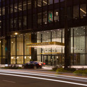
In 2013 the former IBM Building in Chicago, Mies van der Rohe's last completed skyscraper, underwent a significant renovation as a part of the tower was converted into a hotel. In this article, originally published in Blueprint issue #338 as "Lobbying for Mies van der Rohe," Anthea Gerrie catches up with Dirk Lohan - the Chicago architect who helped his grandfather design the building nearly 50 years ago, and who was called back in to design the new hotel's entrance lobby.

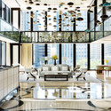
"It's not very Mies," says Dirk Lohan dubiously, in one of the great understatements of the year. We are standing in the double-height reception hall of the Langham Chicago hotel with what looks like dozens of multicoloured glass balloons swimming above us and a mirror-glass frieze adding to a cacophony of glitz and dazzle.

It is indeed the very antithesis of the aesthetic of the architect known for the phrase "less is more". But then the audacious idea of converting an office building by the most functionalist of architects into a five-star hotel was always going to be problematic.

Mediating Mies: Dirk Lohan's Langham Hotel Lobby at the IBM Building - Image 1 of 4Mediating Mies: Dirk Lohan's Langham Hotel Lobby at the IBM Building - Image 2 of 4Mediating Mies: Dirk Lohan's Langham Hotel Lobby at the IBM Building - Image 3 of 4Mediating Mies: Dirk Lohan's Langham Hotel Lobby at the IBM Building - Image 4 of 4Mediating Mies: Dirk Lohan's Langham Hotel Lobby at the IBM Building - More Images+ 7

Nouvel, Gehry and Elemental Among 15 Shortlisted for “Design of the Year 2015”

London’s Design Museum has released 15 shortlisted projects that are being considered for the prestigious “Design of the Year” award. From Wendell Burnette’s Desert Courtyard House to Jean Nouvel’s One Central Park skyscraper, the wide-ranging list spans all scales, showcasing some of the best newly completed projects from across the globe.

The award, now in its eighth year, “celebrates design that promotes or delivers change, enables access, extends design practice or captures the spirit of the year.” 76 nominees over six categories have been selected. The jury, chaired by artist Anish Kapoor and includes architect Farshid Moussavi, will choose category winners on May 4. An overall winner will be revealed June 4.

Last year, Zaha Hadid’s Heydar Aliyev Centre in Azerbaijan was the first building in the award’s history to win the overall prize.

View all the shortlisted buildings, after the break. 

Living Under a Rock: Setenil de las Bodegas

The Andalucian town of Setenil de las Bodegas looks like something from the set of a culturally adventurous fantasy film, but cave dwelling is actually common in Andalucia; being so close to the African continental plate, geological forces threw up mountain ranges and volcanoes that are perfectly suited for habitation. The rocks and caves make for surprisingly easy settlement, and the nearby Cueva de la Pileta shows evidence of a human presence up to 25,000 years ago. After that, though, the inhabitants of the caves here are mostly ignored up until the 12th century, when Setenil's Moorish castle appears on the historical record.

Living Under a Rock: Setenil de las Bodegas - Image 1 of 4Living Under a Rock: Setenil de las Bodegas - Image 2 of 4Living Under a Rock: Setenil de las Bodegas - Image 3 of 4Living Under a Rock: Setenil de las Bodegas - Image 4 of 4Living Under a Rock: Setenil de las Bodegas - More Images+ 4

UNESCO Reveals Winning Scheme For The Bamiyan Cultural Centre In Afghanistan

, in collaboration with the Afghan Ministry of Information and Culture, have announced the winning proposal for the Bamiyan Cultural Centre. An Argentina-based team, lead by Carlos Nahuel Recabarren alongside Manuel Alberto Martínez Catalán and Franco Morero, were selected from 1,070 design entries from 117 countries. Prepatory work on implementing their scheme, entitled Descriptive Memory: The Eternal Presence of Absence, "will start immediately" close to the boundaries of the Bamiyan World Heritage site.

See the winning entry and the four runners-up after the break.

UNESCO Reveals Winning Scheme For The Bamiyan Cultural Centre In Afghanistan - Image 1 of 4UNESCO Reveals Winning Scheme For The Bamiyan Cultural Centre In Afghanistan - Image 2 of 4UNESCO Reveals Winning Scheme For The Bamiyan Cultural Centre In Afghanistan - Image 3 of 4UNESCO Reveals Winning Scheme For The Bamiyan Cultural Centre In Afghanistan - Image 4 of 4UNESCO Reveals Winning Scheme For The Bamiyan Cultural Centre In Afghanistan - More Images+ 21

ARCHINOWHERE: A Parallel Archi-Universe Illustrated by Federico Babina

Federico Babina has released ARCHINOWHERE, a “series of illustrations that represent a parallel universe where past, present and future intertwine” to present a fantastical collection of “realistic yet unreal” architectural visions. The playful graphic, as Babina describes, “maintains a balance between illustrated architecture and an architectonical illustration” to relay imagined stories built on a foundation of contemporary ideals.

ARCHINOWHERE: A Parallel Archi-Universe Illustrated by Federico Babina - Image 1 of 4ARCHINOWHERE: A Parallel Archi-Universe Illustrated by Federico Babina - Image 2 of 4ARCHINOWHERE: A Parallel Archi-Universe Illustrated by Federico Babina - Image 3 of 4ARCHINOWHERE: A Parallel Archi-Universe Illustrated by Federico Babina - Image 4 of 4ARCHINOWHERE: A Parallel Archi-Universe Illustrated by Federico Babina - More Images+ 13

INTERIORS: Birdman

Interiors is an online film and architecture journal, published by Mehruss Jon Ahi and Armen Karaoghlanian. Interiors runs an exclusive column for ArchDaily that analyzes and diagrams films in terms of space. Their Official Store will carry exclusive prints from these posts.

There has been much said and written about the use of the long take in Alejandro González Iñárritu’s Birdman (2014), and how its filmmakers stitched together numerous long shots in an attempt to make the majority of the film feel like a continuous scene. The film follows (literally) its protagonist, Riggan Thomson (Michael Keaton), an actor past his prime, as he plans his career comeback with a stage production.

Emmanuel Lubezki seems the ideal collaborator for the director’s vision. The cinematographer, known for his extended takes in films such as Y Tu Mamá También (2001), Children of Men (2006) and Gravity (2013), has made use of the technique as a way of bringing audiences closer to the action. Birdman is the culmination of his experimentation with the form, bringing together these ideas and creating an immersive experience with a sense of urgency.

The film, of course, uses digital effects and editing as a way of creating its illusion. Birdman’s cuts are hidden between instances of darkness, made possible through the work of production designer Kevin Thompson, who started his work by mapping out the entire film on a floor plan of the sets.

A Preview of Diller Scofidio + Renfro's Broad Museum, Courtesy of Instagram

Here's The Broad 3rd floor gallery space before the art walls are installed #broad2015 #huftonandcrow @thebroadmuseum

A photo posted by ©Hufton+Crow (@huftonandcrow) on

Designed by Diller Scofidio + Renfro, Los Angeles' Broad Museum is due to open September 20th. However, in an attempt to ease the tensions surrounding the building's many delays and legal problems, this past weekend members of the press and a small number of ticketed members of the public where invited to view the unfinished building, offering a preview of the long-awaited addition to LA's Grand Avenue museum scene.

As LA Times Critic Christopher Hawthorn reports, the previews were initiated by Elizabeth Diller herself, with the architect meeting giving reporters a tour of the space on Friday. On Sunday 3,000 members of the public were allowed to enter, after tickets for the event sold out after just 30 minutes. Now that the previews are over, the Broad will remain off limits until its official opening later this year and the rest of us will have to make do with the many Instagram and Twitter shots from those lucky enough to attend - after the break, we've collected 12 of the best.

"A Message to Everybody": The Red Square Pavilion Winners on Encouraging Tolerance with Architecture

Announced in the summer of 2014 the Red Square Tolerance Pavilion, an international ideas competition organized by HMMD, was a deliberately provocative proposal before any teams had even entered - a statement planned in an envronment where tolerance is an increasingly urgent topic, for people both inside and outside Russia. In this interview, originally published by Strelka Magazine, the Italian winners of the competition discuss their proposal and its response to this charged context.

This January the winners of the ‘Red Square Tolerance Pavilion’ competition that was organised by international organisation HMMD were announced. The first prize was given to a team of architects from Italy. Their bold and daring project proposed to build the pavilion right against the Kremlin wall. Strelka Magazine caught up with Kiana Jalali, Marco Merigo, Alessandro Vitale and Matteo Pagani to discuss fluidity of space, the symbolism behind their design and the media image of Russia.

"A Message to Everybody": The Red Square Pavilion Winners on Encouraging Tolerance with Architecture - Image 1 of 4"A Message to Everybody": The Red Square Pavilion Winners on Encouraging Tolerance with Architecture - Image 2 of 4"A Message to Everybody": The Red Square Pavilion Winners on Encouraging Tolerance with Architecture - Image 3 of 4"A Message to Everybody": The Red Square Pavilion Winners on Encouraging Tolerance with Architecture - Image 4 of 4A Message to Everybody: The Red Square Pavilion Winners on Encouraging Tolerance with Architecture - More Images+ 2

A Wilderness in the City: How Diller Scofidio + Renfro's Zaryadye Park Could Help Fix Moscow

In late 2013, Diller Scofidio + Renfro won first prize in the international competition to design Zaryadye Park, Moscow's first new park in 50 years. The project is a headliner in a series of high-profile schemes that aim to improve the city's green space, including the renovation of Gorky Park and the recently revealed plans for the Moscow River. This article, originally published by The Calvert Journal as part of their How to Fix Moscow series examines how DS+R's urban "wilderness" will impact the city.

In a 2010 interview, the critic and historian Grigory Revzin complained that Muscovites wishing to "walk in parks and get pleasure from the city" would have to "come out into the streets" before anything was done. Hoping that architects would respond to the problem, one of Revzin's suggestions was a park to replace the site of Hotel Rossiya, which had become overgrown since being abandoned in 2007. This wild area in the city centre was, in fact, a harbinger of what is to come: Zaryadye Park, Moscow's first new park in 50 years, which the American design studio Diller Scofidio+Renfro won the international competition to design in November 2013.

A Wilderness in the City: How Diller Scofidio + Renfro's Zaryadye Park Could Help Fix Moscow  - Image 1 of 4A Wilderness in the City: How Diller Scofidio + Renfro's Zaryadye Park Could Help Fix Moscow  - Image 2 of 4A Wilderness in the City: How Diller Scofidio + Renfro's Zaryadye Park Could Help Fix Moscow  - Image 3 of 4A Wilderness in the City: How Diller Scofidio + Renfro's Zaryadye Park Could Help Fix Moscow  - Image 4 of 4A Wilderness in the City: How Diller Scofidio + Renfro's Zaryadye Park Could Help Fix Moscow  - More Images+ 4

The 14 Stories Behind the 2015 Building of the Year Award Winners

With our annual Building of the Year Awards, over 30,000 readers narrowed down over 3,000 projects, selecting just 14 as the best examples of architecture that ArchDaily has published in the past year. The results have been celebrated and widely shared, of course, usually in the form of images of each project. But what is often forgotten in this flurry of image sharing is that every one of these 14 projects has a backstory of significance which adds to our understanding of their architectural quality.

Some of these projects are intelligent responses to pressing social issues, others are twists on a well-established typology. Others still are simply supreme examples of architectural dexterity. In order that we don't forget the tremendous amount of effort that goes into creating each of these architectural masterpieces, continue reading after the break for the 14 stories that defined this year's Building of the Year Awards.

The 4 Most Amusing Responses to Frank Gehry's UTS Business School

Last week, Frank Gehry inaugurated his first building in Australia, with the formal opening of the Dr Chau Chak Wing Building at the University of Technology in Sydney (UTS). As his first in the country, the building therefore offers an opportunity for a whole new corner of the world to weigh in with their opinions on the polarizing style of the world's foremost love-him-or-hate-him architect.

The resulting media flurry has provided a number of entertaining responses, both positive and negative. After the break, we round up some of the most amusing.

Through the Lens: When Hollywood Designs Prisons

The architecture of containment is a fascinating area. The spartan utilitarian spaces of prisons are among the most highly considered, sophisticated and expensive there are. It’s unusual for designers to create spaces for people who experience it against their will (well, mostly) and it is a tricky balance between creating sensitive, positive places for rehabilitation and community expectations about what punishment should look like. There are different approaches around the world: the US take a particular stance; the Norwegians have another. Hollywood, of course, has its own interpretation. And it is not concerned by such trivialities as the Geneva Convention.

You've started following your first account!

Did you know?

You'll now receive updates based on what you follow! Personalize your stream and start following your favorite authors, offices and users.