1. ArchDaily
  2. Editor's Choice

Editor's Choice

IFAC: A Romance Between Art and Architecture

Held annually, the International Festival of Art and Construction (IFAC) is a 10-day event that brings together 300 students from all over the world, joined by architects, scientists, musicians, artists and craftsmen. Together they carry out 30 workshops across different disciplines that “are bound together by the architecture through which they are expressed,” according to the website. In an article originally written in Spanish for ArchDaily en Español, Ana Asensio Rodríguez shares her experience at the 2015 edition of IFAC, reflecting on the powerful intersection of art and architecture, and the collective nature of the event.

Sometimes you get to meet people who fill you with energy and electricity -- fleeting, intense crossroads full of shared views and beautiful ideas. Spontaneous connections, which however tiny, will remain with you for a very long time.

Sometimes, these crossroads are not between people, but between arts, crafts, talents and experiences. Among these intersections is the inevitable attraction between art and architecture: explosive collages, a romance drunk with imagination. And, on very few occasions these two types of crossroads occur at the same time. And in those moments you can only hope that it will happen again.

It's called IFAC, the International Festival of Art and Construction. It is a 10-day long celebration that brings together more than 300 people from all over the world - creatively restless individuals, who meet somewhere in the European countryside. I felt immeasurably lucky to be one of those 300 people, and so I wanted to share how fascinating IFAC is from the inside.

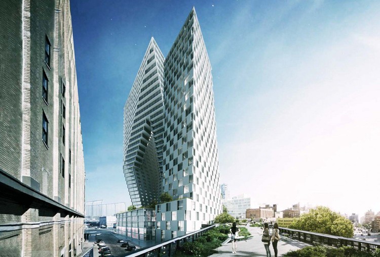
BIG High Line Project Unveiled

New York Yimby has unveiled BIG's latest New York skyscraper: 76 11th Avenue. Planned for one of the largest plots along the High Line, the nearly 800,000-square-foot proposed project is comprised of two towers perched on a podium of retail, gallery and hotel space in the city's Meatpacking district. Rising 302-feet to the east and 402-feet to the west, the towers are divided by a "diagonal cut" through the site that opens up more views for residents to the High Line.

AD Essentials: BIM

AD Essentials: BIM - Image 1 of 4

This article is part of ArchDaily Essentials, a series of articles which give you an overview of architecture's most important topics by connecting together some of our best articles from the past. To find out more about ArchDaily Essentials, click here; or discover all of our articles in the series here.

We often hear of the great tectonic shift that digital technologies have brought to almost every aspect of our lives, but in one particular yet understated way, architecture has been revolutionized by computerization. Building Information Modeling (BIM) is a background revolution that has implications on every stage in the building process from development through construction and onto the lifecycle of the building. As defined by the US National Building Information Model Standard Project Committee:

"Building Information Modeling (BIM) is a digital representation of physical and functional characteristics of a facility. A BIM is a shared knowledge resource for information about a facility forming a reliable basis for decisions during its life-cycle; defined as existing from earliest conception to demolition." [1]

While that gives some indication of BIM’s applications, many people may still be wondering how such a shift came about, what are its present applications and benefits, and how it will shape architecture’s future?

Niche Tactics in Contextual Design: The Difference Between Being "In" and "On" the Surroundings

The question of context is among the most discussed issues in architecture theory, and has only become more complex and controversial as globalization has added yet another layer to the debate. In her new book "Niche Tactics: Generative Relationships Between Architecture and Site," Caroline O'Donnell takes a long look at the idea of context as it relates to a project's surroundings. In this excerpt from the book's introduction, O'Donnell looks at the history of theories related to context, from Vitruvius to Koolhaas, elaborating on the difference between working "in" the site, as opposed to merely "on" it.

The Architectural Soap-Bubble

Architecture’s unlikely yet persistent reluctance to engage fundamentally with issues of context can most notably be traced to Le Corbusier’s renowned comparison of architecture and the soap-bubble. “This bubble,” he famously postulated, “is perfect and harmonious if the breath has been evenly distributed and regulated from the inside.”[1] This primacy of the interior was, despite their many differences, shared by modern architects, amongst whom, as contextualist Thomas Schumacher has noted, “few... would have allowed that the outside surface ought to determine the interior distribution.”[2]

Steven Holl's "Copenhagen Gateway" Will Finally Go Ahead

Steven Holl Architects (SHA) is preparing to break ground on a project that is nearly eight years in the making. The ambitious "Copenhagen Gate" development will break ground next year, as Fast Company reports, after being initially held back in 2008. It will feature two asymmetrical towers - Gate L and Gate M - connected by a (terrifying) pedestrian skybridge suspended 213 feet above the harbor.

Architects and Our Right to Fail

The architecture world is a very different place compared to what it was ten years ago - a fact that is all too obvious for today's young architects, who bore the brunt of the financial crisis. But how can recent graduates harness such rapid change to make a positive impact? This article written by ArchDaily en Español's Nicolás Valencia explores the impact of the financial crisis on architecture in the Global South and in particular in the Spanish-speaking world, finding that it may be the inalienable right of the architect "to give yourself room to fail or to quit."

For some years now, three figures have been floating around that are worrisome to Chilean architects and architectural students: every year 48 architectural schools enroll 3,500 students and give degrees to another 1,400 in a completely saturated market. The future appears bleak, the professional internships are depressing, and among those who already have degrees, we're all too familiar with the exploitative offices that not only offer their employees zero contracts (or health insurance of any kind, all the while praying that nobody gets injured) but also make them work much more than they agreed to with paltry salaries and labor unions that have seen better days. Meanwhile at the universities, talking about money in studios, or about flesh and blood clients, has become a taboo subject. “Students, don't let money tarnish the beauty of the discipline” they tell you. Of course, not only does it not get tarnished, but we've gotten to the point where many don't even know how much to charge for a plan drawing, let alone for an actual project.

The Future of Architecture Visualization: An Interview with Morean Digital Realities and Zaha Hadid Architects

Above: The final presentation video for Zaha Hadid Architects' Danjiang Bridge entry, with construction sequences provided by morean digital realities and atmospheric shots provided by Studio MIR

In this age of lightning fast response rate, it is more important than ever for architects to be able to provide clients with a clear idea of what is to be built. Luckily for us, there are firms out there that specialize in aiding that process. Take morean digital realities, for example, a visualization firm that works in conjunction with architects to create renderings and animations that help explain how a project will work. These visualizations can be geared toward clients, competitions or used as material for fundraising. Their recent work includes a video for the Danjiang Bridge Competition, in which morean provided a dramatic construction animation accompanied by atmospheric shots by another visualization company, Studio MIR. Together, these two visualization studios helped Zaha Hadid Architects come away with the project commission.

ArchDaily spoke to three members of the team on that project - Saman Saffarian, a Lead Designer at Zaha Hadid Architects; Karl Humpf, Director of International Bridges at Leonhardt, Andrä und Partner; and Gonzalo Portabella, Architect and Managing Director at morean digital realities - about the role of visualization within architecture and where the field may be headed.

MKPL Architects Wins Two Projects in Singapore Rail Corridor Competition

After competing with a strong shortlist of firms, which included OMA, MVRDV, West 8, Grant Associates and Olin Partnership, a team comprising MKPL and Turenscape International has been selected for not just one, but two, of the three projects planned for the Singapore Rail Corridor – the Choa Chu Kang affordable housing development and the Tanjong Pagar Railway Station renovation. Read more about the two projects after the break.

New Lower Hill Masterplan / West 8 + BIG + Atelier Ten

BIG, West 8 and Atelier Ten have revealed their masterplan design for Pittsburgh's Lower Hill district, just outside the city's downtown region. Located on the former site of Pittsburgh's Civic Arena, which was demolished in 2012 and has since left a significant hole in the city's fabric, the design will bring 1,200 residences and over 1 million square feet of retail space to the area, while reconnecting the wider Hill District with the downtown core by reinstating the city's road grid, overlaid with a series of pedestrian footpaths, public plazas and green spaces.

New Lower Hill Masterplan / West 8 + BIG + Atelier Ten - Master Plan, CityscapeNew Lower Hill Masterplan / West 8 + BIG + Atelier Ten - Master Plan, Facade, CityscapeNew Lower Hill Masterplan / West 8 + BIG + Atelier Ten - Master Plan, Facade, CityscapeNew Lower Hill Masterplan / West 8 + BIG + Atelier Ten - Master Plan, Garden, Facade, CityscapeNew Lower Hill Masterplan / West 8 + BIG + Atelier Ten - More Images+ 8

Atelier 2B's "Soft in the Middle" Rethinks Modernism for An Age of Collaboration and Sharing

In his book We Have Never Been Modern, philosopher Bruno Latour concludes that an inability to make humanity and nature inherently separate is one of Modernism’s most misguided tropes. Thus, contemporary designers that hope to riff on or have continuity with modernism must understand that architecture, even at its most aestheticized, is not hermetically sealed off from the outside world - and that therefore modernism is not a plateau of design, but another base camp on the road to further refinement.

In Chicago, the city where Modernism reached both its metaphoric and physical peak, Atelier 2B, a team of Yewon Ji, Nicolas Lee, Ryan Otterson, recently shared the top-five prize of the Chicago Architecture Foundation's ChiDesign Competition (part of the Chicago Architecture Biennial) for their project Soft in the Middle: The Collaborative Core. Indebted to the legacy of Mies and the International Style, Atelier 2B proposed a Modernist-tower-redux that (externally at least) is composed of three stacked rectangular volumes bisected with terraces, set back from the street by a large public plaza. The project brief called for “a new center for architecture, design and education,” in a competition judged by critics including Stanley Tigerman, David Adjaye, Ned Cramer, Monica Ponce de Leon, and Billie Tsien.

Atelier 2B's "Soft in the Middle" Rethinks Modernism for An Age of Collaboration and Sharing - Facade, CityscapeAtelier 2B's "Soft in the Middle" Rethinks Modernism for An Age of Collaboration and Sharing - Facade, ChairAtelier 2B's "Soft in the Middle" Rethinks Modernism for An Age of Collaboration and Sharing - Facade, ArchAtelier 2B's "Soft in the Middle" Rethinks Modernism for An Age of Collaboration and Sharing - StairsAtelier 2B's Soft in the Middle Rethinks Modernism for An Age of Collaboration and Sharing - More Images+ 3

OMA's 15 Most Outrageous Unbuilt Skyscrapers

Since 1975, the Rotterdam-based Office for Metropolitan Architecture has produced some of the world's most provocative buildings. Led by Rem Koolhaas and his nine partners, the firm's most notable built projects include seminal works such as the CCTV Headquarters in Beijing, the Seattle Central Library, and Casa da Musica in Porto, Portugal. Known as one of the world's leading creators of boundary-pushing design, OMA's influence on the global architectural landscape is undeniable.

Among the firm's several hundred realized projects, however, many lesser known proposals were drafted but never constructed. Arguably a fundamental component of the OMA's practice, the unbuilt projects contain some of the firm's most outlandish and important ideas with incredible potential to influence architectural design worldwide. As a tribute to Koolhaas and OMA's continued pursuit of the unconventional, we've rounded up fifteen of OMA's most unusual unbuilt skyscrapers. Read on to find out which ones made the list.

OMA's 15 Most Outrageous Unbuilt Skyscrapers - Image 1 of 4OMA's 15 Most Outrageous Unbuilt Skyscrapers - Image 6 of 4OMA's 15 Most Outrageous Unbuilt Skyscrapers - Image 2 of 4OMA's 15 Most Outrageous Unbuilt Skyscrapers - Image 3 of 4OMA's 15 Most Outrageous Unbuilt Skyscrapers - More Images+ 11

Architects Team Up with Khmer Women to Build a Community Centre with Fabric and Concrete

Using an innovative method of casting concrete in lightweight fabric molds, the architects of Orkidstudio -- along with StructureMode -- teamed up with a group of Khmer women in Sihanoukville, Cambodia to rebuild a community centre in the city’s urban heart.

The construction technique was developed and tested by engineers from StructureMode using a combination of physical testing and computer analysis software, Oasys GSA Suite, to predict the stretch of a particular fabric when concrete is poured inside. Through three-dimensional sketches the seamstresses and building team could understand the construction sequence of the form, completing the entire project in just eight weeks.

Architects Team Up with Khmer Women to Build a Community Centre with Fabric and Concrete - SustainabilityArchitects Team Up with Khmer Women to Build a Community Centre with Fabric and Concrete - SustainabilityArchitects Team Up with Khmer Women to Build a Community Centre with Fabric and Concrete - SustainabilityArchitects Team Up with Khmer Women to Build a Community Centre with Fabric and Concrete - SustainabilityArchitects Team Up with Khmer Women to Build a Community Centre with Fabric and Concrete - More Images+ 34

The Architecture School Survival Guide

Starting out on the path of architectural education can be daunting. With so much to learn and so many different ways to approach design, often the most basic principles are left for the student to learn the hard way. Predicated upon the idea that "every year new architecture students make the same mistakes," Iain Jackson's new book "The Architecture School Survival Guide" offers tips, tricks and advice to help make the transition from novice to capable student just that little bit less painful. Covering everything from how to properly approach contextual design to how often to back up your work, the book is full of ideas that new students will find enlightening, and older students - and even professionals - are likely to find useful as reference points. Read on for an excerpt of the book's fifth chapter, "Process."

Exploring Chicago's Architectural Legacy Through 5 Exceptional Projects

Chicago has long been known for distinctive architecture, and this year’s inaugural Chicago Architecture Biennial has only furthered that reputation. Although it is nearly impossible to narrow down the countless iconic structures, in celebration of the Biennial, we have compiled five Chicago buildings that highlight the many phases of the city’s architectural history.

ArchDaily Readers Debate: Brands in Architecture and BIG's Business Success

Awards season is in full swing in the architecture world, with - among others - the World Architecture Festival and the Council on Tall Buildings and Urban Habitat recently handing out prizes for the best new buildings worldwide (OMA + Ole Scheeren's Interlace and Stefano Boeri's Bosco Verticale, respectively). However, it has been relatively quiet in our comments section; are we to assume that there are few strong objections to these winners?

Nevertheless, a quiet period doesn't mean there weren't some great discussions had in the comments over the past two weeks, with opinions shared on the success of BIG, the problem of negativity in architecture, and more. Read on to find out what our readers had to say.

Belyayevo Forever: How Mid-Century Soviet Microrayons Question Our Notions of Preservation

Belyayevo Forever: How Mid-Century Soviet Microrayons Question Our Notions of Preservation - Image 21 of 4
Belyayevo, which was based on the example set by the Ninth Quarter of Cheryomushki. Image © Max Avdeev

What are the characteristics of preservation-worthy architecture? In his book "Belyayevo Forever: A Soviet Microrayon on its Way to the UNESCO List," Kuba Snopek finds uniqueness in the seemingly generic Belyayevo microrayon, and argues that in spite of its pattern-book design it is worthy of protection. In this excerpt from the book's first chapter, Snopek examines Belyayevo's predecessor - the Ninth Quarter of Cheryomushki, which was constructed in the 1950s as an experiment that would transform Soviet housing policy - finding it to be a place which challenges our preconceived notions about architectural heritage.

A foreigner’s first contact with Moscow might begin with Google Earth. Its virtual tour through Russia’s capital starts with a view of its radial-concentric plan: loops of circular roads radiating from the Kremlin are cut through with the straight lines of prospects (avenues) and streets leading from the center towards the outskirts. This general scheme is familiar to any European architect: many other cities have circular boulevards, straight avenues and ring roads.

Belyayevo Forever: How Mid-Century Soviet Microrayons Question Our Notions of Preservation - Image 1 of 4Belyayevo Forever: How Mid-Century Soviet Microrayons Question Our Notions of Preservation - Image 2 of 4Belyayevo Forever: How Mid-Century Soviet Microrayons Question Our Notions of Preservation - Image 3 of 4Belyayevo Forever: How Mid-Century Soviet Microrayons Question Our Notions of Preservation - Image 4 of 4Belyayevo Forever: How Mid-Century Soviet Microrayons Question Our Notions of Preservation - More Images+ 17

5 Projects at the Chicago Biennial that Demonstrate the State of the Art of Sustainability

At the Chicago Architecture Biennial, the theme selected by directors Joseph Grima and Sarah Herda was deliberately wide in scope, with the expectation that more than one hundred exhibitors would each bring their own perspective on what is “The State of the Art of Architecture.” But where does that leave one of architecture's most widely adopted missions of the 21st century: sustainability? In this article, originally published on her blog Architectstasy as “Chicago Architecture Biennial: The State of the Art of Sustainability,” Jessica A S Letaw delves into five projects that take on sustainability in the context of Chicago's biennial.

At North America's inaugural Architecture Biennial in Chicago, “The State of the Art of Architecture,” architectural firms and practices from all six inhabited continents have been invited to display their work. Spanning all sizes and kinds of projects, the Biennial is showcasing solutions to design problems from spiderwebs to social housing.

US buildings use around 40% of all the country’s energy consumption. It is a disconcerting truth that even if every new building starting construction tomorrow were to be net-zero energy and net-zero water, we’d still be on a crash course, draining more naturally-available resources than our one planet can permanently sustain. In this environment, architectural designers have a special responsibility to educate themselves about innovative sustainable design techniques, from those that have worked for thousands of years to those that, as the Biennial’s title hopefully suggests, are state of the art.

So what does the Biennial have to say about sustainability? Five projects on display demonstrate different approaches at five different scales: materials, buildings, resources, cities, and the globe.

Otherothers' "Offset House" Reveals the Architecture Hidden in Suburban Homes

In the classic film The Wizard of Oz, Dorothy and friends manage to obtain a visit with the great and powerful wizard, who appears to them as an enormous, grotesque head, surrounded by smoke and flames, with a booming voice and a hostile demeanor. But when Toto pulls back the curtain, the wizard’s true nature is revealed, and it is only then that he is able to help the gang get the help for which they journeyed many miles down the yellow brick road. In architecture today, suburban houses share many of the characteristics of the wizard’s illusion: large, stand-offish and intimidating. But what if there is a more benevolent architecture hidden behind the smoke and flames? This is the thesis of Australian firm Otherothers' Offset House, on display now at the Chicago Architecture Biennale.

Otherothers' "Offset House" Reveals the Architecture Hidden in Suburban Homes - Image 1 of 4Otherothers' "Offset House" Reveals the Architecture Hidden in Suburban Homes - Image 2 of 4Otherothers' "Offset House" Reveals the Architecture Hidden in Suburban Homes - Image 3 of 4Otherothers' "Offset House" Reveals the Architecture Hidden in Suburban Homes - Image 4 of 4Otherothers' Offset House Reveals the Architecture Hidden in Suburban Homes - More Images+ 8

You've started following your first account!

Did you know?

You'll now receive updates based on what you follow! Personalize your stream and start following your favorite authors, offices and users.