1. ArchDaily
  2. Editor's Choice

Editor's Choice

"Array of Things" is A Ray of Hope for Big-Data-Based Urban Design

For a number of years now, Smart Cities and Big Data have been heralded as the future of urban design, taking advantage of our connected, technological world to make informed decisions on urban design and policy. But how can we make sure that we're collecting the best data? In this story, originally published on Autodesk's Redshift publication as "'Array' of Possibilities: Chicago’s New Wireless Sensor Networks to Create an Urban Internet of Things," Matt Alderton looks at a new initiative in Chicago to collect and publish data in a more comprehensive way than ever before.

If it hasn’t already, your daily routine will soon undergo a massive makeover.

For starters, when your alarm clock goes off, it will tell your coffeemaker to start brewing your morning joe. Then, when you’re on the way to work, your car will detect heavy traffic and send a text message to your boss, letting her know you’ll be late. When you arrive, you’ll print out the agenda for today’s staff meeting, at which point your printer will check how much ink it has left and automatically order its own replacement cartridges.

At lunch, you’ll think about dinner and use your smartphone to start the roast that’s waiting in your slow cooker at home. And when you come home a few hours later, your house will know you’re near, automatically turning on the lights, the heat, and the TV—channel changed to the evening news—prior to your arrival. It will be marvelous, and you’ll owe it all to the Internet of Things (IoT).

In Defense of Renders and Trees On Top of Skyscrapers

In a recent article on Vice (in Dutch) and on his research platform website Failed Architecture, architecture writer Mark Minkjan comments on the phenomenon of architectural renders, arguing that “digital visualizations and hollow sales pitches hide the ugly sides of architecture.” In the article, Minkjan takes MVRDV's proposal for Ravel Plaza in Amsterdam as a “case study” to discuss the misleading quality of the render. This criticism – of renders in general and MVRDV's renders specifically – is a returning point of critique: on ArchDaily in 2013, Tim De Chant begged in an opinion piece “Can We Please Stop Drawing Trees on Top of Skyscrapers?” Though that article did not mention MVRDV in the text, our Peruri88 project in Jakarta was given the dubious distinction of being the article's most prominent image.

We'd like to discuss this common critique. The point of the role of visualizations in our communication is relevant but, even though we fully understand where the criticism comes from, arguments such as these are in our opinion not correct.

In Defense of Renders and Trees On Top of Skyscrapers - Image 1 of 4In Defense of Renders and Trees On Top of Skyscrapers - Image 2 of 4In Defense of Renders and Trees On Top of Skyscrapers - Image 3 of 4In Defense of Renders and Trees On Top of Skyscrapers - Image 4 of 4In Defense of Renders and Trees On Top of Skyscrapers - More Images+ 5

7 Examples of How to Show Off Interiors in Your 3D Models, As Selected by Sketchfab

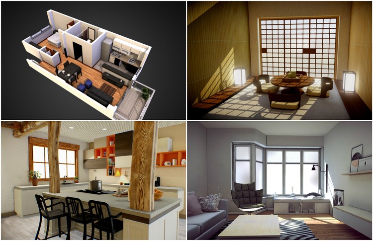
When making a 3D model, just as with a physical model, one of the biggest challenges is in effectively conveying the feeling of a design's interior. This is made worse by the fact that historically, 3D modeling and viewing software has treated the design being modeled as primarily an object to be orbited around, rather than as a space to be viewed from within. The introduction of first-person viewing modes has improved this, but these still are hampered by the fact that movement is never as simple or intuitive as simply walking around in real space. All of this can make presenting interior spaces a frustrating experience.

However, there are a variety of techniques you can use to display interiors more effectively. In the second of our Selected by Sketchfab series, our partners at Sketchfab have picked out the best examples of from their platform of models that inventively show off interior spaces.

Habitat 2.0 / BIG

BIG has unveiled plans for a new residential development on downtown Toronto's King Street West. A "ziggurat" designed to "create communities," as The Globe and Mail says, "Toronto 2.0" features two "pixilated" towers likened to Moshe Safdie's Habitat 67.

When It Comes to Sustainable Design, Architects Still Don't Get It

In the face of global doomsday predictions, sustainability has become one of the most crucial aspects of the 21st century, now playing a huge role in everything from politics to the way you dispose of your trash. Fortunately, most architects understand sustainability implicitly, and have adopted it into their lives and work. Or have they? In this article, originally published on Common Edge as "Why Architects Don't Get It," green building expert Lance Hosey highlights the failures of the architecture community in reaching their stated sustainability goals, and argues for a new conception of architecture in which good design and sustainable design are integrated.

A few years ago, the American Institute of Architects, the self-declared “voice of the architecture profession,” announced that "AIA members will no longer need to complete the sustainable design requirement to fulfill their AIA continuing education." Why? Because “sustainable design practices have become a mainstream design intention.” Hooray! If sustainability is “mainstream” now, and knowledge about it is no longer necessary “to maintain competency” and “to advance and improve the profession”—the purpose of continuing education, according to the AIA—then the profession must have met its environmental goals, and there’s nothing left to improve. Mission accomplished.

If only.

Answering 5 FAQs About VR in Architecture

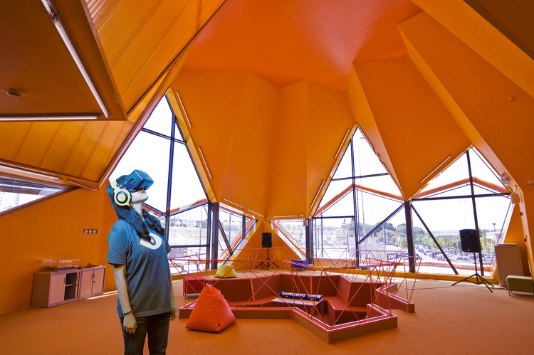
There's no question that virtual reality has the potential to change architecture. But as with all new technologies, it can be difficult to understand at first. In this article originally published on his LinkedIn page, Kym Porter answers five commonly-asked questions about VR in architecture.

There's a movement about to happen in the industry of design and architecture and it involves VR (Virtual Reality). I've been using it for well over a year now and thought I'd share five of the commonly asked questions I've received so far.

This Kickstarter Campaign Hopes to Fund a Coworking Space Specifically for Architects

As part of the current "sharing economy" revolution, coworking facilities have transformed the creative marketplace. Since 2005, when the first coworking space was founded in San Francisco, the popularity of working in a shared environment has taken off. Today, hundreds of coworking facilities exist in cities of varying sizes across the world, supporting small businesses ranging from app developers to furniture makers to recording studios. But how have they grown so quickly? It’s all in the community. WeWork, which owns a number of coworking spaces worldwide, sums it up as “a place you join as an individual, ‘me,’ but where you become part of a greater ‘we.'”

How My Trip to Jordan to Escape Design Rekindled My Faith in Architecture

Let yourself be silently drawn by 
the stronger pull of what you really love.

To the bewilderment of many friends, this quote by Rumi adorns the cover of my portfolio. It justifies my pursuit of a career in architecture instead of a more stable field. Although I teasingly explain that “architecture is chronic,” the quote still holds some truth.

As an architect, I thought I did my due diligence: working long, underpaid hours and late nights to build a solid portfolio. But, despite the recognition one’s work may receive, underpayment and employment uncertainty are considered part of the job. On the other hand, the diversity inherent to the profession promotes creative thinking and an aspiration to incite meaningful change; thus, it continues to ignite the imagination.

That’s why, when the opportunity presented itself in the summer of 2014, I took leave from work to visit the Middle East. Yes, that is correct. Having the opportunity to grow up in the East and then to live in the West, I know better than to submit to the media’s fear-inspiring propaganda. I figured that speaking the language and being a seasoned traveler would come in handy. So I set out on an expedition that not only reconnected me to architecture, but also led to one of the most meaningful projects I have worked on.

How My Trip to Jordan to Escape Design Rekindled My Faith in Architecture - Image 1 of 4How My Trip to Jordan to Escape Design Rekindled My Faith in Architecture - Image 2 of 4How My Trip to Jordan to Escape Design Rekindled My Faith in Architecture - Image 3 of 4How My Trip to Jordan to Escape Design Rekindled My Faith in Architecture - Image 4 of 4How My Trip to Jordan to Escape Design Rekindled My Faith in Architecture - More Images+ 13

Santiago Calatrava's WTC Transportation Hub to Open Next Week

Half of Santiago Calatrava's $4 billion World Trade Center Transportation Hub is set to "quietly" open next week, according to a report by Crain's New York. Heavily criticized for being seven years overdue and twice its original cost, the public project has been labeled a "symbol of excess" by some and a "legacy project" by others. Despite the criticism, its 355-foot-long operable "Oculus" is "breathtaking" says New York Times reporter David Dunlap.

“It is necessary,” Calatrava told Dunlap, “that public space prevail... A balance is struck at Grand Central Terminal, and it will be here." 

7 Reasons Why Transitioning to BIM Makes Sense for Small Firms

The benefits and capabilities of building information modeling in large-scale architectural practices are well known. But is BIM really necessary for smaller firms? Many small firms have been operating using traditional CAD methods for some time now, and switching technologies can seem a daunting task, especially for companies that operate on small budgets and without the specialized personnel of large international firms. But this is 2016 and the economic landscape has changed, with more and more expected from architects all the time. Time is more valuable now than ever. Where BIM software programs were once seen as simply nice to have, their large range of benefits have now made BIM an essential part of the design process. And as the following reasons show, BIM is just as important a tool for small offices as it is for larger ones.

A Virtual Look Into Eames and Saarinen's Case Study House #9, The Entenza House

This month's interactive 3D floor plan shows a simple and beautiful steel frame structure designed by Charles Eames and Eero Saarinen. The Case Study House Program, initiated by John Entenza in 1945 in Los Angeles, was conceived to offer to the public models of a low cost and modern housing. Predicting the building boom after World War II, Entenza invited renowned architects such as Richard Neutra to design and build houses for clients, using donated materials from manufacturers and the building industry.

Entenza was the editor of the monthly magazine Arts & Architecture, in which he published the ideas of the participating architects that he had invited. Two of those architects were Eero Saarinen and Charles Eames, who for Case Study House number 6, Entenza commissioned to design his own home. The house was built just a few meters away from Charles and Ray Eames’ house which the duo also constructed as part of the Case Study program.

BIG's 2016 Serpentine Gallery Design Revealed (Plus Four Summer Houses)

The Serpentine Gallery in London has unveiled the designs for this year's prestigious Serpentine Gallery Pavilion, designed by BIG, showing an "unzipped wall" which rises to a point above the entrance. In addition to the pavilion, this year the Serpentine gallery will host four smaller "summer houses" designed by Kunlé Adeyemi - NLÉ, Barkow Leibinger, Yona Friedman and Asif Khan. For these summer houses, the Serpentine Gallery asked the participants to take inspiration from Queen Caroline's Temple, a small, classical summer house near to the gallery that was built in 1734.

Read on to find out more about all five designs.

BIG's 2016 Serpentine Gallery Design Revealed (Plus Four Summer Houses) - Image 4 of 4BIG's 2016 Serpentine Gallery Design Revealed (Plus Four Summer Houses) - Image 6 of 4BIG's 2016 Serpentine Gallery Design Revealed (Plus Four Summer Houses) - Image 11 of 4BIG's 2016 Serpentine Gallery Design Revealed (Plus Four Summer Houses) - Image 13 of 4BIG's 2016 Serpentine Gallery Design Revealed (Plus Four Summer Houses) - More Images+ 13

The Paradoxical Popularity of Jean Prouvé's Demountable Houses

In this video, one of Jean Prouvé's famous 1944 demountable houses - in this case a 6-meter by 6-meter variation - is rapidly constructed on a beach, showing off the design's ruthlessly efficient structural system and sequence of construction. The video is one of a series in recent years, almost always published in a time-lapse format, that show off how quickly this early example of mass-produced, temporary social housing could be put together.

The video, as with others before it, is an interesting look at such an early example of small-scale modular buildings - but with the advances made in material and manufacturing technology in the 70 years since its design, the building is hardly a revelation in how to create buildings quickly and cheaply. So what's behind all this interest in the Prouvé demountable house?

Architectural Photographers: Ricardo Oliveira Alves

Architectural Photographers: Ricardo Oliveira Alves - Featured Image
Tree Snake Houses / Luís Rebelo de Andrade + Tiago Rebelo de Andrade. Image © Ricardo Oliveira Alves

From architecture to music, directing and production, Portuguese photographer Ricardo Oliveira Alves worked in several different creative industries before combining his two biggest passions and starting his own architectural photography studio, Ricardo Oliveira Alves Architectural Photography, in 2010.

Alves captures emblematic national architecture projects in addition to work by prominent architects worldwide, “fusing the vision of the architect” with that of the photographer. He is also known for his “Archilapse” videos, which feature timelapse montages of architectural works.

Read an interview with Alves and view a selection of his images after the break. 

Architectural Photographers: Ricardo Oliveira Alves - Image 1 of 4Architectural Photographers: Ricardo Oliveira Alves - Image 2 of 4Architectural Photographers: Ricardo Oliveira Alves - Image 3 of 4Architectural Photographers: Ricardo Oliveira Alves - Image 4 of 4Architectural Photographers: Ricardo Oliveira Alves - More Images+ 14

Making Sense of The Broad: A Milestone in the Revitalization of Downtown Los Angeles

Unlike most American cities, which spent the 20th century radiating out into suburbia, Los Angeles befuddles outsiders because it doesn’t really have a definite center. The phrase “LA” is loosely used to refer to a collection of small yet distinct cities across the Los Angeles basin that grew together over time. Traditionally, a handful of these localities have been the cultural centers and tourist destinations (Hollywood, Santa Monica, Beverly Hills, Silverlake, etc). While these districts thrived, “downtown” sat largely neglected; its financial towers and retail spaces had severe occupancy issues for much of the 90’s and 2000’s. Ten years ago, downtown street life outside of working hours was virtually nonexistent.

That fate was largely the result of poor urban planning. The tragic destruction of the vibrant Bunker Hill residential neighborhood in the 1960’s created a series of vacant freeway-flanked “superblocks” intended for ugly, efficient modernist towers - many of which never reached fruition. To this day, the area is still plagued with empty lots. Developers and architects have considered downtown as a risky return on investment ever since.

DTLA wasn’t just the butt end of jokes (Family Guy: “There’s nothing to do downtown!”) it was treated with disdain. Even Frank Gehry said on record that he wished the Walt Disney Concert Hall had been constructed 12 miles away in Westwood (near UCLA). He went on to add that he felt the current attempted revitalization of downtown was: “both anachronistic and premature.” Ouch.

Making Sense of The Broad: A Milestone in the Revitalization of Downtown Los Angeles - Image 1 of 4Making Sense of The Broad: A Milestone in the Revitalization of Downtown Los Angeles - Image 2 of 4Making Sense of The Broad: A Milestone in the Revitalization of Downtown Los Angeles - Image 3 of 4Making Sense of The Broad: A Milestone in the Revitalization of Downtown Los Angeles - Image 4 of 4Making Sense of The Broad: A Milestone in the Revitalization of Downtown Los Angeles - More Images+ 3

Alejandro Aravena Reveals More Details About the 2016 Venice Biennale, "Reporting From the Front"

The 2016 Venice Architecture Biennale, directed this year by Alejandro Aravena, have revealed more information about the central exhibition and associated projects which will be on display at a press conference today in Venice. According to La Biennale, 'Reporting from the Front' will form one single show spanning the venues of the Arsenale and the Central Pavilion in the Giardini, featuring work from 88 participants from 37 countries. Of these, 50 will be presenting work for the first time and 33 are architects under the age of 40. "Reporting from the Front" will share work from Architects tackling issues relating to segregation, inequality, suburbia, sanitation, natural disasters, the housing shortage, migration, crime, traffic , waste, pollution, and community participation.

AD Readers Debate: Calatrava's Dubai Skyscraper and a Failed Attempt to Reinvent Paris

Recent weeks have seen a period of big plans in the architectural world, with Dubai planning another show-stopping skyscraper, this time by Santiago Calatrava, and Paris looking to “reinvent” itself with a variety of entries to its government-led design competition. Naturally, such big proposals attracted the attention of ArchDaily’s commenters - read on to find out what they had to say.

Have Your Portrait Done in the Style of Your Favorite Architect-Artist with DeepArt

"Pardon my face," says designer Daniel Voshart in the opening to his latest blog post on Medium, "I’ve been throwing things into DeepArt’s algorithm for a few hours and the results are surprisingly good."

DeepArt is an online service created by Leon Gatys, Alexander Ecker and Matthias Bethge, Łukasz Kidziński and Michał Warchoł. It uses a neural network algorithm to combine the subject of one image with the style of another. It seems particularly adept at applying striking, abstract art styles to photographic images, which means that many of the twentieth century's most celebrated architect-artists are perfectly suited to it. So, if you've ever wondered what your portrait (or indeed anything else) might look like when drawn by Le Corbusier, Lebbeus Woods, or Daniel Libeskind, now might be the perfect time to find out. Voshart has kindly shared his examples of what DeepArt can do - read on to see more.

You've started following your first account!

Did you know?

You'll now receive updates based on what you follow! Personalize your stream and start following your favorite authors, offices and users.