1. ArchDaily
  2. Architecture News

Architecture News

ELASTICOFarm, Led by Stefano Pujatti, Wins the Italian Architecture Prize

Architecture studio ELASTICOFarm, led by Stefano Pujatti, has been awarded the Premio Italiano di Architettura (Italian Architecture Prize), promoted by the Triennale di Milano and MAXXI. The award, now in its fourth edition, is received in recognition of their S-LAB project, a new building in Turin, Italy, for the Istituto Nazionale di Fisica Nucleare (INFN). The prize highlights works of architecture with high design quality and an attentive approach to innovation and the social role of architecture.

ELASTICOFarm, Led by Stefano Pujatti, Wins the Italian Architecture Prize - Image 1 of 4ELASTICOFarm, Led by Stefano Pujatti, Wins the Italian Architecture Prize - Image 2 of 4ELASTICOFarm, Led by Stefano Pujatti, Wins the Italian Architecture Prize - Image 3 of 4ELASTICOFarm, Led by Stefano Pujatti, Wins the Italian Architecture Prize - Image 4 of 4ELASTICOFarm, Led by Stefano Pujatti, Wins the Italian Architecture Prize - More Images+ 13

"Liminality" by Neri&Hu Explores the Zone Between Theory and Practice at La Biennale di Venezia 2023

Neri&Hu presented “Liminality”, a multimedia exhibition selected by Lesley Lokko, at the International Architecture Exhibition in Venice. The exhibition took place in the Dangerous Liaisons section of La Biennale di Venezia at the Arsenale. In response to Lokko’s curatorial statement, Neri&Hu’s display explored the concept of liminality, the “zone” between design practice and theoretical exploration. The display consisted of three adaptive reuse projects that represent the practice’s research in “Reflective Nostalgia, Recasting Vernacular, and Ruinophilia/Future Artifact.”

"Liminality" by Neri&Hu Explores the Zone Between Theory and Practice at La Biennale di Venezia 2023 - Image 7 of 4"Liminality" by Neri&Hu Explores the Zone Between Theory and Practice at La Biennale di Venezia 2023 - Image 12 of 4"Liminality" by Neri&Hu Explores the Zone Between Theory and Practice at La Biennale di Venezia 2023 - Image 2 of 4"Liminality" by Neri&Hu Explores the Zone Between Theory and Practice at La Biennale di Venezia 2023 - Image 5 of 4Liminality by Neri&Hu Explores the Zone Between Theory and Practice at La Biennale di Venezia 2023 - More Images+ 8

The Spanish Pavilion at Expo Osaka 2025 to be Designed by Enorme Studio, Néstor Montenegro, and Smart and Green Design

The architecture and design practices Néstor Montenegro (EXTUDIO), Enorme Studio, and Smart and Green Design will be in charge of carrying out the designs of the Spanish Pavilion at Expo Osaka 2025. This comes after being selected in the public competition organized by the Spanish Cultural Action (AC / E), the institution responsible for representing the country in Universal and International Expositions.

Public Art Circuit Passages Insolites 10 Proposes a Retrospective Route to Explore Quebec City, Canada

The 10th edition of Passages Insolites is taking place from June 22 until October 9, 2023, bringing together artists from around the world. The public art circuit is presented by the City of Quebec and created by EXMURO arts public to showcase a retrospective artistic path through the city, recalling the event’s previous editions. The public art event takes place every summer in Quebec City in in the Place Royale, Petit Champlain and Old Port districts. This year, the event presents works of art from 40 artists, headlined by Felice Varini, who presents a monumental three-dimensional work at Place-Royale.

Public Art Circuit Passages Insolites 10 Proposes a Retrospective Route to Explore Quebec City, Canada - Image 1 of 4Public Art Circuit Passages Insolites 10 Proposes a Retrospective Route to Explore Quebec City, Canada - Image 2 of 4Public Art Circuit Passages Insolites 10 Proposes a Retrospective Route to Explore Quebec City, Canada - Image 3 of 4Public Art Circuit Passages Insolites 10 Proposes a Retrospective Route to Explore Quebec City, Canada - Image 4 of 4Public Art Circuit Passages Insolites 10 Proposes a Retrospective Route to Explore Quebec City, Canada - More Images+ 20

Studio Gang to Design the Clinton Presidential Center Expansion in Little Rock, Arkansas

The Clinton Foundation in Little Rock, Arkansas, has just announced a major expansion of the Clinton Presidential Center. The expansion will be designed by Studio Gang, with the aim to further the Center’s mission to engage and educate people about President Clinton’s values. Moreover, the project expansion will be further detailed in 2024, creating new essential programs in the development.

Studio Gang to Design the Clinton Presidential Center Expansion in Little Rock, Arkansas - Image 1 of 4Studio Gang to Design the Clinton Presidential Center Expansion in Little Rock, Arkansas - Image 2 of 4Studio Gang to Design the Clinton Presidential Center Expansion in Little Rock, Arkansas - Image 3 of 4Studio Gang to Design the Clinton Presidential Center Expansion in Little Rock, Arkansas - Image 4 of 4Studio Gang to Design the Clinton Presidential Center Expansion in Little Rock, Arkansas - More Images+ 2

The Design Process in Production Design: 8 Conversations About Sets, Props, and Locations

"I have a feeling we're not in Kansas anymore," Dorothy says to her dog in 1939's 'The Wizard of Oz' as she walks around, discovering a fantasy set in which, without realizing it, we find ourselves immersed. From the initial sketch to the construction of the sets, production design for film requires careful detail to truly bring visions to life and transport viewers.

In this combination of creativity, research, and collaboration, various production designers have approached us to share their adventures and design processes. The importance of creating a cohesive visual aspect, understanding language and styles, and translating all of this to the screen come together in the following series of 8 interviews we conducted with Annie Beauchamp, Luca Tranchino, Felicity Abbott, Jacinta Leong, Alexandra Schaller, Ina Mayhew, Amy Lee Wheeler, and Stefan Dechant.

Infographic: The Evolution of 3D Printing in Architecture, Since 1939

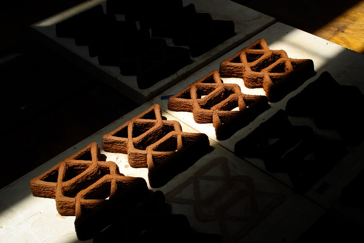
For many years, often spoken in tones of anticipation and excitement, we have heard that 3D printing will revolutionize the architecture industry as we know it. But if we stop for a moment, reflect on the present and look back at the past, it becomes evident that the technology has long been reshaping the field, continuously undergoing profound transformations and ushering in new eras of design, construction and spatial creativity. Operating as a layer-by-layer additive manufacturing process, 3D printing uses digital models to create customized three-dimensional objects with a remarkable level of precision and efficiency, saving time, generating zero waste, reducing labor costs and opening avenues for rapid prototyping and iterative design. It enables architects to explore creative opportunities and regain autonomy by designing complex, non-standardized elements within an industrial and mass-customized process.

Infographic: The Evolution of 3D  Printing in Architecture, Since 1939 - Image 1 of 4Infographic: The Evolution of 3D  Printing in Architecture, Since 1939 - Image 6 of 4Infographic: The Evolution of 3D  Printing in Architecture, Since 1939 - Image 5 of 4Infographic: The Evolution of 3D  Printing in Architecture, Since 1939 - Image 4 of 4Infographic: The Evolution of 3D  Printing in Architecture, Since 1939 - More Images+ 13

Durable Timber: Designing for Embodied Carbon Benefits in All Life Cycle Stages

 | Sponsored Content

Architects have always adapted their designs for the key building indicators of their time. After decades of focus on energy efficiency, embodied carbon is quickly becoming the key indicator for our next generation of buildings. Yet most of us are only beginning to understand the work of life cycle analysis (LCA), which is central to assessing the environmental impacts of building products both before, during, and after construction.

Theaster Gates’ Rebuild Foundation Transforms St. Laurence Elementary School into a Cultural Hub for Chicago

Rebuild Foundation, run by Artist Theaster Gates, is converting the St. Laurence Elementary School into a new 40,000 sq foot arts hub on Chicago’s South Side. The formerly vacant elementary school in Chicago’s local St. Laurence neighborhood has been reimagined to redeem indoor and outdoor spaces, making it a cultural hub. Set to open in 2024, the building's adaptive reuse expanded the program and the landmark into a place of exploration, entrepreneurship, and creative education.

Theaster Gates’ Rebuild Foundation Transforms St. Laurence Elementary School into a Cultural Hub for Chicago - Image 1 of 4Theaster Gates’ Rebuild Foundation Transforms St. Laurence Elementary School into a Cultural Hub for Chicago - Image 2 of 4Theaster Gates’ Rebuild Foundation Transforms St. Laurence Elementary School into a Cultural Hub for Chicago - Image 3 of 4Theaster Gates’ Rebuild Foundation Transforms St. Laurence Elementary School into a Cultural Hub for Chicago - Image 4 of 4Theaster Gates’ Rebuild Foundation Transforms St. Laurence Elementary School into a Cultural Hub for Chicago - More Images

Sustainability and Economy: Brazilian Houses That Use Solar Energy

In the face of the environmental crisis and the need to mitigate climate change, adopting clean and renewable energy sources, such as solar energy, in architectural projects is becoming increasingly imperative. As a country with abundant sunlight incidence throughout the year, Brazil has enormous potential to take advantage of this energy source, which has become an increasingly attractive and viable option in the Brazilian scenario. There are numerous benefits solar energy can provide to both residents and the environment that make it a popular choice for residential use.

Sustainability and Economy: Brazilian Houses That Use Solar Energy - Image 1 of 4Sustainability and Economy: Brazilian Houses That Use Solar Energy - Image 2 of 4Sustainability and Economy: Brazilian Houses That Use Solar Energy - Image 3 of 4Sustainability and Economy: Brazilian Houses That Use Solar Energy - Image 4 of 4Sustainability and Economy: Brazilian Houses That Use Solar Energy - More Images+ 9

24 Examples of Dithered, Halftone, and Other Illusion Patterns Used to Create Surface Gradients

Architects and designers are often looking for ways to make building facades and interior surfaces stand out from the crowd. But sometimes just the smallest change can have the biggest impact once you step back and see the whole picture. By employing an illusionary pattern such as dithering pixels or halftone dots, or by making subtle but intentional changes to the position or orientation of materials, flat surfaces can be transformed into curved, moving forms.

Halftone patterns work by reducing a solid surface of color into dots of decreasing size. As the dots gradually reduce to nothing, they leave nothing behind except a background color. The result is a flat surface with a gradient that mimics the shadows or highlights of a three-dimensional curve. Dithering, meanwhile, is the process of feathering multiple shades of the same color to blend them together. The effect allows designers to, on a large enough scale, create images with depth and curves, while using only a single color. Or even to create the illusion of an intermediary color.

24 Examples of Dithered, Halftone, and Other Illusion Patterns Used to Create Surface Gradients - Image 1 of 424 Examples of Dithered, Halftone, and Other Illusion Patterns Used to Create Surface Gradients - Image 2 of 424 Examples of Dithered, Halftone, and Other Illusion Patterns Used to Create Surface Gradients - Featured Image24 Examples of Dithered, Halftone, and Other Illusion Patterns Used to Create Surface Gradients - Image 3 of 424 Examples of Dithered, Halftone, and Other Illusion Patterns Used to Create Surface Gradients - More Images+ 28

Architect and Curator Jean-Louis Cohen Passes Away at 74

Architect, critic, and curator Jean-Louis Cohen passed away at the age of 74 yesterday, August 7. Recognized for his extensive research in the field of modern architecture and urban planning, he held the Sheldon H. Solow Chair of Architectural History at New York University since 1994.

Cohen served as a curator for various prestigious exhibitions, including some held at the Museum of Modern Art, the Canadian Centre for Architecture, the Centre Georges Pompidou, the Cité de l'Architecture et du Patrimoine, and the MAXXI. More recently, alongside Brazilian researcher Vanessa Grossman, he curated the exhibition "Geografias Construídas: Paulo Mendes da Rocha," which opened in May at the Casa da Arquitectura in Portugal.

Unveiling the Daily Life Inside BIG's IQON: A Visual Narrative by Pablo Casals-Aguirre

From the changing seasons to the users' interactions, there is almost an infinite set of facets of the architectural project that can be represented through film, and many photographers have entered into this dimension in different formats: documentaries, fixed camera, scripted performances or time-lapses, among others that you can browse in our video section.

European Cities Pass Regulations and Entrance Fees in Response to Tourist Overcrowding

Since pandemic-imposed restrictions have been lifted, Europe has experienced a surge in tourism, with millions of people visiting some of its most attractive destinations, such as Venice, Barcelona or Paris. The large number of visitors has proved to be a challenge for the cities, creating overcrowding and affecting the local population, urban development, and even the natural ecosystems surrounding the urban areas. In a bid to limit this influx, some of Europe’s most popular cities are taking various measures to address the overcrowding and the subsequent social and infrastructural issues. The measures include fines, entrance fees, and time-slot systems to impose some restrictions.

European Cities Pass Regulations and Entrance Fees in Response to Tourist Overcrowding - Image 1 of 4European Cities Pass Regulations and Entrance Fees in Response to Tourist Overcrowding - Image 2 of 4European Cities Pass Regulations and Entrance Fees in Response to Tourist Overcrowding - Image 3 of 4European Cities Pass Regulations and Entrance Fees in Response to Tourist Overcrowding - Image 4 of 4European Cities Pass Regulations and Entrance Fees in Response to Tourist Overcrowding - More Images+ 1

New Architectural Film Inspired by Wes Anderson Celebrates Singapore's Built Environment

Drawing inspiration from the visual style of acclaimed director Wes Anderson, known for films like "Asteroid City" and “The Grand Budapest Hotel,” this new architectural film chronicles the homeland and landscape of Singapore. Directed by Kevin Siyuan, this is the second volume of “A Wes Anderson-ish Singapore” released. Moreover, the 20-minute documentary will be previewed on Singapore’s National Day and focuses on the urban planning, architecture, parks, and the people of Singapore.

New Architectural Film Inspired by Wes Anderson Celebrates Singapore's Built Environment  - Image 1 of 4New Architectural Film Inspired by Wes Anderson Celebrates Singapore's Built Environment  - Image 2 of 4New Architectural Film Inspired by Wes Anderson Celebrates Singapore's Built Environment  - Image 3 of 4New Architectural Film Inspired by Wes Anderson Celebrates Singapore's Built Environment  - Image 4 of 4New Architectural Film Inspired by Wes Anderson Celebrates Singapore's Built Environment  - More Images+ 16

Masslab Wins Competition to Design Affordable Housing in Lisbon

The Portuguese office MASSLAB won a competition promoted by the Housing and Urban Rehabilitation Institute (IHRU, IP) for 100 affordable housing units in Lisbon. The competition aimed to integrate the new buildings with heritage values and the city’s urban fabric next to the Estrela Basilica.

Masslab Wins Competition to Design Affordable Housing in Lisbon - Image 1 of 4Masslab Wins Competition to Design Affordable Housing in Lisbon - Image 2 of 4Masslab Wins Competition to Design Affordable Housing in Lisbon - Image 3 of 4Masslab Wins Competition to Design Affordable Housing in Lisbon - Image 4 of 4Masslab Wins Competition to Design Affordable Housing in Lisbon - More Images+ 9

Seamless Transitions and Superior Insulation Through Frameless Glass Facades

 | Sponsored Content

In the past, glazed surfaces tended to be small and almost opaque; but this began to change throughout the years due to the growing trend of increasingly larger glass panes in construction. Accompanied by thinner frames, they dilute the boundaries between the inside and the outside, and have become ubiquitous in modern buildings. In fact, it is increasingly rare to find a contemporary work of architecture that does not include the remarkable presence of glass: this material is present in the most diverse architectural scales, and its transparency provides harmonious integration with the surroundings and generous natural light for buildings. Traditional systems with frames are still predominant, but frameless glass facades are gaining ground in specific architectural projects, as they create perfect connections between the glass and the structure of the building, resulting in a singular aesthetic with soft and harmonious transitions. By eliminating heavy frames, a project's aesthetics can be enhanced while also improving the quality of life inside.

First Nations-Led AKIN Team Wins Competition to Transform Sydney’s Waterfront

AKIN has been announced as the winning team in the Barangaroo Harbour Park Design Competition, a project that will transform a central location along the waterfront of Sydney, Australia. The winning team is a First Nations-led and Sydney-based ground composed of Yerrabingin, Architectus, Flying Fish Blue, Jacob Nash Design, and Studio Chris Fox, with Arup as engineering consultants. Through its designers, the group integrates Indigenous knowledge systems along with landscape architecture, regenerative design, public art, and place-making.

Powerhouse Parramata Museum by Moreau Kusunoki and Genton to Open in 2025

Powerhouse Parramata, Sydney’s new largest museum, has been announced to open in early 2025. The museum group overseeing the project sits at the intersection of the arts, design, science, and technology industries. Designed by Moreau Kusunoki in collaboration with local practice Genton, the museum will be located on the south bank of the Parramatta River in Western Sydney, acting as the largest cultural infrastructure project in the Australian capital city since the Sydney Opera House.

Powerhouse Parramata Museum by Moreau Kusunoki and Genton to Open in 2025  - Image 1 of 4Powerhouse Parramata Museum by Moreau Kusunoki and Genton to Open in 2025  - Image 2 of 4Powerhouse Parramata Museum by Moreau Kusunoki and Genton to Open in 2025  - Image 3 of 4Powerhouse Parramata Museum by Moreau Kusunoki and Genton to Open in 2025  - Image 4 of 4Powerhouse Parramata Museum by Moreau Kusunoki and Genton to Open in 2025  - More Images+ 2

The Symbolic Use of Color in Islamic Architecture

The Islamic Architecture style has a diverse history, spanning over a millennium, stretching from Western Africa to Europe to Eastern Asia. Beginning in early 7th century Arabia, this form of architecture emerged with the rise of the Islamic civilization. In fact, Al Masjid Al Nabawi, the first Mosque to ever be constructed was built in 622, in Medina, Saudi Arabia. Moreover, early Islamic architecture was influenced by the pre-existing styles around the region, such as Roman, Byzantine, and Persian qualities.

Today, Islamic architecture is known for its acute attention to detail, craftsmanship, and its spiritual symbolism. Furthermore, as color plays an essential role in architecture, influencing the emotional experience of the space, different colors have been utilized over the years in Islamic Architecture to evoke certain meanings. In Islamic Architecture, colors hold significant spiritual symbolism, reflecting the values and beliefs of the Islamic faith. Four core colors, Green, Blue, Gold, and White, are each used to convey various cultural, religious, and symbolic meanings.

Read on to discover the use of these colors in various Islamic architectural icons around the world.

The Symbolic Use of Color in Islamic Architecture - Image 1 of 4The Symbolic Use of Color in Islamic Architecture - Image 2 of 4The Symbolic Use of Color in Islamic Architecture - Image 3 of 4The Symbolic Use of Color in Islamic Architecture - Image 4 of 4The Symbolic Use of Color in Islamic Architecture - More Images+ 6

You've started following your first account!

Did you know?

You'll now receive updates based on what you follow! Personalize your stream and start following your favorite authors, offices and users.

In alliance with Architonic
Check the latest Architecture NewsCheck the latest Architecture NewsCheck the latest Architecture News

Check the latest Architecture News