How relevant is the use of color in architecture? Throughout history, we find various scenarios where color takes centre stage in its integration with the architectural work. Nowadays this is no exception. This is because colour is a medium that can be used to provoke deep and immediate emotions and reactions in the person observing. Because of this, colour plays an important role in the architectural reading, as it has the power to clarify the components that make it up or, on the contrary, to change the perception of the work or space.
The following list shows various Latin American housing projects that have had a particular approach to color in their composition. In them, we see the conception of color as the integrator of the work, or as a means of enhancing a particular element, be it interior or exterior.
Red
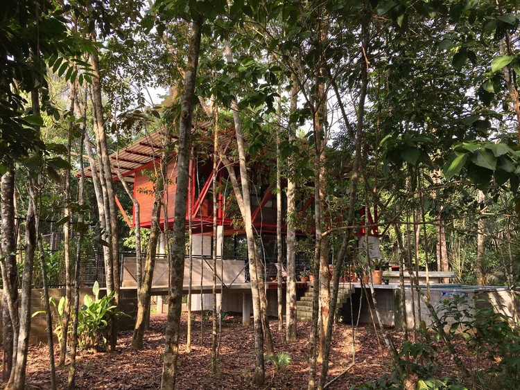
"The envelope is made of blood-red metallic cladding, which is widely used in Chilean colonial style houses".


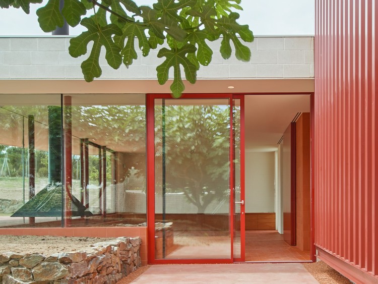
"From here you can see the back façade of the house, very sober and minimalist, with volumes offset from each other, with few small windows and all in clay-red behind dense vegetation. It is an invitation to discover the house which, from here, reveals little of what it has".


"The warm and soft atmosphere of the spaces have been achieved through the colours and textures used in the interiors, avoiding direct exterior light as much as possible."

Yellow
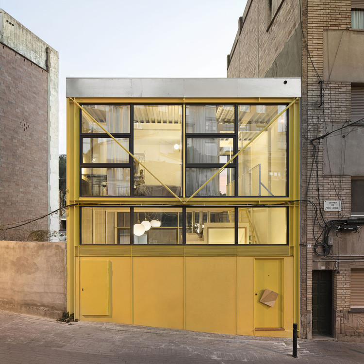
"In an attempt to make the house less serious, it was decided to paint it yellow, which is surprisingly cheerful, in harmony with the green of the landscape and the blue of the sky".


Green


"This decision emphasises the bright colours of the courtyards: green and yellow, which are only revealed once the access route to the house has been entered. The chromatic contrast enhances the importance of these transitional spaces between home and garden, while defining them as more domestic and independent from the rest of the façade".

"Beyond the load-bearing wall, the green strip chromatically divides the area between the living room and the dining room, contains elements of the installations and assumes pre-existing irregularities in the main structure of the floor".
Blue
"The light blue of the plaster is a traditional colour of the Baroque in Madrid, but also the colour of isolation, combining traditional imagery with the development of a culture of sustainability".

"The colours are used in a conceptual and sociological way, inspired by the bright colours of the facades of the local houses and their expression of joy and acceptance. The tones chosen are mainly bluish tones which, due to the condition of being between two bodies of water, seek to reproduce the multiple variants of tones coming from the sea and the lagoon".
"The sound, the light, the temperature, the materials and colours compose a subdued atmosphere, of low frequency, of more muted tones. If nostalgia wants to return to memory, let it be through recreating it in a present charged with new meanings".


Pink
"Its interiors, devoid of colour and texture, play the role of blank canvases. The atmosphere of the house comes from the colours, between the pink of the courtyards that bounces off and into the house, and that of the direct overhead yellow light that combines with the pink and averages the tones on these neutral surfaces. The result is the appearance of a soft warm atmosphere, changing according to the natural light and the passing of the day. These tones are modulated by small blue windows that intensify the colour variants and complement the warm tones".
"As for the finishes, we opted for a contrasting colour with the nature of the context, with the aim of creating a different atmosphere from the everyday in the city, as it is a house for a short period of rest, the pomegranate colour proposed on the upper floor both on the façade and in the interior corridors becomes the protagonist, leaving the interior living spaces in white".

"The house is entirely built in pink pigmented concrete, which allows it to subtly blend in with the mineral tones of the surrounding mountains".

"The shade of pink, complementary to the lighter matte side of an olive leaf, covers walls, floors and ceilings in a monochrome ensemble reminiscent of man's first home, the cave. The colours of the interior make the landscape become more vivid, defined and crisp".

"The central courtyard aims to break completely with the neutral colours of the interior of the original bays, with an intense Mexican pink, highlighting the colour of the woodwork and the tropical vegetation surrounding the space".

This article is part of ArchDaily's Topics: Aesthetics. Each month we explore a theme in depth through articles, interviews, news and artworks. Learn more about our topics. And as always, ArchDaily values the contributions of our readers. If you would like to submit an article or artwork, please contact us.


