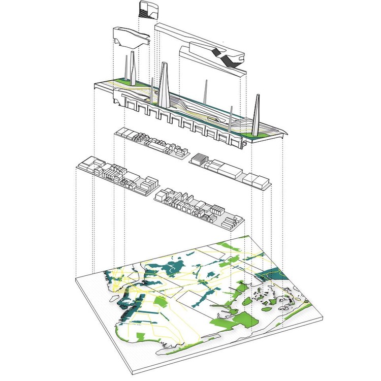
When we hear the term visualization, it’s likely that we picture a flashy render full of lights, people, dazzling finishes, and a sense of energy about the place that we are viewing. Aside from rendering a three-dimensional space, architects also need to develop their skills in the representation of intangible ideas that help drive the narrative behind their arguments. Instead of creating one-off concepts that are presented in a traditionally linear sequence, designers need to craft a story, structure their designs like a thesis, and consider how our presentations have the power to reveal the priorities of a project.

Spatial visualizations are just one of several tools that are used to craft a vision, but diagrams, data analysis, text, colors, and layout, are all just as important as the semi-literal imagery of the thing itself. Karen Lewis, Associate Professor of Architecture at The Knowlton School at Ohio State University is a subject matter expert in exploring how architects frame arguments through a variety of diagrammatic and data-based representations. In the first edition of her book, Graphic Design for Architects (Routledge, 2015), she provides in-depth tips and tricks for how architects can sharpen their graphic design skills and develop powerful arguments to express their design intent. Her work focuses heavily on the ways that architects convey their ideas not only to others in the profession but also the outward projection to the rest of the world interested in hearing what architecture has to say and the power for change that it can bring.

When asked about what trends in graphic representation she felt the profession was moving away from, Lewis commented that data visualization and the synthesis seems to be less popular than it once was, likely due to how ubiquitous it quickly became. “There was a time when the move was to simplify the information, but now we’ve swung to the far right of simplicity, that it’s become hurtful to the argument. What we see now is a call for complexity, but that we need to find a way to clarify, rather than simplify, difficult subjects. Especially given the current state of the world, information and the power to engage is so critical.” Lewis also recalled the political ads that Starbucks pushed towards their customers leading up to the United States 2008 Presidential Election. “At the time, it was an almost endearing idea that our coffee came with a side of political information, but now with the overconsumption of data that occurs in our daily lives, people are steering clear of the representation of numerical statistics in favor of something more complex,” adds Lewis.
As design trends and movements come and go, the way that we represent our ideas through portfolios has also experienced change as well. The once-popular hard copies of printed booklets are being swapped out for digital forms of representation, such as personal Instagram feeds and websites. The content of portfolios is also ever-evolving, and the intent has shifted away from showing that the author knows Revit or AutoCAD, and more about that they have developed the skill to draw in space, and know the implications of what every single line represents.
.jpg?1592491937)
The future of the physical model is also under the heavy influence of our analog and digital representations as well. With the advancement of 3D printers, laser cutters, and large format CNC machines, the physical model will follow suit and become less of a literal representation, and more of a diagrammatic tool. Models have the ability to show us much more than just the form at a minimized scale, and can push the boundary of showing the performative aspects of design work.
Lewis also offered three main pointers for designers to consider when crafting their stories. First, begin with the audience in mind. Think about what information needs to be shown so that you are the one shaping the argument. Second, it’s important to represent yourself, inject a bit of your personality into your representations, and be proud of what you’re sharing. It’s great to use other designers for inspiration, but make sure that your work speaks to your interest and represents your voice. Lewis noted that her personal inspiration comes from a variety of colors and typefaces. Last, lose the idea of grouping similar drawings together, and instead think about the structure of the narrative. Arguments usually need more than one type of drawing to make a case, so don’t hesitate to mix things up even if it initially feels out of order.


