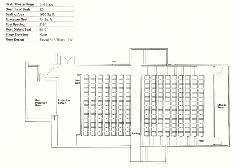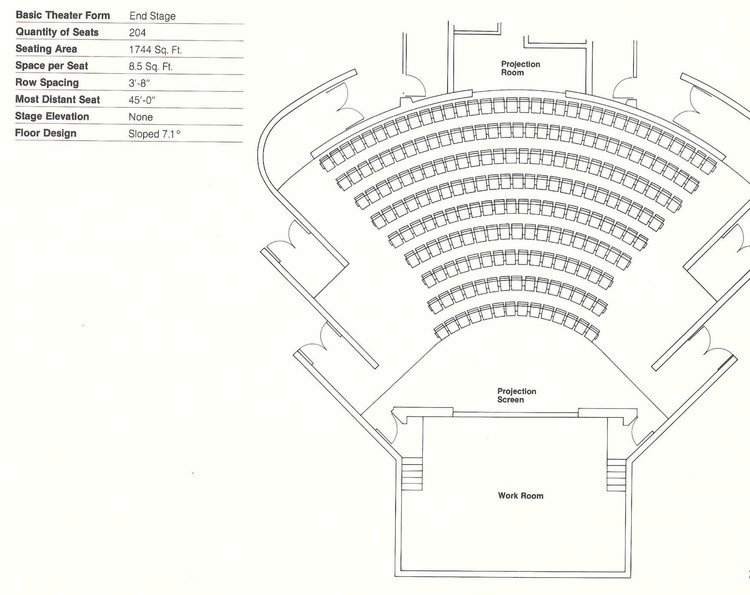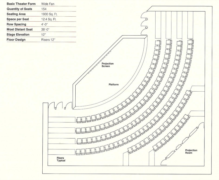
Audience sightlines, accessibility and acoustics all make theater seating a hugely precise art. As part of their set of online resources for architects and designers, the team at Theatre Solutions Inc (TSI) have put together a catalog of 21 examples of theater seating layouts. Each layout is well detailed, with information on the number of seats, the floor seating area and row spacing. These layouts fall under three general forms; to supplement this information, alongside TSI's diagrams we've included the pros and cons of each type, as well as examples of projects which use each format. Read on for more.
1. End Stage

In the End Stage form, the entire audience faces the stage in the same direction. Sightlines are kept simple, making these layouts perfect for lectures, films and slide-based presentations. They also fit well into conventional rectangular plans.

However, End Stages are not overly successful at creating a close relationship between performer and spectator. Theatres in this form also can’t be too large due to acoustic limits.
Examples:
The Blyth Perfoming Arts Centre / Stevens Lawson Architects


Municipal Theatre of Guarda / AVA Architects

2. Wide Fan

In this form, theatre seats are placed within a 130-degree angle of inclusion. This brings in the audience closer to the performer, establishing a more intimate experience.

This angling also means that the form is better geared towards speech-related performances. Film presentations would be trickier in these spaces, with screens requiring proper positioning – perhaps further back from the stage, to compensate for seats that find their sightlines distorted.

Examples:
National Grand Theatre of China / Paul Andreu
.jpg?1479294174)
Ulumbarra Theatre / Y2 Architecture

Limoges Concert Hall / Bernard Tschumi Architects

3. ¾ Arena

¾ arenas see a 180-270-degree angle of inclusion. Hearing and visual contact between spectator and performer is improved, and as audience members can see each other when facing ahead, the sense of inclusion is increased even more.

However, conventional film presentations are almost impossible and would require an alternative screen layout, such as a number of smaller screens arranged throughout the space.

Examples:
Han Show Theatre / Stufish Entertainment Architects

Dee and Charles Wyly Theatre / REX + OMA
.jpg?1479294234)
Hardelot Theatre / Studio Andrew Todd

4. Other Layout Options
While the above three tend to be the most common forms of seating layout, they are by no means the only ones. Further options include Arena seating where the audience wraps around the stage a full 360 degrees, common for extra-large theaters like the Royal Albert Hall, and the Vineyard style where seats are arranged in cascades of mini-blocks of varying levels, including the rear of the stage, as seen in the Hamburg Elbphilharmonie.

Or even more differently, Bijlmer Park Theatre is a hybrid between End Stage and ¾ Arena, with flexible pull-out seating turning it from one to another, while The Wave’s seating takes after its namesake.
For more detail on designing auditoriums, including info such as seat spacing and the slope of the auditorium, check out TSI's comprehensive article here.
Originally published on November 16th, 2016; updated on November 4th, 2019.


