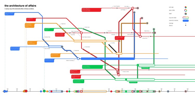
What type of architecture do dictators prefer? What would a subway map of the affairs of famous architects look like? What is the current state of gender and ethnic diversity within the profession? Which architects would win a color war, Dutch or American? Archi-Graphic places architecture on the operating table, using infographics to cut a visual cross-section that answers these questions and many more.


I began this project in the spring of 2013 because I was desperate to read this kind of book, and I had found no other resource quite like it. The intention behind Archi-Graphic is that knowledge of the richness and complexity inherent in the discipline and profession of architecture can become an accessible and even desirable pursuit for architects and non-architects alike.

This book aims to be educational without being especially didactic, and though it embraces certain serious themes, it is not so severe that it can’t poke fun at itself once in a while.


Archi-Graphic peers into issues within architecture that are rarely if ever tackled in an accessible way: big personalities, color relationships in the built environment, gender and ethnicity in the profession, construction expense, even death, are visually revealed through colorful infographic diagrams.


My hope is that people will be drawn to this book first because of its graphic quality, but will ultimately enjoy it because of its compelling content and inherent complexities.


What other architecture book provides a map of every project that Le Corbusier ever built and in the location and order that he built them, presented to us as the flight of a bird? If you enjoy architecture, graphic design, art, information graphics, or simply love visual complexity, this book should suit you well.
Laurence King is offering a 30% discount for ArchDaily readers when they purchase Archi-Graphic through their website and use the discount code ARCH30. Visit their site here.


