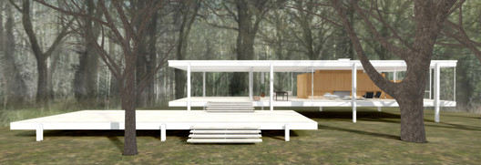
A Virtual Look Into Mies van der Rohe's Farnsworth House

Farnsworth House, the temple of domestic modernism designed by Mies van der Rohe as a weekend retreat for a Chicago doctor, is one of the most paradoxical houses of the 20th century. A perfectionist mirage, it floats like a pavilion in a park, but its history has been beset by plagues, floods and feuds. As the second installment of a series of three modernist classics presented by Archilogic, we’ve modeled the Farnsworth house so that you can see if—in spite of its austere reputation—it can be lived in after all. In this model you can explore the spatial arrangement of the house, and refurnish it with Eames chairs, deck it out with your IKEA favorites, or booby-trap it with children’s toys.

Courtesy of Archilogic

The standard account of the Farnsworth House is well known. Edith Farnsworth, a prominent nephrologist, commissioned the house from Mies for a property on a (then) relatively isolated floodplain on the Fox river. As the early letters between client and architect attest, the house was to be a relaxed refuge for the cultivation of the self—for translating poetry, playing music, that kind of thing.

The architectural ambitions for the house, however, were pitched high from the beginning. Even before construction the plans were exhibited at the Museum of Modern Art in 1947 (by Philip Johnson, who later did his own knock-off). All the elements of a story are there: a rumored romance between architect and client, a public falling out, and a controversial court case (see Sex and Real Estate, Reconsidered: What Was the True Story Behind Mies van der Rohe's Farnsworth House?).

Courtesy of Archilogic

Although the materials do not conceal their industrial origins, the precision of the composition, and the level of finish is designed to convey a sense of carefully controlled luxury. Everything is done to make the building appear weightless. The white metal stanchions do not reach the line of the roof, hinting at the aesthetic order of a Greek temple, whose columns sit below the entablature.

Dr Edith Farnsworth’s furnishings on the upper terrace of the House. Courtesy and copyright of Newberry Library, Chicago, Illinois

Take only one visual subtlety that Mies employed: the roof itself is exactly as thick as the floor plate, fifteen inches. Yet the floor, filled with aggregate and dressed in travertine, is much heavier than the roof. There’s no structural reason to make them the same depth, but it helps reinforce the illusion that the building floats in the landscape, that it is tethered to the ground by its white columns, rather than held up by them. The promise of the house to float is perhaps best fulfilled by its appearance during the floods that periodically cause the Fox river to burst its banks. When the initial plans were made, the stilts held the house safely above the highest recorded flood levels, but as Chicago has expanded and the climate has changed, it is a regular victim of inundation (and it’s been expensively restored several times after being filled with mud).

Flood waters surround the Farnsworth House. Image via National Trust for Historic Preservation.

Like Philip Johnson’s Glass Hhouse, which it directly inspired, the Farnsworth house is exceptionally photogenic. It lives in perfect symbiosis with photography, the interior revealing itself to the voyeuristic x-ray eye of the camera. However the most interesting photographs of the Farnsworth house might not be those that show it in its purist glory. Rather, they are those from the later occupancy of Dr. Edith Farnsworth herself, struggling to assert her identity over that of the buildings. Those photographs that show the insect screens and TV aerials, the flood damage and rust, like the classic photos of the Villa Savoye as a ruin, perhaps carry more appeal than the building in its current uninhabited perfection.

Courtesy of Archilogic

The day-to-day disadvantages of such houses are obvious, but rarely commented on. At night, the inhabitant of such a house is visible to everything that lives in the forest, but they see nothing.  As House Beautiful reported, Dr. Farnsworth described feeling “like a prowling animal, always on the alert.” The plagues of mosquitos that attacked the house from the meadow probably didn’t help her sleep much, either.

Courtesy of Archilogic

Archilogic’s model helps reveal the spatiality of the Farnsworth house in a way that photography cannot. The central core of the house, the opaque wooden obelisk that screens the kitchen and contains the bathrooms, shows itself in the Archilogic model to be a kind of grand daddy to the now ubiquitous kitchen island, the static centre around which everything circulates. Mies often favored a kind of pinwheel floorplan, in which the plan might look flexible, but came with strong serving suggestions, not only about what furniture to use, and what to wear, but also what direction to walk in. As a walk around the Archilogic model clearly shows, although all the zones of the house are interconnected, crucial lines of sight are blocked by the wooden core. As transparent as the house may be, the bedroom is not visible from the front door, nor can the living room be seen from the kitchen.

Courtesy of Archilogic

Archilogic’s model allows you mess with Mies’ purity. You can refurnish the house like you’re an Eames in your dreams, or Dr Farnsworth herself. Click on the square brackets at the bottom right to go full screen. Build walls of cupboards to separate the bedroom from the living room, or improvise a sophisticated campsite on the terrace. Archilogic’s engine allows you to interact with the model, rather than just gawk at it, so go ahead and make your own domestic heaven or hell.

Start the tour above, or via this link. The animation will guide you through different aspects of the building and will finally leave you to furnish your Farnsworth House.

  • The camera icon will repeat the animation. 
  • The floorplan, dollhouse and person icon change the viewing mode. 
  • The black menu bar on the right provides most importantly the account, interior and sharing menu.

Don't miss Archilogic's Virtual Look Into The Eames Case Study House #8.

About this author
Cite: Adam Jasper & David Tran, Archilogic. "A Virtual Look Into Mies van der Rohe's Farnsworth House" 24 Jul 2015. ArchDaily. Accessed . <https://www.archdaily.com/770612/a-virtual-look-into-mies-van-der-rohes-farnsworth-house> ISSN 0719-8884

Courtesy of Archilogic

对密斯·凡·德·罗设计的范斯沃斯住宅进行虚拟装饰

You've started following your first account!

Did you know?

You'll now receive updates based on what you follow! Personalize your stream and start following your favorite authors, offices and users.