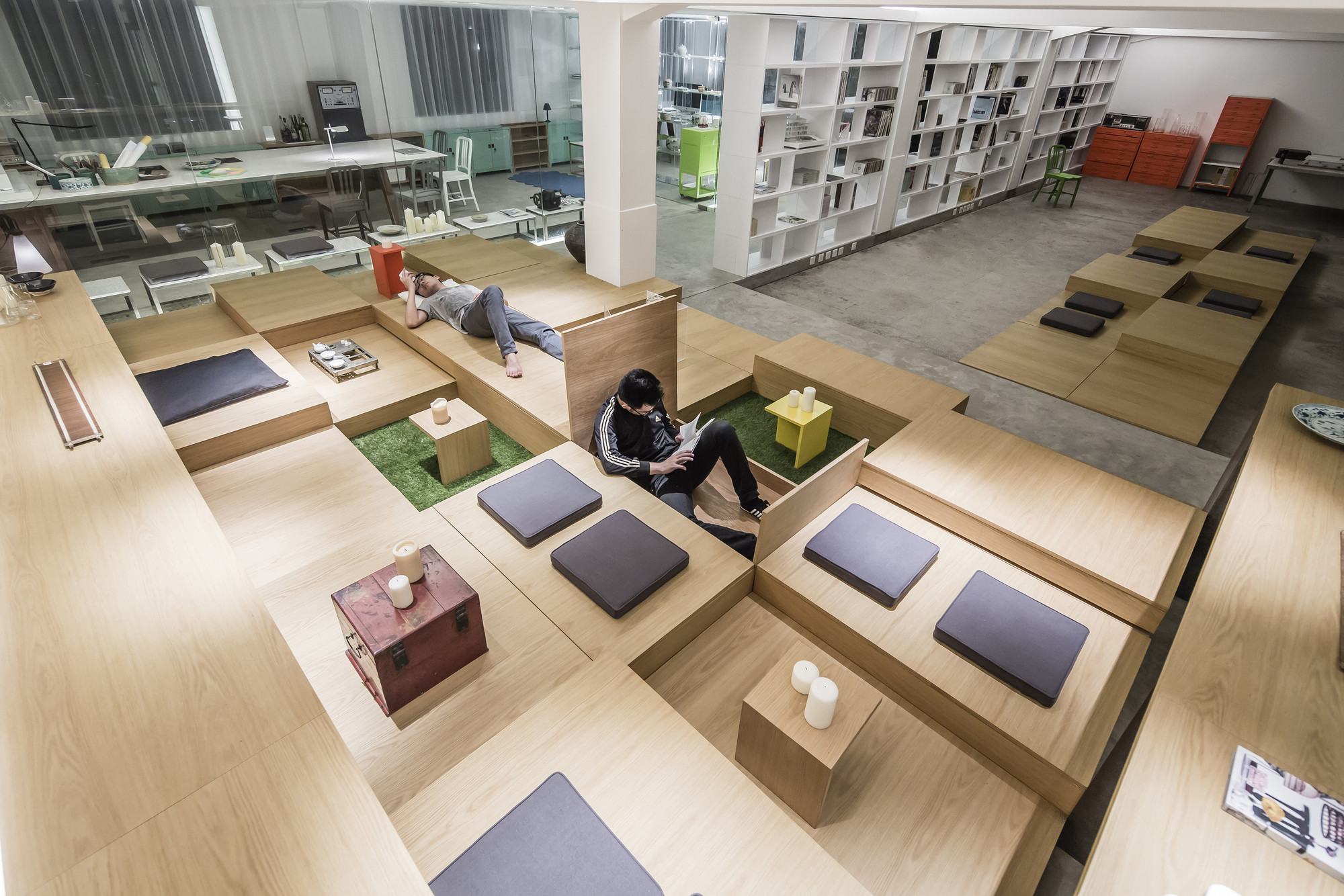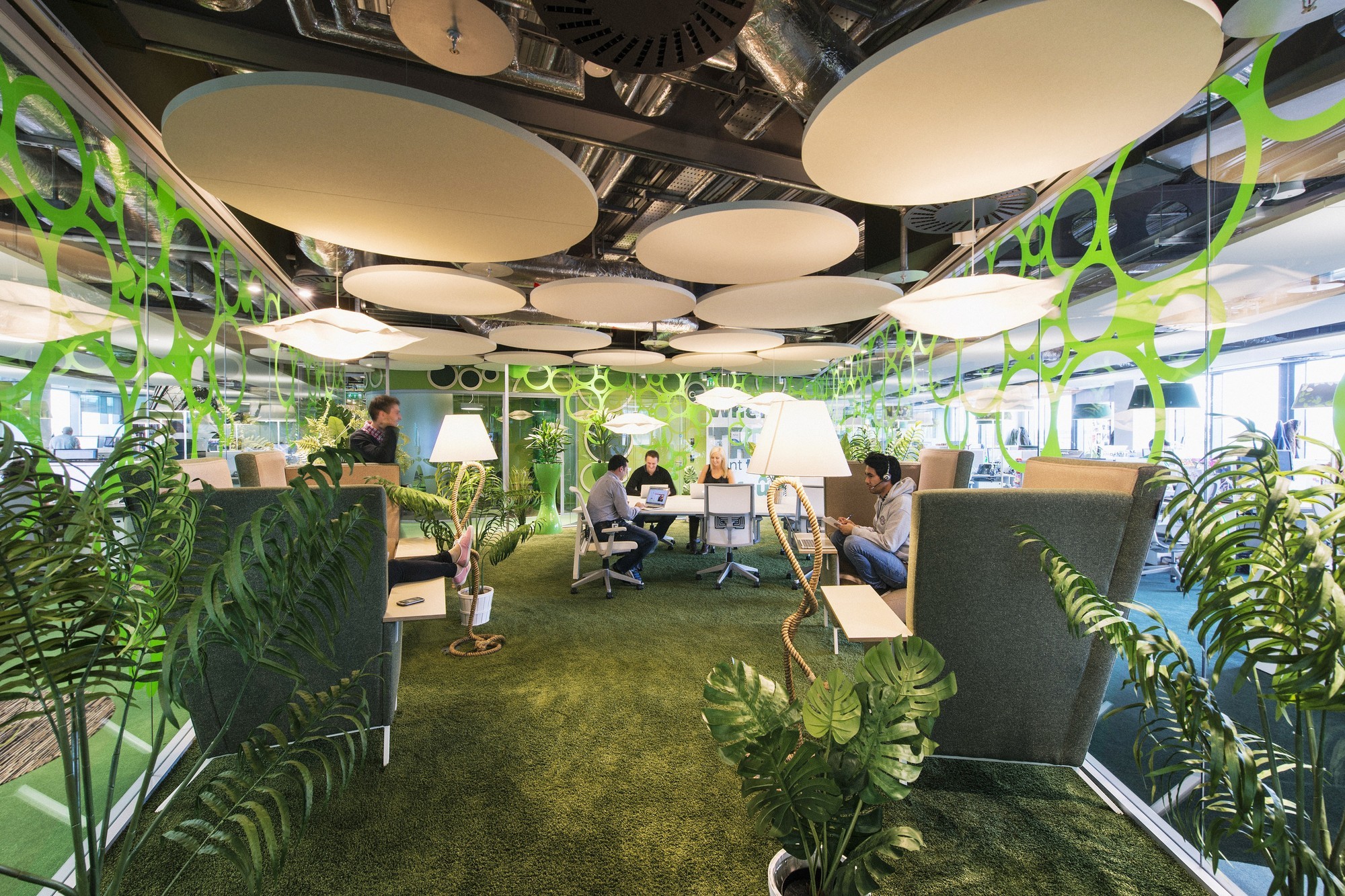
Workplace design has undergone a radical transformation in the last several decades, with approximately seventy percent of today’s modern offices now converted to open plans. However, despite growing concerns over decreases in worker productivity and employee satisfaction, the open office revolution shows no sign of slowing down. The open office model has proliferated without regard for natural differences in workplace culture, leading to disastrous results when employees are forced into an office that works against their own interests. If we are to make offices more effective, we must acknowledge that ultimately, design comes out of adapting individual needs for a specific purpose and at best, can create inviting spaces that reflect a company’s own ethos.

The concept of the open plan had noble beginnings in architecture and promised natural light, flexible space, and freedom from oppressive walls and rooms. Many companies have adopted open office plans in order to promote the values this layout supposedly represents such as transparency, collaboration, innovation, and even egalitarian visions where the CEO shares a desk alongside his employees. But despite all of their supposed benefits, a number of studies have revealed the downsides to open plan offices. In one such study, organizational psychologist Matthew Davis found that “though open offices often fostered a symbolic sense of organizational mission, making employees feel like part of a more laid-back, innovative enterprise, they were damaging to the workers’ attention spans, productivity, creative thinking, and satisfaction.” Another study found even more extreme repercussions of the typology, revealing that as the number of employees working in a single room increased, employee attendance correspondingly decreased with those working in fully open offices out sixty-two percent more than those in single offices. [1]
So why do open plan offices perpetuate in the wake of so much criticism and research-backed evidence against them? The answer first and foremost lies in their economic advantages. The purported benefits of the open plan office often mask their underlying function – to cut down on real estate costs by cramming the maximum number of employees into the minimum amount of space. As workers spend less and less time in the office due to the proliferation of mobile devices and the ability to work remotely, corporations are less willing to spend money on partially filled offices. Therefore, the shift to open plan offices could be a very smart decision on the part of employers in terms of saving on operating costs, but it raises questions about how work actually gets done in the office environment.

In some settings, open workplaces may have a particularly positive impact if individuals can gain from increased social interactions. In creative environments that thrive on interaction and learning from colleagues, the positive aspects of open plans may even outweigh the negative consequences of decreased productivity. Many corporations seek to physically demonstrate their company mission and continue to believe that open layouts encourage employee interaction. Technology companies in particular often design their offices in the spirit of many startups, which have open flexible plans to accommodate rapid growth. Facebook's mission, as stated by Mark Zuckerberg is "to make the world a more open place" and this ethos is reflected in their office designs, with their new headquarters designed by Frank Gehry expected to house the world’s largest open office. Google also has an office design that embodies their corporate personality and appropriately caters to the demographic of their young employees.

Many of the complaints arising from open offices may be due to the fact that the design has widely proliferated in the last decade with very little consideration to individual workplace needs. In response to an inflammatory article criticizing the open office trend supposedly inspired by Google, Kay Sargent writes “Any headline that says “Google got it wrong” is bound to catch attention. But we don’t think that Google gets it wrong. We think Google gets it right—for Google. The folks who get it wrong are the ones who try to slap Google-like space and policies onto their own organization without understanding what it is that they really need.” A company that thrives on collaboration and creativity would logically have a very different work environment than a more traditional business practice in which work can be completed independently. However, the enormous success and glamour associated with startups in recent years has driven even the largest corporations to mimic office designs of their smaller counterparts, regardless of whether or not it suits their workplace culture.

There are numerous ways to achieve the purported benefits behind open offices in ways that simultaneously create positive workplace interactions, inviting offices, and even act as metaphors for a company’s vision. Steve Jobs, for example, was one of the earliest proponents of designing the offices of Pixar to enhance spontaneous collaboration. Designed in the late nineties when cubicles were still very much the norm, Pixar’s headquarters includes an expansive atrium which acts as a central hub for a building that includes offices for computer scientists, animators, and others. Making the decision to move employees from all different departments into a single building was important to Jobs as he believed that the chance encounters prompted by the atrium space could prompt innovation, a sentiment often heard about the open plan office. The Pixar headquarters differs from many of today’s offices, in that most of the offices are private and arranged in a U-shaped plan around a central meeting area. Pixar had experienced the distracting environment of cubicles in their previous headquarters, and thus had chosen to create private offices for their new building while effectively creating a collaborative environment. CEO John Lasseter declared the inherent success of the building when he stated “…I’ve never seen a building that promoted collaboration and creativity as well as this one.” This building may serve as an example which successfully embodies a corporate ethos and enhances collaboration, all while managing to avoid the difficulties with open offices. [2]

Creating common circulation spaces that encourage or even force workers to interact on their way to their desks is another means by which companies attempt to enhance workplace culture. Similar to the strategy of the atrium in Pixar’s office, the Bloomberg headquarters in Manhattan establishes an area called “the link” through which every worker and visitor must pass to proceed to the other floors. Additionally, elevators do not stop on every floor, which forces employees to take stairs through parts of the workplace they may not otherwise see and encourage interactions with those in other departments. Unlike Pixar, however, Bloomberg’s offices employ a completely open floor plan with glass conference rooms to create visual continuity across the entire space. Their office design thus acts as a physical metaphor for their corporate goal of creating more transparency in the marketplace. According to an article by Seth Stevenson, the employees at Bloomberg are surprised at how often they bump into their colleagues throughout the day and this increased interaction prompts individuals to gain a better sense of everything taking place at the company. Additionally, as Bloomberg invests in and works with the founders of many startups, they have found success in adapting the open plan to a larger scale thanks to the ways in which it allows people to collaborate across disciplines and easily check in with colleagues about upcoming deadlines.

Other workplace design strategies include bringing places and activities present in many people’s daily lives into the office itself, possibly to encourage people to work in the office rather than at home in an age of online meetings and mobile connectivity. Google offers areas for yoga classes and other recreational activities within their offices, whereas Square’s new San Francisco offices are designed to work like a city, complete with “avenues” and a “town square.” Their wide hallways feature large tables and restaurant style booths for collaborative work or informal meetings, and a coffee bar in the middle functions to draw people from the entire office together for casual meetings. Taking the metaphor of a city a step further, Square has even been experimenting with bringing pop-up stores and artisan merchants into their offices, a feature which references the kinds of businesses that employ the company’s mobile payment system. Additionally, their office design varies across cities, with an office in Japan incorporating tatami rooms for meeting places and giving each office a unique sense of “place” - and thus further adapted to fit a specific workplace culture. [3]

Instead of working to perpetuate mundane offices that copy each other with row after row of desks, designers should promote greater flexibility within open plan environments and adapt workplace design to a company’s individual culture. Gensler’s 2013 Workplace Survey reveals “Across industries, we found that balanced workplaces—those prioritizing both focus and collaboration—score higher on measures of satisfaction, innovation, effectiveness, and performance.” This could explain the emerging trend of “hybrid” workspaces which often utilize movable furniture systems and couches that offer comfortable environments for workers to meet in small groups or individuals to retreat for focused work. This is one step towards designing offices that offer a greater variety of spaces, but in too many cases these hybrid designs are simply a formulaic application of three or four different types of work area, which still don't take into account the specific needs of each office.
True hybrid offices should be informed holistically by a company’s workplace goals and go beyond the implementation of simple furniture systems. In the case of Pixar and Bloomberg for example, their desire to increase spontaneous employee interaction was addressed through architectural decisions such as defining unique circulation patterns and designating gathering spaces to bring everyone in the office together at various times throughout the day. These offices in particular do not attempt to implement the open plan as the only way of encouraging communication and transparency, and rather, these ideals are visible throughout the space and speak to corporate identity and unique ways of working.
For too long office designs have adopted a singular model, and if modern work environments are to truly be successful they must adapt to a multitude of working styles present in an increasingly digital age. Office designs such as Google’s become synonymous with a specific corporate culture unique to Google, while Square’s offices seek to create a dynamic workplace inspired by the urban culture in which their products thrive. These designs distinguish themselves through purpose-driven strategies that create engaging environments with varying spaces, thus ameliorating many of the issues stemming from uniform and faceless open plans. Most importantly, the new workplace ideal should not rely on a collection of buzzwords to foster innovation, because ultimately, design with intent is the only way to save the modern workplace from becoming a place of dread.
References:

