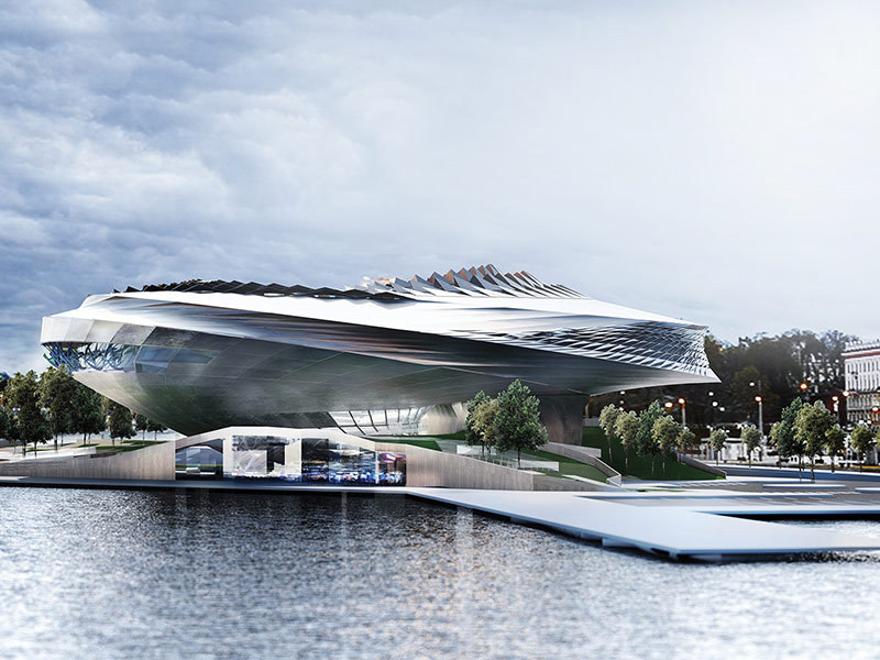
The following analysis of the Helsinki Guggenheim competition entries was contributed by Federico Reyneri, partner at LPzR associates architects, and his research team.
Architects have always pushed the limit, often experimenting with forms and technologies unavailable in their time. In the last 20 years, we experienced a small revolution in thinking about spaces and embracing complexity, as computers started to show their real power. Since Gehry’s Guggenheim came to life in the mid nineties, nothing has been the same: free forms emerge everywhere from the dreamland to reality (often becoming someone else’s nightmare). Before this computer technology, except for the realm of the mind and clay modeling, real control over complexity through technical drawings was too hard a game for us ordinary mortals but eventually, in the last 10 years or so more powerful and cheaper computers and even cheaper software, capable of astonishing parametric-generated design elements, came out. Since then, new generations of designers have started to set free mind-blowing ideas, showing the world amazing computer generated pictures. Some architects even started to build them.
But how widespread is parametric design technology? How does it influence architecture worldwide? We started to analyse the Guggenheim Helsinki Design Competition, the largest architectural design competition in world history.
Thanks to the Finnish urge for transparency, for the first time we can see all the entries (even if this is just two images and a few words for concept summary). It is a unique chance to get a glimpse of so many ideas on the same brief.
With a lot of patience and dedication we have scrutinized the tremendous number of submissions, and got several predictable confirmations and some surprises. Did anyone spot the two that are the same? GH-103959685 and GH-86115389 are in fact identical. So the total number of unique proposal is 1.714 and not 1.715 as it has been claimed.
RENDER / IMAGE QUALITY
First of all we inspected every render and gave each a mark for its quality. Although evaluating a project with two images only is not possible (and we’re not the jury!), for higher ranking levels our judgement has also been affected by design. As the goal was to get a “visionary design”, already-seen-design and ordinary design unavoidably got lower marks.
We established four grades: “very poor”, “poor”, “good” and “very good”, considering that “good” and “very good” had to at least meet the minimum standards for an international architectural competition, while “poor” and “very poor” do not:
- Very poor: The image is not clear and it does not show the design process. The arrangement of spaces is not comprehensible and it is hard to read the design materials. The choice of the points of view is meaningless and the scene lighting is unreal.
- Poor: The image can be interpreted easily. It shows a possible picture of the building interiors or exteriors. Lighting is simple and it is related to shadows. The materials representation lacks control over basic parameters (reflection, refraction, transparency).
- Good: The image is clear and points out several building features. From the picture we can infer the surrounding space beyond the shown image. Lighting is totally related to the environment and there is a good affinity between outdoor and indoor spaces.
- Very Good: The representation clearly raises the design quality. The material is properly shown and is in perfect relation with the structure. The image composition involves a large quantity of elements that enrich the space. It is possible to completely understand the volumes’ placement even out of the picture. Some visual effects are added to make the project more appealing.
Our research has confirmed the comments by several critics: a dramatic 73% not even barely passed the quality test, pretty equally divided into “very poor” and “poor”.
PARAMETRIC EFFECT
How many architects used parametric design to reach their claimed “visionary design”? Not that many. We found evidence of parametric design in 10% of the overall entries.
Parametric design (also called generated design) is basically shown in two ways, which can sometimes be combined together: object based geometry population (also called propagation) and parameter-generated geometry.
The former is easier and it starts from a given form, using the software to populate desired geometries over the surface of that form. We called it “parametric pattern”. The latter creates forms following constrains and parameters. It’s harder to learn and manage but it’s a more powerful tool. Forms generated with this process are often integral part of the design concept. We called it “parametric shape”.
As shown in the graph above, parametrically designed proposals are included in every category. However, if we take a look at the percentage ratio we can see that almost 30% of the very good projects were designed with parametric software, while the very poor ones had a usage rate of only 4%. In between we have the good and the poor, the former getting almost 20% and the latter only a little over 10%. In conclusion, we notice an increasing use of parametric design as the quality of the examined images is getting higher.
Among all proposals showing evidence of generative software, a total of 65% used parameter-generated geometry, using parametric design in a deep way for making forms. A good number of them also used it for different design elements such as surface patterns. Therefore it looks like the majority of teams using a parametric approach did it in the most interesting way.
But when we take a look at the percentage ratio we realize that the use of parametric design is deeper among the very good projects, showing 70% usage under both (shape and pattern), 10% usage under shape, while only 20% of them used pattern alone. These values are reversed when we analyse the very poor projects, which mainly adopted the generative method for a superficial approach: 50% of them used exclusively pattern, 30% used shape and only 20% used both. Poor and good projects have comparable values, each with 45% both, 20% shape and 35% pattern. Therefore, the most interesting use of parametric technology (both shape and pattern) shows an ascending trend with the quality of projects, as in previous graphs.
Once again, parametric software is used in a more accurate way for very good projects, unlike the very poor ones, being decisive to the appearance of architecture.
In the following projects, each belongs to a different quality rate given by us. Here we understand how parametric software can apply the same algorithm, but achieve different results, some more complex than others.
In the first image, belonging to the very poor projects, something like the triangulation algorithm was used simply as a surface pattern, and it has almost no impact on the architectural design.
The following projects, poor and good, again show the triangulation algorithm: it is used to define form itself, and becomes a deeper part of the design process. The building does not look the same once we imagine it without it. Nevertheless overall form of building is still organised in traditional way.
While the previous projects have a shallow parametric software approach, the last one, a “very good” project, shows the use of parametric tools at a much higher level. The algorithm here is an essential part of the design process, defining the shape and the structure of the building: a spiral made by triangles that gently embrace the inner courtyard. This would have been hard to conceive without Grasshopper or similar software.
CONCLUSIONS
When parametric software was used in very good projects, the project had a better outcome, showing a more interesting shape and a higher quality of representation. On the other hand in the worst projects, even if parametric software had probably been used, it was meaningless or at least not effective.
But is better quality connected to parametric software? Or are better teams capable of managing the hardest tools? And are parametric-shaped designs a must to achieve the so called “wow-effect”, better called “visionary design”?
Research continues...
POSTSCRIPT
After this research project was completed, the six finalists for the Helsinki Guggenheim Museum were unveiled, answering the question: "How much does generative design count?"
Apparently not at all, as the finalists show no obvious signs of generative design. Perhaps this is the beginning of a new stage in architectural design, more mature, in which design tools serve the idea and not the contrary. If this competition is any indication of design trends, it seems that parametric intoxication is finally over.
Federico Reyneri is an architect and partner at LPzR associates architects (Italy). This article was written with the collaboration of Maria Aldea, Alessio Grancini and Gabriele Pranzo-Zaccaria.