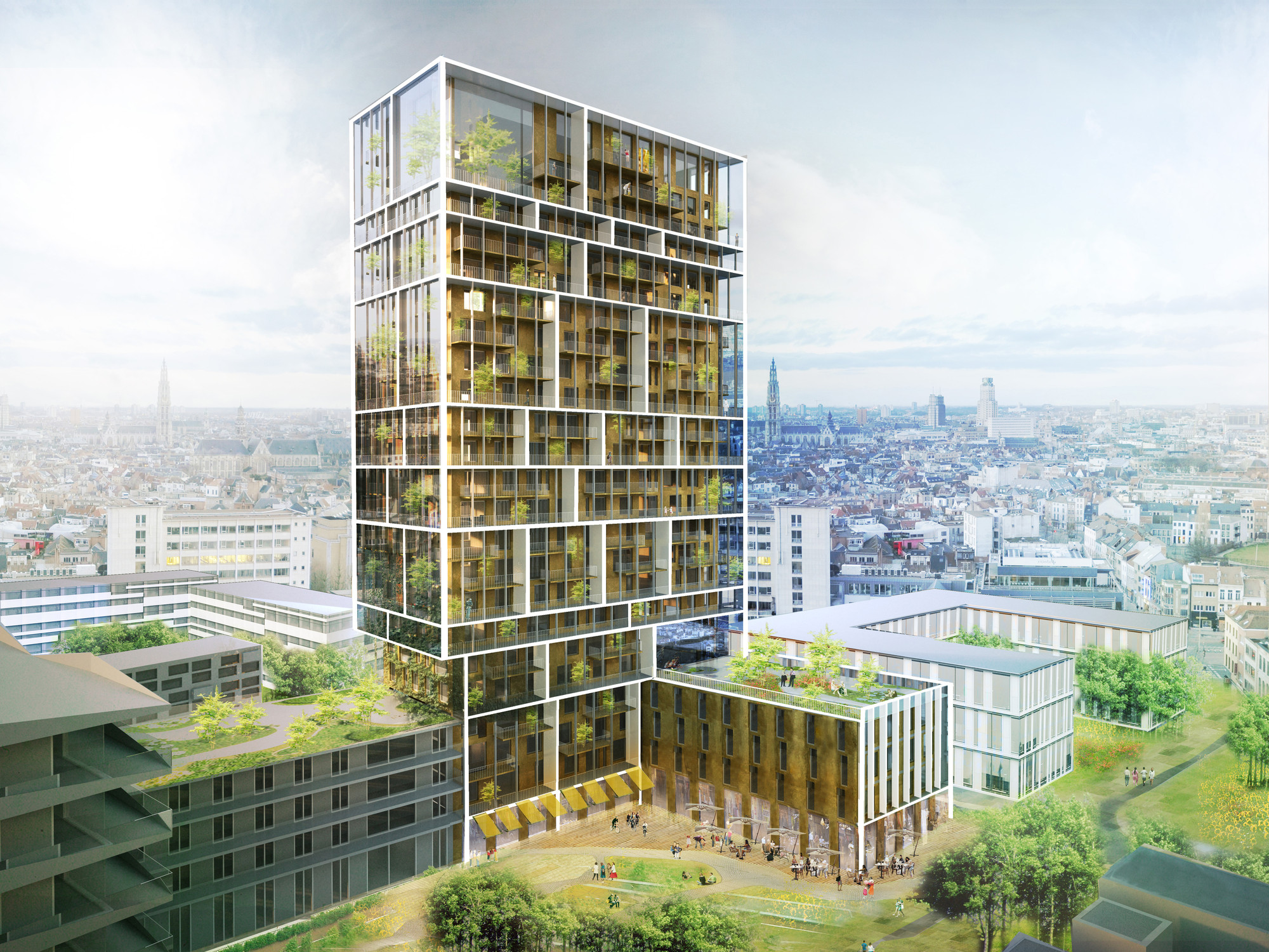
With the aim of creating a “vertical social community,” C.F Møller Architects and Brut won a competition to design a residential tower in Antwerp, Belgium. The 15,000 square meter building, which stretches 24 stories high, includes 116 homes, shops, offices and collective spaces.
Apartments range from smaller suites for students to larger family units, and each group of similar apartments opens towards balcony spaces, creating “vertical mini-communities.” Through balconies, glass winter gardens and roof terraces, an additional 5,000 square meters of space are added. The architects describe the tower as incorporating an “inside-out perspective, where the social qualities of the building are a dominant driver for the design.”
More on the design from the architects after the break.

From the architects. C.F. Møller Architects and Brut have won the competition for a new residential and mix-use tower in the Nieuw Zuid area in Antwerp, with a proposal that redefines the residential high-rise as a vertical social community.
The architectural idea of the building is derived from an inside-out perspective, where the social qualities of the building are a dominant driver for the design: Often in tall buildings, the sense of community amongst the occupants is challenged by the fact that you hardly ever meet your neighbours, except coming and going via the lobby and at the lifts.
In contrast, this design proposes to become a sustainable and collective community, where social interaction is enabled and encouraged in numerous ways without compromising the need for privacy. The proposal contains a large selection of apartments reaching out to a diverse group of inhabitants, from small types suitable for student co-housing to larger family and live-work types, all grouped into vertical mini-communities.
The development plan for Nieuw Zuid, a new urban area close to the river Schelde south of the historic centre of Antwerp, defined the outline and height of the tower. By increasing the efficiency of the floor plans, the proposal manages to create more space for the individual homes as well as attractive shared facilities within the same volume - summed up by the motto "Bigger & Cheaper".

Visible communities
The 24 storey, 15.000 m2 complex with 116 homes, shops, offices and collective spaces is thus augmented by an extra 5.000 m2 in the form of balconies, glass winter gardens and roof terraces, adding extra living qualities and mediating the scale of the building between the urban and the human scale.
The result is a light grid enveloping the volume, structuring the facades and connecting the vertical mini-communities - every visible compartment represents a cluster of similar apartments opening towards the balcony spaces. At the end gables of the tower, the grid forms glass-enclosed winter gardens serving as green semi-outdoor living spaces, and the common spaces for all residents include a bike-repair and dining room at the foot of the tower, a shared 5th floor facility with a landscaped roof terrace for residents and office-workers alike, and a triple-height green oasis at the top with spectacular views over Antwerp and the river Schelde.

The building will be made of pleasant and durable materials; predominantly warm grey-brown brick contrasted by white concrete, and is designed to achieve the passive-house standard, thus altogether omitting the need for a central heating system. Great care is taken to mitigate the possible negative effects that tall buildings can have on the local microclimate, and to ensure a positive contribution at street level.
The jury report stated: "The jury was very impressed by the design. The architecture presents interesting proposals for how to strengthen the community and identity for the Nieuw Zuid towers, and how to unfold the sustainability ambitions. The design enables a new form of collective living in tall buildings, and makes its inner dynamics and diversity visible in the facades without sacrificing the overall expression. (.) The grid structure results in a slender and elegant architecture. The way the grid is subdivided and defines the smaller communities is fascinating."
The client is SAZ (Stadsontwikkeling Antwerpen Zuid), and the team behind the winning design consists of C.F. Møller Architects and Brut, in collaboration with ABT, Deerns Technieken and Peritas EPB.

