Originally posted in Metropolis Magazine as "Iconic Museums, Rendered In Gingerbread", Samuel Medina looks into a fun project to realize world-famous buildings in various types of candy.
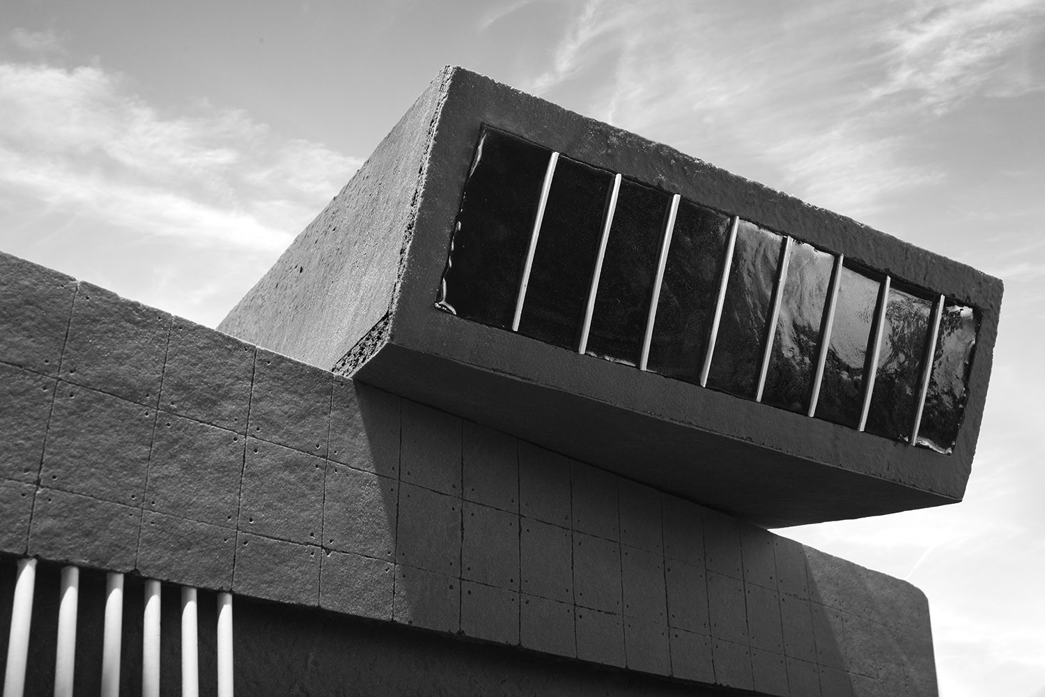
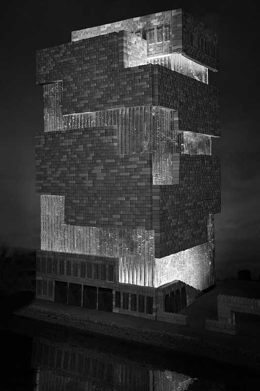
Had Hansel and Gretel stumbled across one of these sugary structures, they may have taken off in the opposite direction. Dark, gloomy, and foreboding, the confectionary architecture would have made quite the impression on Jack Skellington, however. The project, by food artist Caitlin Levin and photographer Henry Hargreaves, is clearly indebted to the gothic mise-en-scène of the latter’s expressionistic underworld, a dreary, but whimsical land where one might half expect to find a twisted (gumball) doppelganger of the Tate Modern or Zaha Hadid’s MAXXI.
Find out more about the process behind this sweet project after the break

Levin and Hargreaves conceived of the gingerbread creations for this year’s Art Basel. With the help of Dylan’s Candy Bar, the pair fashioned a line of not-so-cookie-cutter facsimiles of iconic museums. In addition to the aforementioned structures, there is a pasty rendition of Wright’s Guggenheim, with licorice pinwheels standing in for the porthole windows; a tribute to FR-EE’s Museo Soumaya in candy balls and taffy; and sugar-glazed clones of I.M. Pei’s Louvre pyramids. The scariest of the bunch is modeled on the Karuizawa Museum in Nagano, whose pointed, origami-like form is rendered in slanted rectangles of chocolate, hard candy, and sour flush.

Filtered through Hargreaves’s lens, the various candies are transformed into veritable building materials. These are combined with unorthodox shapes that don’t seem particularly suited to the gingerbread medium, i.e., four walls and a roof, all held together rather precariously by thick lines of frosting. Therein, of course, lay the artistic challenge: how to, say, translate crystalline panes of glass using thick wedges of gingerbread, or how to keep a hyperbolic curve of gumballs from falling in on itself. “We had no idea if we were going to be able to pull this off,” Hargreaves admits. "[I]t was learning as we went."

Having eventually figured out the mathematics of the ideal gingerbread villa, there was still the question of how to photograph it. Levin and Hargreaves opted for a more atmospheric approach, which privileged frog’s-eye perspectives of the buildings. In doing so, the building unit—whether a lollipop stick or sour roll—takes on the scale and visual gravity of their real-life steel and concrete analogues. The “deliberate” monochrome palette of the photographs, meanwhile, functions as the “antidote” to the impossible hues and lurid colors of the sugarstuffs that comprise the would-be architecture.

The result may look serious, but, as Hargreaves points out, it’s still just candy. “So much of what goes on during Art Basel is elitist, and we wanted to do something everyone was able to enjoy.”


