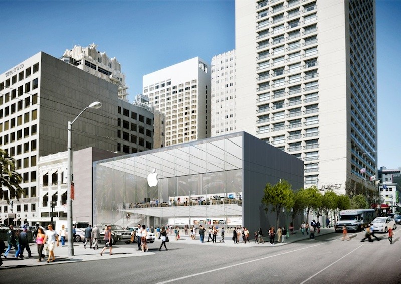
This past May, Apple filed plans to close its existing flagship retail store at 1 Stockton Street in San Francisco and move it three blocks north to one of the city's most popular spots: Union Square. This plan was met with enthusiasm from city officials until they realized that Apple and the store's architects at Foster + Partners were disregarding a beloved bronze folk art fountain by San Francisco sculptor Ruth Asawa that currently occupies the site. Many have also criticized the store's design for being a characterless box of metal and glass that contributes nothing unique to the local landscape, raising awareness of a commercial architecture defined more and more by trademark and less and less by its surroundings.
More on Apple's proposal in San Francisco and the problems of trademarked design after the break.
Last month, San Franciso's Mayor Lee described the new Apple Store as "quite simply incredible" and that he could think of "no better location for the world’s most stunning Apple Store than right here in Union Square;" later, however, he admitted to the Chronicle that he didn't realize that the plans called for the elimination of the Ruth Asawa fountain.

The circular fountain, installed in 1973, was made of baker’s clay and cast in bronze. It is seven feet high and a focal point of a triangular-shaped public square just off of Union Square. According to Asawa herself, “The fountain depicts San Francisco, and approximately 250 friends and school children helped in its making by contributing self-portraits, cars, buildings, and various San Francisco landmarks.” The fountain depicts hundreds of figures, local places and events near and dear to any San Franciscan including the City Hall Dome, Golden Gate Park, Chinatown and Victorian row houses - just to name a few. It is truly a product of its unique environment.

The same cannot be said for the new Apple store, critics claim. San Francisco Chronicle urban design critic John King pointed out the absurdity of "a company renowned for design innovation [hiring] one of the world's most acclaimed architecture firms, only to unload a box that would look at home in Anymall, U.S.A." King also takes issue with the all-glass storefront on Post Street that will see direct sun exposure for much of the day as well as the Stockton Street facade that will simply be an 80 foot-long windowless wall with an 11 foot-high Apple logo. Therese Poletti at MarketWatch muses that perhaps "Apple envisions that side of the building to be livened up occasionally with lines of consumers around the corner waiting to buy new iPhones;" otherwise, it will embody only the spirit and identity of Apple, not of San Francisco.

Yet one has to admit that not every Apple store design is as disquieting as this one. Their store in the Georgetown neighborhood of Washington DC, for example, is fairly well-integrated into the existing style and framework of the street while still maintaining its trademark sleek and modern style. Why can't something like this be done for Union Square, where old and new come together to communicate San Francisco's past, present <i>and</i> future?
This also raises several questions about commercial architectural design at large: Is it acceptable for Apple and other international companies to pollinate many different and unique cities with a homogenous, trademarked design that often has nothing to do with the existing urban landscape? Should more effort be made to successfully integrate said design into the site and respect who and what is already there or is this counter-productive to marketing a specific product and place that is recognizable worldwide?
Thoughts? Leave them below!
References: MacRumors, MarketWatch, The Chronicle

