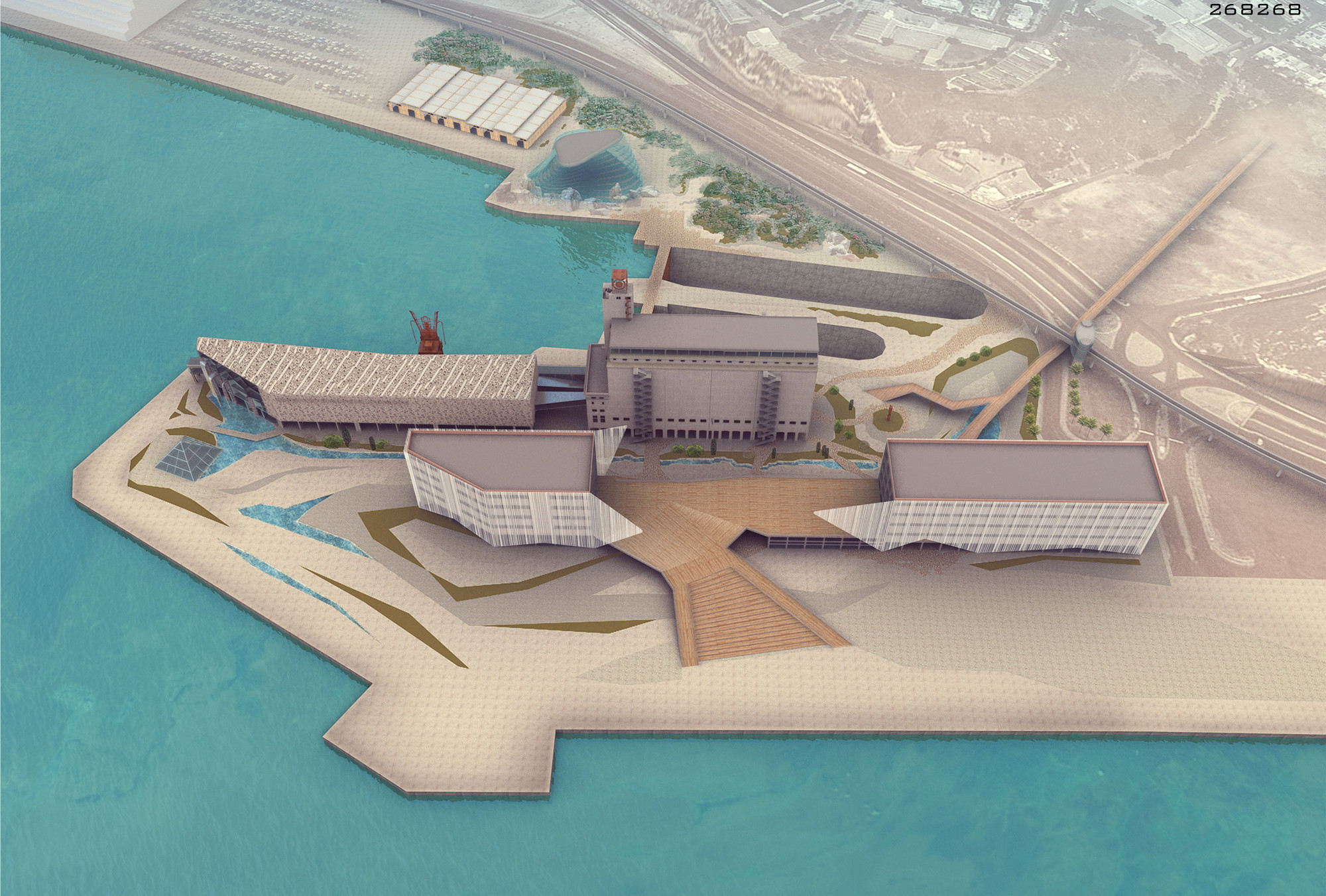
The collaborative team of architects Khvil Anastasia, Ivanova Elena, Fadeeva Alina, Rudikov Aleksei, and Spiridon Mellos chose simplicity as their main strategy in the Piraeus Museum for Underwater Antiquities Competition. Without creating enormous change, their design aims to use only what is already there, emphasizing simplicity and industrial nature of the building and beauty of the place to create a complex travel route. More images and architects' description after the break.
We use close and open space, the sea and the wind, simple surfaces and complex routes, communication and observe the work of with the ancient artifacts, exhibitions and a sense of authenticity that connects us with that of Greece, which we imagine. Concrete and paper, water and glass, wood and stone, modern technology and the memories of the industrial architecture of the port of Piraeus.
How to change all at the same time while keeping the memories place. How to connect the grain and ancient artifacts. How to hold spectators in just a building, but instead tell them complex, the breathtaking story of many thousands of years, showing reliable evidence. As one and the same time be an exciting and truthful.
The concept of urban landscape - integrating the nature in the industrial city in order to create a new public space. The creating an attractive landscape with the natural lines,the maximum number of new routes, linking the port territory, making a walk a fascinating journey. Discreet paving of several types, alternating open sunny and shady spaces,greenery, water, sand, stone and wood. A key activity is accumulated in the two sub-centers. The first place is unfolding before Silo when visitors descend from the monorail. The nature of the sub-centers - the place from which radiate all sorts of directions. Not assigned the task to gather people here, necessary to have a scenario involve in the routes. So this place has no explicit nature.This is a hall.
The main scenario is played between two warehouse buildings (future theme park and exhibition). We made open and inviting gesture to the waterfront as a wing, which provides an open, but protected public space at ground level, and at the same time partitions space in - just a stripped sheet of paper, revealing the main Silo building behind.
Complicating the space we offer a lot of additional links permeating building. Many the open area built-in the building enriches leisure. Restaurants, areas for communication, grounds for the representations - integration of open space in the building is enriched functions. Maximum activity is concentrated near the seafront. Opposite In the northern part behind the dry docks route exists another order. The quiet tree-shaded oases, rocky road. This is a quiet secluded area.
On the waterfront there are many people, wind, sun and sea. The ships come and go. Slowing the general movement the Creek serves as a line of separation, where fun and relaxation are replaced the museum program.At the same time the creek emphasizes simple linear composition of the Museum of Underwater Antiquities museum. The museum has a very simple form like a stone, carved the sea. Water enlivens building, gentle waterfalls stem from the huge windows of the main hall of the museum giving rise the thin Creek.
The main material is concrete. The whole game is based only on the difference in textures. In essence it is two concrete boxes (Silo and the new building). Technology to connect these enclosures is similar to the industrial belt. The main task for us was the creation of a variety in form and content halls and clearly widely read and exciting routes.
From the top of the fifth level labyrinth, where the main exhibition is over and you can go down in industrial elevators, arranged is a new ramp up in the last block of educational programs. Our main task is to create here a contrast with the lower level. The cave, the closedness, only artificial light, hard coded movement opposite open space, good-natured, full of air, light and sea views. The upper level of the building also involves major changes. We have removed part of the columns, mark the roof is raised, and the hall is covered with new wooden truss. A device of amphitheater on the top floor be costs. But we believe that if the result is to create a comfortable space for communication and training, the cost would be justified. In addition, we did not want to make significant changes in the appearance of Silo. And a new roof makes no dissonance. As you can see, in the guise of Silo only new open evacuation stairs.
Thus, we consider the reconstruction of the Silo without change of the external appearance of the building. Rather, it is the existing "box" filled with a variety of wonders and spaces.
Architects: Khvil Anastasia, Ivanova Elena, Fadeeva Alina, Rudikov Aleksei, Spiridon Mellos
Location: Piraeus, Greece
Area: 19,333.23sq.m