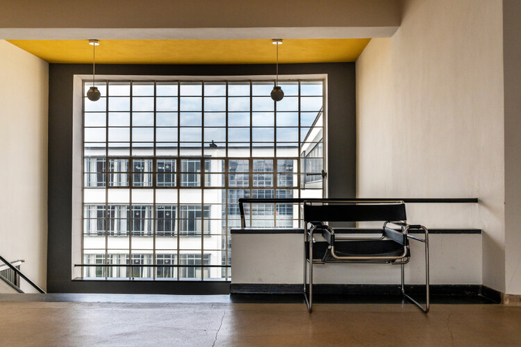
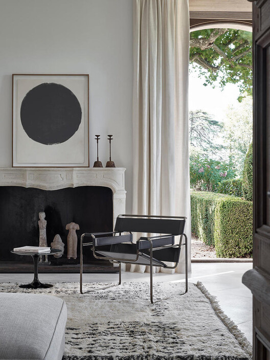
Bauhaus's designs have influenced our contemporary society in obvious and subtle ways. Iconic examples include Marcel Breuer’s Wassily Chair, the B55 Chair, the Bauhaus typeface, and the graphic design principles emphasizing clean lines, primary colors, and geometric shapes. However, the architectural construction details of the Bauhaus movement are much less discussed. While most can readily identify modern or Bauhaus buildings by their geometric forms, functionality, and industrial materials, their architectural details are often overlooked. They not only echo the design language of Breuer’s renowned furniture pieces but also have influenced the much-celebrated architectural glass details of Mies van der Rohe. How were Bauhaus's details executed, and how might they be translated into contemporary details today?
Glass Corners
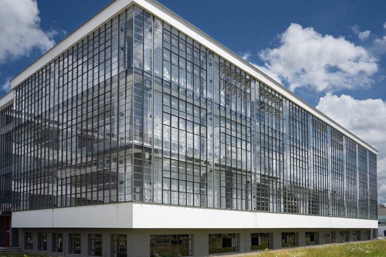
Corner conditions are some of the most challenging architectural details to execute. How do materials come together at an edge? Or do they? Bauhaus architecture paid particular attention to how materials meet at corners, especially when it comes to glass. This approach, prominently featured in iconic projects like the Bauhaus at Dessau by Walter Gropius and the Fagus Factory by Walter Gropius and Adolf Meyer, emphasized the separation of structure from the façade while carefully considering how mullions may capture and represent the corner. This set the precedent for the famous Miesian corners seen in buildings like the Neue National Gallery in Berlin and the Seagram Building.
Related Article
Infographic: The Bauhaus, Where Form Follows FunctionThe Bauhaus at Dessau and the Fagus Factory, built in 1926 and 1925, respectively, were constructed with significantly less advanced glass technology than today. The absence of float glass manufacturing processes restricted glass sizes and quality, and single-pane glass was mainly used. Although this was disadvantageous for the building's environmental performance, it offered benefits in creating intricate details—the thinner glass reduced material thickness conflict at the corner.
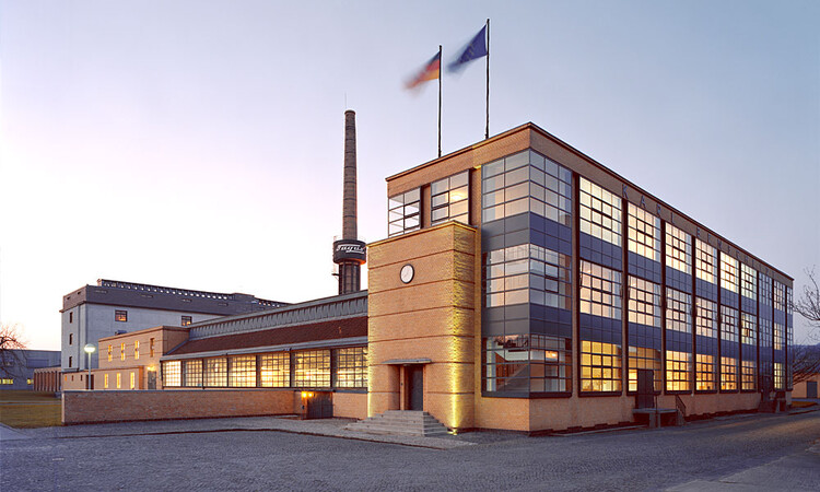
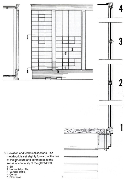
The corner mullion played a crucial role in resolving glass thickness at a corner to maintain the appearance of glass mullions’ uniformity across the building. In the Fagus Factory's detail drawings, the corner condition is treated as a singular element rather than as two separate mullions meeting together. It was necessarily thickened to maintain elevational dimensions similar to those of other planar mullions. Nonetheless, it employed strategies of material indentations to produce shadow lines to conceal the heaviness of the corner as much as possible.
An evolved version of this detail is evident in Bauhaus Dessau, where the concept of "freeing the corner" is taken to its limits. As seen in photographs, the corner mullion appears to vanish. Rather than achieving this through simply sizing down the corner mullion, which has its own physical and structural limitations, the corner detail at Bauhaus Dessau chose to exaggerate the depth of the typical planar mullions. Viewed diagonally, this results in the "thickening" of the typical mullions, creating the illusion of a disappearing corner. When the glass facade is viewed head-on, the increased depth does not appear heavier and seamlessly integrates with the corner mullion.

Ironically, the technological constraints of the time made it possible to create thin, variable-sized mullions at a glass corner detail. Widely used smaller glass panels required less structural support, and the absence of double-glazed systems meant the glass did not need to be as thick. This allowed the glass to remain a relatively thin, delicate material, allowing designers to manipulate mullion dimensions to achieve the desired detail expression at different locations.
Tubular Steel Construction
In 1925, Marcel Breuer of the Bauhaus movement was the first to use tubular steel for furniture construction, a material that the Mannesmann brothers had only made available a few decades earlier in the 1890s. Around the same time as Breuer's pioneering use of tubular steel in furniture, the same material also emerged as an architectural detailing element, most notably in Walter Gropius's home and the Bauhaus at Dessau.
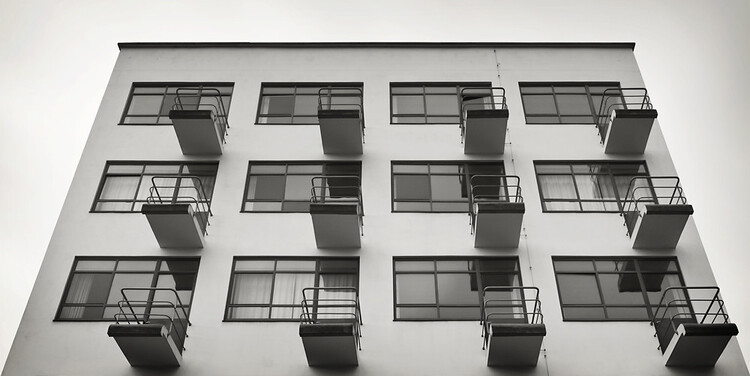
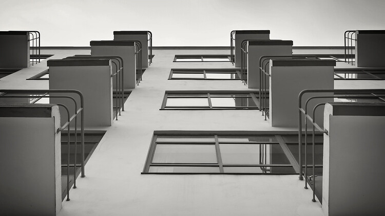
The Bauhaus in Dessau featured highly functional balconies designed to be large enough for one person and appear to cantilever from the building. Tubular steel's simplicity was ideal for guardrail use, complementing this clean, simple, and functional design. This is because tubular steel essentially embodied the concept of a ‘line’ in a drawing, with only added material thickness. It allowed for the use of minimal material to serve its simple purpose—preventing falls. Notably, the end plates of the tubular steel handrails were retained, and a conscious decision was made to leave the structural attachment visible. Not to be confused with escutcheons, a decorative element that conceals, this to-the-point end plate detail reflects the Bauhaus ideology: the tubular steel guardrail is free of decoration and concealment, expressing its logical structural form while serving its architectural function.
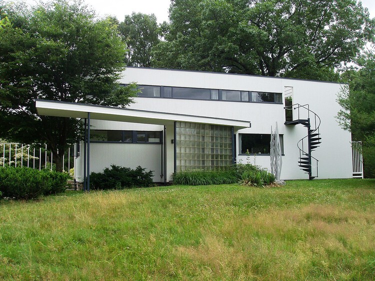
A similarly elegant use of tubular steel is seen in the Gropius House, built in 1938. Tubular steel as guardrails is employed throughout the house, inside and out, with the most striking example being the exterior spiral staircase. The simplicity of the tubular steel as a thin line perfectly captures the geometric beauty of the spiral stair. Vertical posts are only placed as frequently as structural needs to support the structure, and the attachment end plates are similarly visible even from a distance, forming a stark contrast to the white wall and marking the transition of the tubular steel detail to the facade.
Window Subdivision and Operations
Early Bauhaus buildings often express their apertures through the heavy subdivision of glass panels and thin mullions. While this approach may have primarily responded to the limitations of glass technology at the time, a closer examination reveals a rationale behind this treatment of large openings. Creating coherent, evenly divided glazing systems in buildings like the Bauhaus in Dessau and the Fagus Factory demonstrates that these systems were designed to adapt to any aperture size. As a modular system, it removed its design constraints, deferring to the more hierarchical limitations imposed by structural requirements.

This approach of heavy subdivision also enhanced the operability of the windows. By breaking down large apertures into smaller segments, greater flexibility was achieved in determining which parts could be opened. To simplify the operation of these smaller windows, Bauhaus introduced a signature detail: linking multiple windows into a series of mechanically connected units. This is why many photographs of Bauhaus buildings show windows opened to the same angle.
The synchronized operation of these windows creates a specific visual effect and offers practical benefits. The mechanical linkage allows windows to be placed at heights beyond the reach of an average person, enabling easy operation of windows that might even be 10 feet above the ground. This disengagement from direct window handling was crucial in developing large, glazed facades, providing flexibility in ventilation and light control without compromising accessibility.
The downside of these intricate mechanisms is their susceptibility to breaking over time. However, when they function properly, they give the impression that the building is performing a kind of mechanical sorcery, perfectly embodying the Bauhaus architecture vision as a kit of parts.
The Contemporary Variants
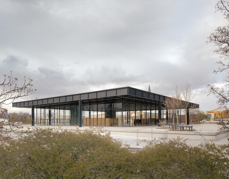
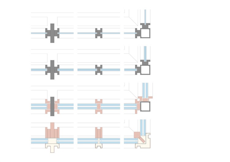
The architectural details discussed above have evolved, driven by advancements in building standards, technological advances, and the automation of prefabricated elements. A clear example of this evolution can be seen in David Chipperfield's refurbishment of Mies van der Rohe's Neue Nationalgalerie. As highlighted in the office's diagram study of the corner mullion, modern complications arise from the increased thickness of glass required to meet contemporary environmental performance standards. They faced the challenge of either thickening the corner mullion, using shadow lines to mimic the original detail, or opting for thinner glass, which could compromise performance.
In the case of tubular steel details, contemporary designs often conceal structural end plates, making the detail less "honest" but more minimal, contemporary, and diagrammatic—as if the tubular steel were seamlessly disappearing into the wall. Additionally, due to updated building codes depending on your locality, particularly those concerning safety regulations, the density of tubular steel may need to be increased to prevent a 4-inch sphere from passing through. As for window systems today, they are more likely to be individually operated, providing greater flexibility and easier maintenance. This shift also facilitates prefabricated units and building methodology, each with its testing data and warranties, offering greater convenience to building owners. In an era where architectural design is heavily influenced by factors such as energy performance, building codes, testing data, warranties, liabilities, and construction efficiency, how can we continue to develop architectural details with the same level of care that the Bauhaus movement was known for?


