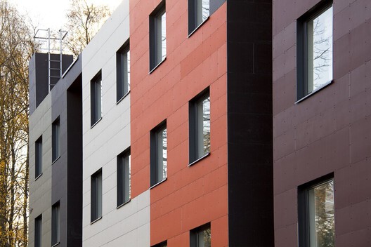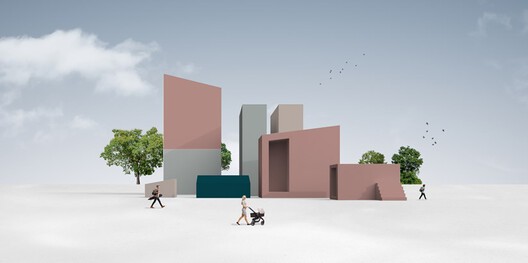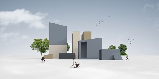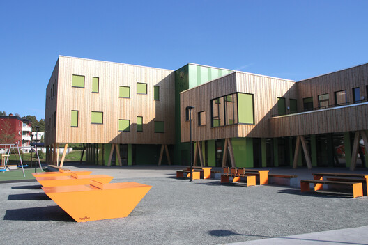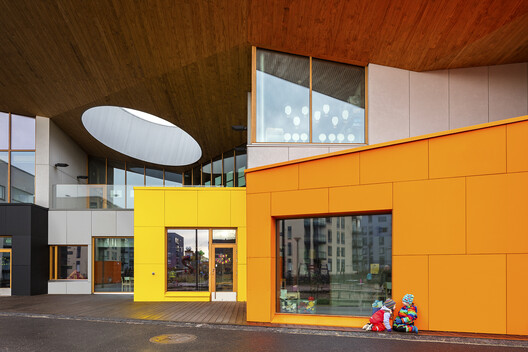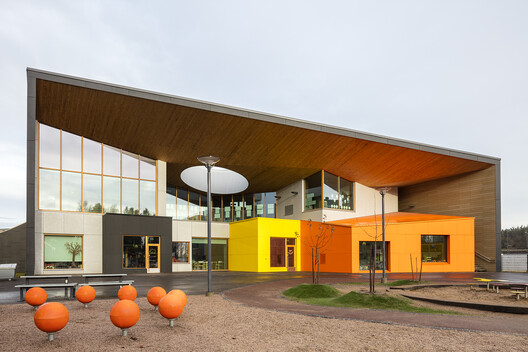
Façade colors are closely linked to place identity and help influence the surroundings and inhabitants of an area; they make it easier to safeguard and correct the use of color in urban areas. During the launch of their new color collection, STENI worked in collaboration with Scandinavia's leading expert in color and architecture, Kine Angelo, Associate Professor at NTNU, Department of Architecture and Technology, who has been working with color for over 12 years.

"A common problem with products on the market today is that the colors available are often too colorful or too weak. Often I work on peeling these away, but in this project it has been good to work out a new color map based on real needs. It's really nice to be able to publish a map where I can say 'Here are safe choices'," says Angelo.
The new color map emphasizes cultural history and is based on combinations from the Baroque period to modernism. Based on historical colors in urban areas, STENI presents a selection of hues and shades chosen to inspire creative expression. The colors aren't "trendy", or made to keep up with fashion; they are timeless, honest, and full of meaning.

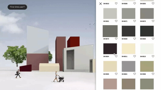
The newly developed STENI Colour tool allows users to test colors to find the perfect composition for any project, making it easier to test out different combinations before committing. Kine Angelo set up some rules of thumb for coloring façades, to help guide architects and designers:
1. Define Colors
When you start finding good color combinations, it is important to define what is the main color, accent color and contrasting color. In STENI’s color gallery you will find an overview of all the colors.
2. Main Color
The color that is on the largest wall surfaces of the façade sets conditions for the other colors. The main color should only be selected from the base colors in the color swatch.
3. Accent Color
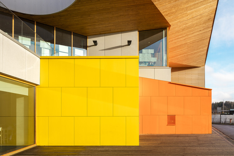
These are the colors that are on smaller wall surfaces, building volumes and façade elements. The accent colors should harmoniously emphasize the hue tone of the main color. You can use two accent colors: accent 1 can be used on smaller wall surfaces or larger building elements, while accent 2 can be used on small wall surfaces and smaller building elements.
4. Contrasting Color
The contrasting color is the one that pushes the harmony of the façade slightly out of balance. Like the accent colors, the contrasting color should emphasize the main color, but with the help of contrast; it can come from the base colors or accent colors in the color swatch. Contrasting colors are used on building details such as doors, gates, framing, floor bands, décor elements, etc. This color is the one that will create the most contrast with the other colors present in the façade, whether it is color strength or lightness. It is the color that will catch people's attention, activating the other colors and creating variation and excitement in the façade.
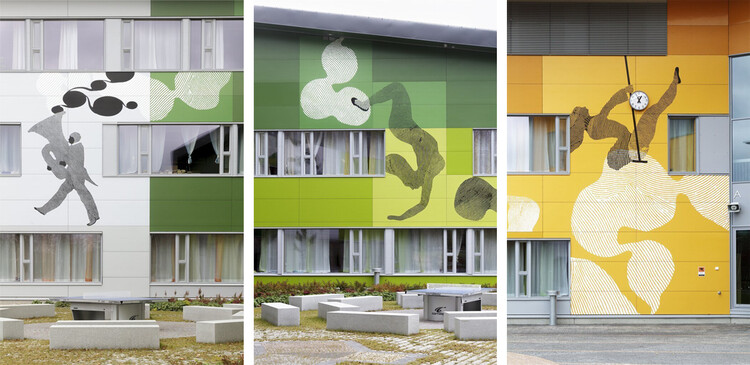
5. Weighting
The principle of weighting refers to the natural weights of each color and how to best arrange them. It is typical to have the heaviest color at the bottom and the lightest color towards the top, following the principles of warm and cold colors.
Keep in mind that all colors look different on a façade than they do on a screen or small swatches; colors will appear brighter and more vibrant, and colors in northern light will move in the direction of blue. If you have found colors you want to test, you can order samples here.
If you'd like to learn more about color in architecture, sign up for a color course. Through five video lessons, color expert Kine Angelo shares her knowledge.


