For many years, often spoken in tones of anticipation and excitement, we have heard that 3D printing will revolutionize the architecture industry as we know it. But if we stop for a moment, reflect on the present and look back at the past, it becomes evident that the technology has long been reshaping the field, continuously undergoing profound transformations and ushering in new eras of design, construction and spatial creativity. Operating as a layer-by-layer additive manufacturing process, 3D printing uses digital models to create customized three-dimensional objects with a remarkable level of precision and efficiency, saving time, generating zero waste, reducing labor costs and opening avenues for rapid prototyping and iterative design. It enables architects to explore creative opportunities and regain autonomy by designing complex, non-standardized elements within an industrial and mass-customized process.
Infographics: The Latest Architecture and News
Infographic: The Evolution of 3D Printing in Architecture, Since 1939
Infographic: The Pritzker Architecture Prize
Dealing with data analysis and communication is an important part when it comes to mediating between decision-makers and residents. Architect and Urbanist Lena Pak has developed a personal interest for data visualization in order to improve the communication process in a clear and effective way and she has shared with ArchDaily her last project based on the Pritzker Architecture Prize. A dynamic and interactive infographic that is meant to generalize information about the prize and to highlight curious facts of its distribution.
Infographic: The Evolution of Glass
Glass is so present in our lives that it’s very difficult to think about the amount of work, experimentation and technologies behind each panel or glass object. It’s also impossible to separate innovations from modern architectural projects –from architects such as Mies Van der Rohe and Le Corbusier– from the advances of the glass industry.
We’re following the history of glass, from Mesopotamian artifacts to technological glasses, and we invite you to travel with us.
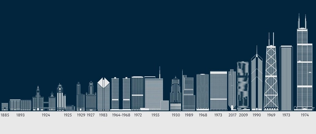
Travel Through History with this Interactive Timeline of Chicago's Tallest Buildings
Mud City, the Windy City, the City of the Big Shoulders... If there is one thing we are certain of, it is that Chicago is the birthplace of exceptionally tall buildings.
To celebrate the city's ongoing innovations in soaring skyscrapers, Orbitz has illustrated 20 of Chicago’s most iconic sky-high architecture.
View the republished content from Orbitz' list complete with an interactive timeline of Chicago's tallest buildings.
Have Your Say on the Landscape of Emerging Practices With the Interactive Architectural Political Compass
If you were to identify, categorize and map the 21st century’s emergent architectural practices from the world over, all on one diagram, what would it look like? Considering how the current architectural landscape consists of several different approaches, attitudes and political stances, how would you map them without being too reductive? And how would you ensure that out of hundreds of emergent practices and firms across the globe, you don’t leave anyone out? Perhaps the Global Architectural Political Compass V 0.2 could offer a clue.
Created by Alejandro Zaera-Polo and Guillermo Fernandez-Abascal, the diagram is part of an ongoing inquiry into “the state of the art in (global) architectural practice” [1]. In 2016, Zaera-Polo explored the subject in a comprehensive essay for El Croquis titled “Well into the 21st Century” in which he set down the framework for 11 political categories that now form the compass diagram.
In A Male Dominated Field, Women Make Up Only 30% of Architects in USA
Nathan Yau collected US Census data between 1950 and 2015 to create a set of visualizations that demonstrate how the diversity of the workforce has evolved. "Naturally, men and women now work many of the same jobs, but many jobs are mostly men or mostly women," explains Yau. So how does the architecture profession fit into this narrative?
The World's Tallest Buildings Throughout History
Graphic artist and designer Martin Vargic of Halcyon Maps has created a fascinating set of infographics that showcase both the cultural typologies of each continent's architecture as well as the evolution of its tallest buildings throughout history. Exploring the progression of height differences of the tallest buildings in Europe, North America, Asia, Africa, South America, and Oceania, Vargic's visually-striking charts detail 5,000 years of building history, from ancient to modern times.
Check out the charts, after the break.
Infographic: The World's Most Expensive Skyscrapers
It may or may not be the tallest building in North America, but one thing's for sure: when it comes to costs, no other skyscraper comes close to New York's One World Trade Center. This is the conclusion of Emporis, whose list of the world's top ten most expensive buildings puts 1WTC way out in front at $3.9 billion. Originally estimated at just half that cost, this sets a trend in the top ten list, with many of the featured buildings suffering staggering overruns. The second-place Shard, for example, overshot it's original £350 million ($550 million) budget nearly four times over (although this is to be expected in London).
Interactive Infographic: How Much do Architecture Graduates Earn?
Using information collected from the US Census Bureau’s American Community Survey, the Hamilton Project at The Brookings Institution has created a set of interactive infographics comparing the lifetime earning potential of graduates of 80 majors. With so much debate over the earning potential of architects, the tool provides us with an invaluable insight into the long-range outlook for members of our profession, charting the both the total lifetime earnings of architects and their average earnings per year over a 42-year career.
Read on after the break for analysis of what the infographics tell us
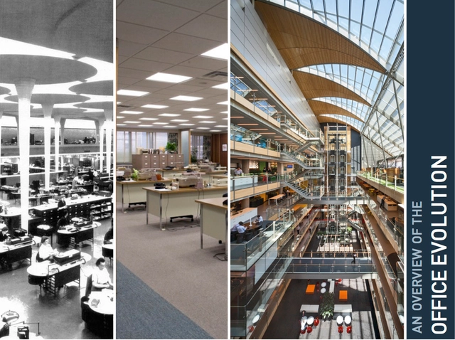
Infographic: The Evolution of the Office
Learn about the evolution of the workplace, from the very first office developed by the De Medici family to today's open collaboration spaces, after the break!
Infographic: ArchDaily, The Past 6 Years
Six years ago, we had a crazy idea: let's create a platform to give architects exposure, no matter where they come from or how famous they may be. Let's put them side by side with architectural greats. Let's make that platform absolutely free and accessible to whomever wants to be inspired by it. Let's give architects the inspiration, knowledge, and tools they need to make our rapidly urbanizing world a better place.
In six short years, we went from an idea to the most visited architecture web site in the world, with over 300,000 daily readers, a staff of over 50 people working in 9 different countries, and three local versions: ArchDaily Brasil, ArchDaily México and Plataforma Arquitectura (and a fourth coming soon!). This is our story.
A New Tool for Comparing Cities
For the last fifty years Richard Wurman - architect, graphic designer and founder of the TED Conferences - has been dedicated to creating a platform that compares cities. In Wurman's early studies, he quickly learned that comparing global cities was no easy task. Cities use very different languages to describe their assets, from planning principles to land use types to social statistics. "They don’t collect their information the same way. They don’t describe themselves with the same legend," he tells Nate Berg of Next City.
Thanks to sophisticated mapping tools, delving into the statistical data of numerous cities has become far more manageable than in 1962, when Wurman produced his first comparative analysis using clay models of 50 different cities. Wurman's analog-driven statistical analysis has turned into the Urban Observatory, a website that allows users to choose from 15 variables and easily compare the public data of up to 16 cities around the world in real time.
More about the platform after the break.