The world certainly looks different through the eyes of a young child; enormous, intriguing, and somewhat overwhelming, and it has long been believed that what we encounter as children shapes our perspective of the world. When asked about his childhood memories in Switzerland, Peter Zumthor shared that the memories of his youth contain the deepest architectural experience, which has become reservoirs of the architectural atmospheres and images that he explores in his work as an architect today.
Having a complete understanding of how children change and grow physically and psychologically throughout their childhood requires an in-depth observation of different factors, such as their hereditary traits and genetics, the interactions they have with other children and adults, as well as the environment they are living, playing, and learning in. In celebration of World Children's Day on November 20th, we look at how architects and designers stimulated children's autonomy and promoted their mental and physical well-being through architecture and interior design. This initiative aligns with the theme of World Architecture Day 2024: "Mobilizing the Next Generation for Urban Transformation," emphasizing the crucial role that thoughtful design plays in shaping a sustainable and inclusive future for our cities and the communities within them.
One of the most essential aspects of interior design is lighting – an element that can make or break an interior space of any size or material. Yet good lighting can be especially important for smaller or more crowded spaces, making them feel larger and more open even when their literal dimensions haven’t changed. In turn, larger spaces with poor lighting may feel smaller and less welcoming than they have the potential to be. To make interiors feel aptly large and well lit, designers can rely on several tried and true methods that make the most of a space, from using the right shades and types of lights to placing them in the best locations to integrating other elements that best complement existing lighting. These strategies, as well as several examples of their application, are listed below.
https://www.archdaily.com/947631/how-to-virtually-enlarge-spaces-using-good-lightingLilly Cao
For architects, schools are often complex structures to design. They must provide a variety of spaces for education, and also consider sports and recreational activities. But beyond its size or surface, the greatest challenge is to design an area that fosters a positive pedagogical environment for children. Below, a selection of +70 school projects with their drawings to inspire your proposals for learning campuses.
Designing the interior of an apartment when you have very little space to work with is certainly a challenge. We all know that a home should be as comfortable as possible for its inhabitants, but when we have only a few square meters to work with and the essential functions of the home to distribute, finding an efficient layout is not easy. Following our popular selection of houses under 100 square meters, we've gone one better: a selection of 30 floor plans between 20 and 50 square meters to inspire you in your own spatially-challenged designs.
The visual aesthetic of the past few decades could be defined as designing with the principles of ‘nothingness’. Whether it’s through art, lifestyle, fashion, industrial, or interior design, there has been an alleged need to keep things at a bare minimum, promoting the globally-loved-yet-highly-criticized trend of minimalism. Minimalism is this notion of reducing something to its necessary elements, but who is deciding what is necessary, and who is deciding what is too much? With those questions in mind, combined with radical changes in consumerism and the way people live seen during recent years, current trends have shown that minimalism might be here to stay, but with a twist.
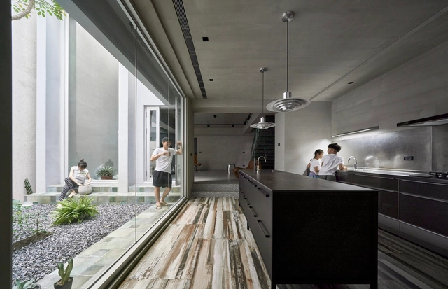
Islands are an essential part of any larger kitchen layout, increasing counter space, storage space, and eating space as well as offering a visual focal point for the kitchen area. Serving a variety of functions, they can be designed in a variety of different ways, with some incorporating stools or chairs, sinks, drawers, or even dishwashers and microwaves. To determine which elements to include and how to arrange them, designers must determine the main purpose or focus of the island. Will it primarily serve as a breakfast bar, a space to entertain guests, an extension of the kitchen, or as something else? And with this function in mind, how should it enhance the kitchen workflow vis-à-vis the rest of the area? These considerations, combined with basic accessibility requirements, necessitate that the design of the island be carefully thought out. Below, we enumerate some of the essential factors of kitchen island design.
Despite being the smallest rooms of houses, bathrooms have always been one of the most challenging and critical to design, which often left them fairly simplified. The past few years, however, saw these spaces undergo significant change; what was once only limited to functionality, ease of maintenance, and privacy, is now being given a strong character with pops of color, classic fixtures, and patterned surfaces. Similarly for public bathrooms, where "functionality" and "ease of maintenance" are now complimented with aesthetics, technology, and high quality finishing. In this interior focus, we explore the three main bathroom typologies used in residential projects, and look at how architects have employed them through 12 examples.
Functionality, good ventilation, comfortable lighting, and access to views are some of the important required characteristics that make for human comfort in inhabited or occupied spaces. Nonetheless, those elements are becoming harder to achieve within smaller city dwellings. Architects and individuals, therefore, turn towards design solutions to create more agreeable and personalized settings.
An initial solution to upscale and widen spaces is to reduce the amount of standard solid partitions or walls and replace them with alternative means of spatial separation.
Just as the colors of an abstract painting or photograph can produce a certain mood, so can the colors of a building or room profoundly influence how the people using it feel. Physiologically, study after study has shown that blue light slows the production of melatonin, keeping people more alert or awake even at night. Psychologically, people associate certain colors with certain feelings due to cultural symbols and lived experiences – for example, they might perceive the color red as menacing or frightening because of its connection to blood.
Altogether, the way a room is colored can have complex effects on how its users feel, while a façade can be perceived in dramatically different ways depending on how it is colored. Below, we summarize the emotional associations of every color, assessing their differing effects as each is used in architectural space.
https://www.archdaily.com/930266/how-color-affects-architectureLilly Cao
Even though white minimalism remains the norm, retro trends are making a serious comeback in modern bathroom designs, with homeowners incorporating pops of color, classic fixtures, and patterned surfaces. Despite often being static and traditional spaces in homes, bathrooms have certainly undergone significant transformations throughout the years. While those of the outspoken 1970s brought vibrant colors like avocado green and mustard yellow, the ‘80s introduced ceramic tiles in more muted, pastel shades. On the other hand, this century has set the ideal on white and marbled surfaces, slick gloss finishes, and silver fixtures. However, even as this all-white look continues to be the protagonist, bold retro enhancements are reviving and blending in with contemporary elements to create elegant, yet lively atmospheres with a strong character.