Estudio Tampiquito

BROWSE ALL FROM THIS PHOTOGRAPHER HERE

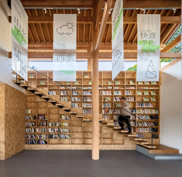
Mexican Interiors: 18 Spaces That Use Books as a Design Element

Over the years, interior design has evolved according to the needs that arise, but above all according to the experiences we seek to provoke in the user. In the last two years, we witnessed a radical change and a particular interest in this subject because the pandemic forced us to pay specific attention to the configuration of the places we inhabit. This brought about much more holistic designs that cater to the wellbeing of the user, combining colours, sensory experiences, technology and natural elements that promote health.

Mexican Interiors: 18 Spaces That Use Books as a Design Element - Image 1 of 4Mexican Interiors: 18 Spaces That Use Books as a Design Element - Image 2 of 4Mexican Interiors: 18 Spaces That Use Books as a Design Element - Image 3 of 4Mexican Interiors: 18 Spaces That Use Books as a Design Element - Image 4 of 4Mexican Interiors: 18 Spaces That Use Books as a Design Element - More Images+ 14

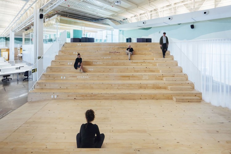
Indoor Bleachers: From Offices to Homes

Indoor Bleachers: From Offices to Homes - Featured Image
Sede da Unicred / Arquitetura Nacional. Image © Cristiano Bauce

Circulation spaces are often challenging for designers as they are intended—as the name implies—for moving from one room to another. While many take advantage of these areas by using them as storage spaces, Mies van der Rohe at the Farnsworth house reduced circulation to a minimum, creating an open floor plan completely free of hallways. When faced with vertical circulation, the issue is similar. Stairs fulfill the purpose of overcoming the height between one floor and another, but rarely constitute indoor living spaces. Bleachers, in turn, play this role in several projects. Until recently, they were only found in sports spaces or amphitheaters; now the use of bleachers has become widespread and is seen in office spaces, public buildings, schools and even homes.

Retail Stores Under 100 Square Meters: Examples in Plan and Section

Designing commercial spaces has historically been a challenge. In these environments, spatial distribution plays a fundamental role, even more so if we have a few extra square meters. With this being said, the study of these spaces in plan and section can be a great starting point. It not only allows us to analyze the logistics and circulation of customers but also helps us find efficient variations and innovations that will enable your store to stand out from the others.

Below, we've selected a series of 25 examples in plan and section that can help you understand how different architects faced the challenge.

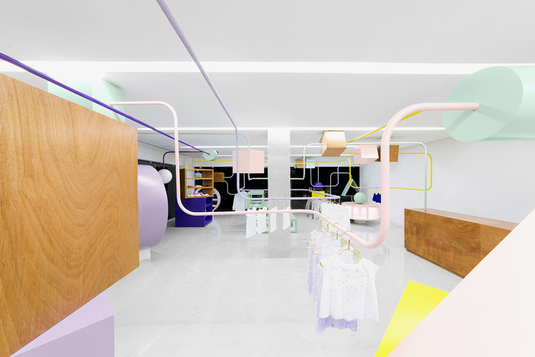
Kindo / Anagrama

Kindo / Anagrama - StoreKindo / Anagrama - StoreKindo / Anagrama - StoreKindo / Anagrama - StoreKindo / Anagrama - More Images+ 5

Monterrey, Mexico
  • Architects: Anagrama
  • Year Completion year of this architecture project Year:  2015
  • Manufacturers Brands with products used in this architecture project
    Manufacturers:  ACURRIDE, Corian, Poliform, SAYER LACK

Conarte Bookstore / Anagrama

Conarte Bookstore / Anagrama - Retail , StairsConarte Bookstore / Anagrama - Retail , Facade, LightingConarte Bookstore / Anagrama - Retail , FacadeConarte Bookstore / Anagrama - Retail , Facade, StairsConarte Bookstore / Anagrama - More Images+ 10

Monterrey, Mexico
  • Architects: Anagrama
  • Area Area of this architecture project Area:  90
  • Year Completion year of this architecture project Year:  2015
  • Manufacturers Brands with products used in this architecture project
    Manufacturers:  Benjamin Moore, Led RGB, Pine Plywood