Zoya Gul Hasan

BROWSE ALL FROM THIS AUTHOR HERE

7 Architects Who Weren't Afraid to Use Color

7 Architects Who Weren't Afraid to Use Color - Image 1 of 47 Architects Who Weren't Afraid to Use Color - Image 6 of 47 Architects Who Weren't Afraid to Use Color - Image 2 of 47 Architects Who Weren't Afraid to Use Color - Image 7 of 47 Architects Who Weren't Afraid to Use Color - More Images+ 17

Some architects love color, some are unmoved by it, some hate it, and some love to dismiss it as too whimsical or non-serious for architecture. In an essay on the subject, Timothy Brittain-Catlin mentions the “innate puritanism among clients of architecture,” architects and their “embarrassment of confronting color,” and how “Modernism tried to ‘educate out’ bright colors.” So, while the debate on color in architecture is far from being a new one, it is not finished, and probably never will be.

In today’s world where the exhausted stereotype of the no-nonsense architect clad in black still persists, and while we quietly mull over the strange pull of the Cosmic Latte, there are some architects who haven’t been afraid of using broad swathes of color in their work at all. Read on for a list of 7 such exemplary architects both from the past and the present.

"We Dream of Instant Cities that Could Sprout like Spring Flowers": The Radical Architecture Collectives of the 60s and 70s

The first moon landing, widespread anti-war protests, Woodstock and the hippies, rural communes and environmentalism, the Berlin Wall, the women’s liberation movement and so much more—the tumultuous decades of the Sixties and Seventies occupy an unforgettable place in history. With injustices openly questioned and radical ideas that set out to unseat existing conventions and practices in various spheres of life, things weren’t any different in the architectural world. 

The grand visions dreamt up by the modernists were soon challenged by utopian experiments from the “anti-architecture” or “radical design” groups of the 1960–70s. Reestablishing architecture as an instrument of political, social, and cultural critique, they drafted bold manifestoes and designs, experimented with collage, music, performance art, furniture, graphic design, zines, installations, events, and exhibitions. While certain individuals from this era like Cedric Price, Hans Hollein, and Yona Friedman remain important to the realm of the radical and the unbuilt, the revolutionary spirit of these decades also saw the birth of various young collectives. For eccentricity at its very best, read on for a (by no means exhaustive) list of some groups who dared to question, poke, expand, rebel against, disrupt and redefine architecture in the 60s and 70s.

How to Survive Your Very First Critique in Architecture School

For the fresh architecture student, the “jury,” “review,” or “crit” is far from glorious—sounding more like a death knell than a customary critique session. The concept, as Kathryn Anthony explores in Design Juries on Trial: The Renaissance of the Design Studio, goes as far back as the 1980s when the Ecole Nationale et Speciale des Beaux-Arts in Paris became the first art and architecture school to experiment with a format that would soon be adopted by architectural schools across the world. While some schools have taken steps to loosen traditional hierarchies, others continuing to reinforce them, much to the terror of fledgling first-year students who aren’t used to being “tried.”

So what can one really do to ease into this rather uncomfortable aspect of architectural education? Below is a fairly simple list of dos and don’ts that could go a long way in helping you out.

Photos Capture the Luxurious Life Inside Herzog & de Meuron's Beirut Terraces

Photos Capture the Luxurious Life Inside Herzog & de Meuron's Beirut Terraces - Image 5 of 4
© Bahaa Ghoussainy

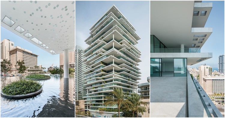
In the rapidly burgeoning city of Beirut, the post-war building boom is far from over. Much like its middle-eastern neighbors, it boasts of a plump share of designer architecture—as critic Oliver Wainwright refers to it, “a diverse shopping list”. It is here that the Beirut Terraces, a residential complex designed by Herzog & De Meuron, rises up to 119 meters, occupying a prominent place in the city’s skyline. In this collection of photographs by Bahaa Ghoussainy, one sees the Beirut Terraces from within, getting a glimpse of both the interior, as well as the multiple, unique views offered from inside the building.

Photos Capture the Luxurious Life Inside Herzog & de Meuron's Beirut Terraces - Image 1 of 4Photos Capture the Luxurious Life Inside Herzog & de Meuron's Beirut Terraces - Image 2 of 4Photos Capture the Luxurious Life Inside Herzog & de Meuron's Beirut Terraces - Image 3 of 4Photos Capture the Luxurious Life Inside Herzog & de Meuron's Beirut Terraces - Image 4 of 4Photos Capture the Luxurious Life Inside Herzog & de Meuron's Beirut Terraces - More Images+ 24

Renzo Piano: "Creativity is Only Possible When You Share Creativity"

If you are missing the capacity to create emotion, then it doesn’t work, it’s not enough.
– Renzo Piano

In this in-depth biographical video by the Louisiana Channel, Renzo Piano talks about his earliest influences, why traveling is essential, the pleasures of drawing, what creativity really means, how “computers are a bit stupid,” the way “beauty can change the world,” and more.

Placemaking: Movement, Manifesto, Tool, Buzzword—or What?

Amongst other placemaking-related news this year, the Boston Society of ArchitectsPlacemaking Network celebrated its 10-year anniversary by launching the Placemaking Manifesto in November. Co-authored by Christina Lanzl, Robert Tullis, and Anne-Catrin Schultz, the document set down six key ideas: “quality of life,” “sense of place,” “community identification,” “collaboration and communication” between “individuals of all backgrounds, interests and talents,” “inclusivity” and “greater civic engagement,” and “awareness of tradition with an embracing of new and emerging technologies.” While the basic principles that placemaking espouses are often hard to question, this manifesto in particular begs one question: Is placemaking understood and defined clearly enough for it to be a useful tool for urbanists?

In the past decade or so, placemaking has gained considerable momentum, spewing forth an array of approaches, countless lists of best practices (including, in essence, this new manifesto), and complicated sub-categorizations. It is simultaneously a much-lauded global movement, an academic discipline, a field, discourse, process, and tool, but is also, among other charges, heavily criticized for being an “ill-defined buzzword.”

Unpacking Paul Rudolph’s Overlooked Architectural Feats in Southeast Asia

Unpacking Paul Rudolph’s Overlooked Architectural Feats in Southeast Asia - Image 46 of 4
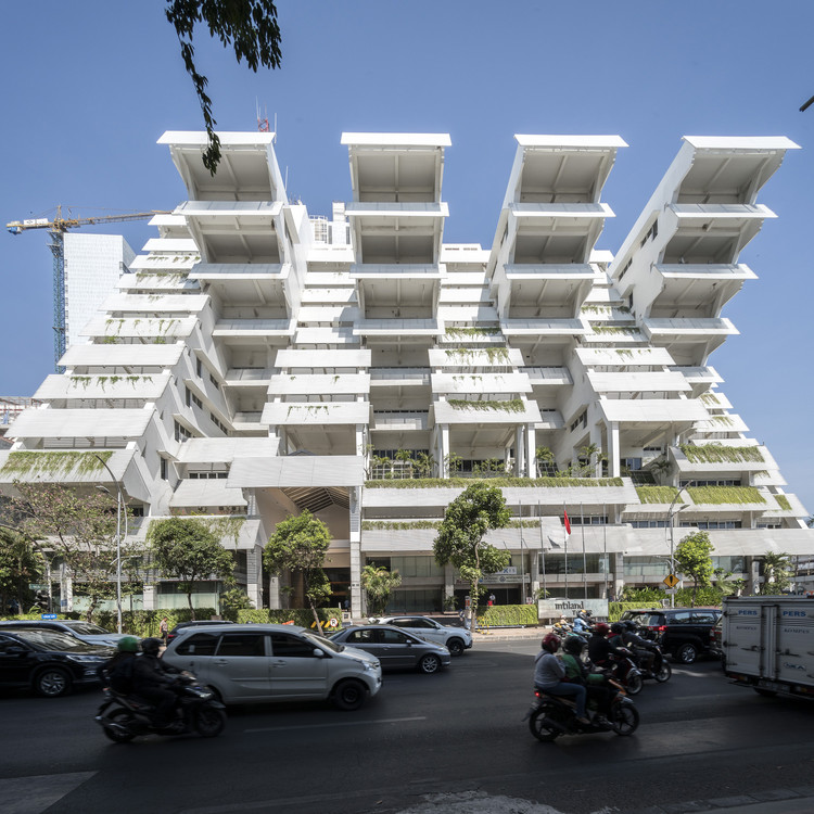
Intiland Tower. Image © Darren Soh

To speak of Paul Rudolph’s illustrious career is to trace a grand arc stretching from the 1940s to the 1990s. More often than not, the popular narrative begins with his student days at Harvard under the tutelage of Walter Gropius, touches upon his earliest, much-loved Florida beach houses, circles around his eventual break from the rigidity of both the Sarasota School and the International Style, and finally races towards the apex: his chairmanship of the Yale School of Architecture, and the concurrent shift to a Brutalist architectural style characterized by monumental forms, rugged concrete, and interwoven, multilevelled spaces awash with a remarkable interplay of light. Then comes the fall from grace: the beloved Yale Art and Architecture Building went up in flames just as the architecture profession began to question modernist ideals, and eventually Postmodernism was ushered in. Flickering, sputtering, Rudolph's grand narrative arc lurched towards Southeast Asia, bearing away the “martyred saint.” Save for several scattered commissions in the United States, Rudolph spent the last two decades of his life building abroad, mostly across Hong Kong, Indonesia, and Singapore, until his death in 1997.

But of course, time and again, historians have sought to challenge the myth of the failed architect by rereading his understudied work from the late years. Adding to this growing corpus of fresh research and alternate perspectives is architectural photographer Darren Soh’s ongoing project documenting—so far—three of Rudolph’s major works in Southeast Asia: The Colonnade (1986) and The Concourse (1994) in Singapore, and the Intiland Tower (1997) in Surabaya, Indonesia.

Unpacking Paul Rudolph’s Overlooked Architectural Feats in Southeast Asia - Image 16 of 4Unpacking Paul Rudolph’s Overlooked Architectural Feats in Southeast Asia - Image 18 of 4Unpacking Paul Rudolph’s Overlooked Architectural Feats in Southeast Asia - Image 28 of 4Unpacking Paul Rudolph’s Overlooked Architectural Feats in Southeast Asia - Image 56 of 4Unpacking Paul Rudolph’s Overlooked Architectural Feats in Southeast Asia - More Images+ 55

Critical Round-Up: The Louvre Abu Dhabi by Jean Nouvel

Earlier this month, Abu Dhabi’s much-awaited “universal museum,” the Louvre Abu Dhabi designed by Pritzker Prize-winner Jean Nouvel, was opened to the public. After several years of delays and problems including accusations of worker rights violations, revisions in economic strategies, and regional turmoil, the completion of the museum is a feat in itself. Critics, supporters, naysayers, artists, economists, and human rights agencies, have all closely followed its shaky progress, but now that it’s finally open, reviews of the building are steadily pouring in.

Read on to find out how critics have responded to Nouvel’s work so far.

Critical Round-Up: The Louvre Abu Dhabi by Jean Nouvel - Image 1 of 4Critical Round-Up: The Louvre Abu Dhabi by Jean Nouvel - Image 2 of 4Critical Round-Up: The Louvre Abu Dhabi by Jean Nouvel - Image 3 of 4Critical Round-Up: The Louvre Abu Dhabi by Jean Nouvel - Image 4 of 4Critical Round-Up: The Louvre Abu Dhabi by Jean Nouvel - More Images+ 4

Oscar Niemeyer's "Favorite Project in Europe" Captured in Spectacular Photo Set by Karina Castro

As a trailblazer of Brazilian Modernism, Oscar Niemeyer is celebrated for his bold, sinuous forms, and his use of the “the liberated, sensual curve.” Paul Goldberger described it best when he wrote that “Niemeyer didn’t compromise modernism’s utopian ideals, but when filtered through his sensibility, the stern, unforgiving rigor of so much European modernism became as smooth as Brazilian jazz.”

When Georgio Mondadori, chairman of the Italian publishing house Mondadori, commissioned Niemeyer to design the company’s new headquarters in 1968, he wanted the building to look like the Itamaraty Palace (also known as Palace of the Arches) in Brasília. Niemeyer agreed, but given his playful spirit, he deliberately deviated from the earlier design and proceeded to build what he would later identify as his favorite of the projects he completed in Europe. Read on to see a striking set of sixteen photographs of the Mondadori building by Milan-based photographer and visual artist Karina Castro, who was commissioned by Mondadori to capture their headquarters over 40 years after the building's completion.

Oscar Niemeyer's "Favorite Project in Europe" Captured in Spectacular Photo Set by Karina Castro - Image 1 of 4Oscar Niemeyer's "Favorite Project in Europe" Captured in Spectacular Photo Set by Karina Castro - Image 2 of 4Oscar Niemeyer's "Favorite Project in Europe" Captured in Spectacular Photo Set by Karina Castro - Image 3 of 4Oscar Niemeyer's "Favorite Project in Europe" Captured in Spectacular Photo Set by Karina Castro - Image 4 of 4Oscar Niemeyer's Favorite Project in Europe Captured in Spectacular Photo Set by Karina Castro - More Images+ 10

Playful Animation Tells the Story of Humankind’s Quest for a Perfect City

Cities are universes in themselves; furiously spawning, spewing, hissing through time and space. They are cudgeled, raked, plastered, worshipped, fought over, set on fire; they are slippery wombs that cradle wars, victories, blood and brilliant storms. The built environment has always been indicative of its inhabitants’ fears, desires, and ideals. As such, it is one of the earliest, most powerful forms of human expression. For World Cities Day 2017, the new BBC Designed section of the BBC Culture website commissioned motion graphics designer Al Boardman to create The Perfect City, an animated video covering a brief history of humankind’s quest for the "ideal" and the "perfect" in urban design. With a voiceover and script by renowned architecture critic and writer Jonathan Glancey, the video is a remarkable 2-minute overview of some prominent examples in city planning, both old and new, successful and unsuccessful.

How to Use “Structured Procrastination” to Get the Best Out of Your Bad Habits

In a hilarious TED talk by world-famous blogger Tim Urban, the procrastinating brain is explained using three squiggly characters: Rational Decision Maker, Instant Gratification Monkey, and Panic Monster. For most of us who procrastinate without fail, the Monkey dominates while the Decision Maker suffers. Panic Monster enters the moment a deadline looms dangerously close—and that’s when all the actual work is done, amid much grumbling, self-loathing and lofty promises of never procrastinating again. But of course, we fail to keep our promises and the wheel keeps turning!

While the internet is full of lists and guides on how to stop procrastinating, for quite a lot of people, those somehow just don’t help at all. And while deadlines, as Urban points out, work for some in terms of getting the work done sooner or later, “long-term procrastination” affects those who must set their own deadlines—think business owners, PhD students, or freelancers. So, how do you get yourself to stop? You don’t! What you need to master is John Perry’s concept of “structured procrastination”—the same concept that Piers Steel earlier explained as “productive procrastination.” Read on for some advice gleaned from pro-procrastination literature.

Amazon HQ2: Study by Data Science Experts Names Washington DC as Ideal Host City

Amazon’s open call for bids for its new headquarters, HQ2, closed last month, but in the months leading up to the final decision in 2018, analysts will continue to flood the internet with detailed studies evaluating who they believe should be the winner. In other words, the mirror-mirror-on-the-wall game for cities is just starting to warm up.

Earlier, ArchDaily reported on the data-driven approach adopted by Moody’s Analytics which projected Austin, TX as the winner. But another study by IT education company Thinkful now points towards Washington DC as the city most likely to make the cut. So what makes Washington DC the fairest of them all? Read on to see how data science techniques helped analysts at Thinkful with this prediction, what kind of approach they adopted, and how it differed from that of Moody’s Analytics.

Have Your Say on the Landscape of Emerging Practices With the Interactive Architectural Political Compass

If you were to identify, categorize and map the 21st century’s emergent architectural practices from the world over, all on one diagram, what would it look like? Considering how the current architectural landscape consists of several different approaches, attitudes and political stances, how would you map them without being too reductive? And how would you ensure that out of hundreds of emergent practices and firms across the globe, you don’t leave anyone out? Perhaps the Global Architectural Political Compass V 0.2 could offer a clue.

Created by Alejandro Zaera-Polo and Guillermo Fernandez-Abascal, the diagram is part of an ongoing inquiry into “the state of the art in (global) architectural practice” [1]. In 2016, Zaera-Polo explored the subject in a comprehensive essay for El Croquis titled “Well into the 21st Century” in which he set down the framework for 11 political categories that now form the compass diagram.

Steven Holl's University of Iowa Visual Arts Building Through the Lens of Aaron Dougherty

Deeply rooted in the phenomenological ideas of Maurice Merleau-Ponty, Steven Holl’s architectural philosophy is centered on human experience, materiality, and a thorough engagement with the site or context. But more than his experiments with space and material, he is best known for his mastery over what is perhaps his favorite material, or medium: natural light.

His design for the Visual Arts Building at the University of Iowa, seen here through the lens of photographer Aaron Dougherty, is one of his projects that best explores these concerns. Clad in weathering zinc and stainless steel, the four-story building houses studios, teaching spaces, galleries and faculty offices for all visual arts departments—from Ceramics, Jewelry Design and Sculpture, to Printmaking, Painting, Video Art, and 3D Design.

Steven Holl's University of Iowa Visual Arts Building Through the Lens of Aaron Dougherty - Image 1 of 4Steven Holl's University of Iowa Visual Arts Building Through the Lens of Aaron Dougherty - Image 2 of 4Steven Holl's University of Iowa Visual Arts Building Through the Lens of Aaron Dougherty - Image 3 of 4Steven Holl's University of Iowa Visual Arts Building Through the Lens of Aaron Dougherty - Image 4 of 4Steven Holl's University of Iowa Visual Arts Building Through the Lens of Aaron Dougherty - More Images+ 10

The World's Most Expensive Buildings

If the Great Pyramid were to be built today, it would cost between 1.1 and 1.3 billion US dollars, according to a cost estimate by the Turner Construction Company—not surprising, considering how that is roughly the same amount of money that it took to build the Trump Taj Mahal or the Petronas Twin Towers. Complicated structural requirements, delayed work timelines, complex building programs, the need for good earthquake or typhoon proofing, the use of advanced mechanical and electronic systems, and costly materials and finishes can all add up to the eventual cost. But sometimes—and especially in cases in which governments or powerful clients set out to beat existing records such as the “tallest building in the world”—money is spent for no real reason except for an unabashed display of wealth, power or strength.

Emporis, the renowned global provider for building data, has compiled a list of the top 200 money-guzzlers from recent years, and not surprisingly, a lot of high-rises have made the list. Read on to see the top 20.

The Top 10 Predicted Cities for Amazon's HQ2 (And Why HQ2 Will Be a Major Urban Catalyst for the Winner)

The Top 10 Predicted Cities for Amazon's HQ2 (And Why HQ2 Will Be a Major Urban Catalyst for the Winner) - Image 3 of 4
Amazon's current campus in Seattle. Image© Flickr user joebehr licensed under CC BY-ND 2.0

The bidding process for HQ2, Amazon's second headquarters in North America, reached a crescendo last week as the submission deadline drew close. While 238 American cities scrambled to submit proposals and run campaigns in the hope to woo Amazon—or as Slate witheringly described the process, "The Bachelor: Corporate America Edition"—the internet abounded with all sorts of discussions on the project. Does our city have what it takes to house the second headquarters? How would HQ2 affect the selected city? Why are smaller cities submitting proposals when they clearly don’t meet the criteria? Can we predict which cities are more likely to make the cut?

Inexpensive, Easy-to-Build Gridshell Pavilion Uses Air-Filled Cushions for Construction

SheltAir, a pavilion developed and designed by Gregory Quinn as part of his doctoral thesis at the Berlin University of the Arts is, as its name suggests, a shelter constructed with the help of air: a meticulously devised system comprising an elastic gridshell and pneumatic falsework in the form of air-filled cushions.

Inexpensive, Easy-to-Build Gridshell Pavilion Uses Air-Filled Cushions for Construction - Image 1 of 4Inexpensive, Easy-to-Build Gridshell Pavilion Uses Air-Filled Cushions for Construction - Image 2 of 4Inexpensive, Easy-to-Build Gridshell Pavilion Uses Air-Filled Cushions for Construction - Image 3 of 4Inexpensive, Easy-to-Build Gridshell Pavilion Uses Air-Filled Cushions for Construction - Image 4 of 4Inexpensive, Easy-to-Build Gridshell Pavilion Uses Air-Filled Cushions for Construction - More Images+ 39

Against All Odds, Photos Show Qatar's Determination to Construct World-Class City

Against All Odds, Photos Show Qatar's Determination to Construct World-Class City - Image 9 of 4
© Manuel Alvarez Diestro

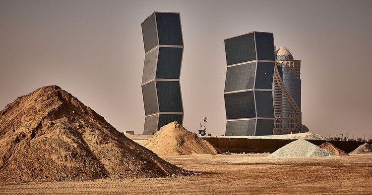
The history of the Qatar Peninsula—or Catara, as first labeled on an ancient map drawn by the Greco-Roman polymath Claudius Ptolemaeus—dates back to the Paleolithic Age. By the 1930s, the tiny Gulf state was struggling to maintain its position as the center of the pearl trade, but soon after, in the 1940s, it found itself at the forefront of economic growth and progress after the discovery of its vast oil reserves. Today, Qatar is the world’s richest country per capita; its capital Doha an ever-growing crop of shiny high-rises, with occasional buildings by the world's most sought-after architects thrown in for effect, its skyline flecked with tireless cranes, and its suburbs strewn with bulldozers, machinery, and endless mounds of displaced sand.

Seen in these photographs by Manuel Alvarez Diestro is a record of the country's impatient race towards an extravagant desert dream—but perhaps it can also be read as a subtle nod towards Qatar’s sheer determination to forge ahead, despite being steeped in controversies and crises during recent years.

Against All Odds, Photos Show Qatar's Determination to Construct World-Class City - Image 1 of 4Against All Odds, Photos Show Qatar's Determination to Construct World-Class City - Image 2 of 4Against All Odds, Photos Show Qatar's Determination to Construct World-Class City - Image 3 of 4Against All Odds, Photos Show Qatar's Determination to Construct World-Class City - Image 4 of 4Against All Odds, Photos Show Qatar's Determination to Construct World-Class City - More Images+ 20