Ashley Mendelsohn

Ashley Mendelsohn is the Curatorial Assistant of Architecture and Digital Initiatives at the Guggenheim.

BROWSE ALL FROM THIS AUTHOR HERE

The Unexpected Low-Tech Solutions That Made the Guggenheim Bilbao Possible

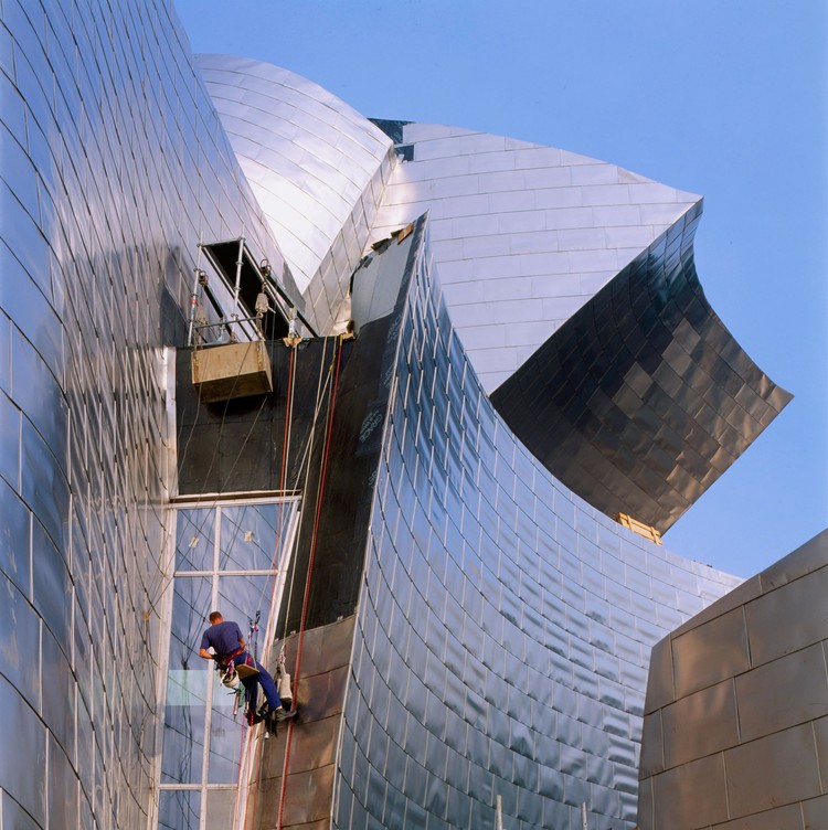
The Unexpected Low-Tech Solutions That Made the Guggenheim Bilbao Possible - Image 4 of 4
Mountain climber installing titanium facade panels during the construction of the Guggenheim Museum Bilbao. Photo: Aitor Ortiz. Image © 2017 FMGB Guggenheim Bilbao

This article originally appeared on guggenheim.org/blogs under the title "How Analog and Digital Came Together in the 1990s Creation of the Guggenheim Museum Bilbao," and is used with permission.

The Guggenheim Museum Bilbao, which celebrates its twentieth anniversary this month, has been hailed as a pinnacle of technological progress since its October 1997 opening. While the use of the modeling software CATIA (Computer Aided Three-Dimensional Interactive Application) was without question groundbreaking, some of the greatest moments of ingenuity during the building’s design and construction were distinctly low-tech. Developed between 1991 and 1997, the curved and angular titanium-clad building was conceived at the turning point between analog and digital practice. This profound shift enveloped and permeated every aspect of the project, from the design process and construction techniques to the methods of communication technology put to use.

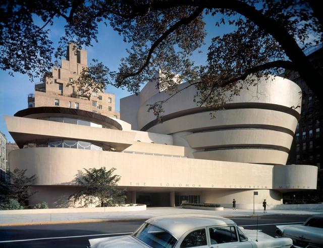
The 58-Year Evolution of Frank Lloyd Wright's Guggenheim Museum

This article originally appeared on guggenheim.org/blogs under the title "Wright’s Living Organism: The Evolution of the Guggenheim Museum," and is used with permission.

Standing on the Solomon R. Guggenheim Museum construction site in 1957, architect Frank Lloyd Wright proclaimed, “It is all one thing, all an integral, not part upon part. This is the principle I’ve always worked toward.” The “principle” that Wright referred to is the design ideology that he developed over the course of his seventy-year career: organic architecture. At its core, that principle was an aspiration for spatial continuity, in which every element of a building would be conceived not as a discretely designed module, but as a constituent of the whole.

Although not Wright’s intention per se, it is fitting that the building he conceived of as a living organism has evolved over time. The overall integrity and character-defining spiral form have remained unchanged, but there have been a series of additions and renovations necessitated by the growth and modernization of the institution.

9 Times Architects Transformed Frank Lloyd Wright's Guggenheim Museum

9 Times Architects Transformed Frank Lloyd Wright's Guggenheim Museum - Featured Image
Exhibition design by Gae Aulenti. Installation view: The Italian Metamorphosis, 1943–1968, Solomon R. Guggenheim Museum, New York, October 6, 1994–January 22, 1995. Photo: David Heald

This article originally appeared on guggenheim.org/blogs under the title "Nine Guggenheim Exhibitions Designed by Architects," and is used with permission.

Exhibition design is never straightforward, but that is especially true within the highly unconventional architecture of Frank Lloyd Wright’s Guggenheim Museum. Hanging a painting in a traditional “box” gallery can be literally straightforward, whereas every exhibition at the Guggenheim is the reinvention of one of the world’s most distinctive and iconic buildings. The building mandates site-specific exhibition design—partition walls, pedestals, vitrines, and benches are custom-fabricated for every show. At the same time, these qualities of the building present an opportunity for truly memorable, unique installations. Design happens simultaneously on a micro and macro scale—creating display solutions for individual works of art while producing an overall context and flow that engages the curatorial vision for the exhibition. This is why the museum’s stellar in-house exhibition designers all have an architecture background. They have developed intimate relationships with every angle and curve of the quarter-mile ramp and sloping walls.