-
Architects: MASS DESIGN
- Area: 160 m²
- Year: 2017
-
Photographs:Feng Shi
-
Manufacturers: Bentu, De Dietrich, aureole shanghai

Text description provided by the architects. At the intersection of Anfu and Wukang roads in the former French Concession, you’ll find RAC Bar & Coffee. The locale has been long-known for its many Western restaurants and desirably central location - that also means the standards for design in this area are higher. The owners of RAC aimed to stand out with their authentically French vibe, speciality coffee, French pastries, crepes and organic wines.

RAC is both a cafe and bar combined. Originally the cafe was a streetside security post at the entrance to the property. The restaurant and bar section sits at the end of the entrance passageway. That separation presented MASS DESIGN with a challenge: How could design create interaction and connection between these two disparate sections?

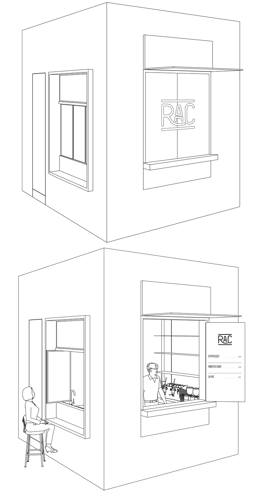
The solution was to treat this outdoor space as a bridge between the two spaces, re-thinking the area as a public area like a park or a courtyard. Operable windows and a marble sill were inserted on the wall facing the courtyard creating an in-between dining table on the facade. Patrons can sit inside the shop, outside in the sun with their coffee or dine across both spaces. The bar was deliberately moved to open a service window facing the courtyard, allowing visitors from the adjacent office building easy access. In doing so, MASS created a space to enjoy in many ways, activating this courtyard and coaxing more visitors to enter RAC.

RAC Coffee is less than 10 square meters, designed strictly for making coffee and the minimum necessary storage. Instead, MASS has taken advantage of the space’s streetside location, creating a special coffee window where the barista can easily serve people on the sidewalk and also allure passerby to take a closer look and walk into the courtyard.

The interior design for RAC Coffee uses a technique called “mise en abyme”, a technique in which an image contains a smaller copy of itself. The main material is a white terrazzo scattered speckled with red throughout. The combination of arches and mirrors makes for an entryway that beckons and entices - is the scene you glimpse a peek into the small courtyard, or a reflection of Anfu Road behind you?

MASS also drew inspiration from the European habit of drinking coffee while standing at the bar. By installing a small wooden bar, complete with hooks for hanging bags and coats, MASS not only found a clever way to solve the lack of space for seating, but also inadvertently created a central meeting place for residents and regulars to chat over coffee.

The design for the restaurant and bar section is inspired by RAC’s core product: organic wine. The transparent wine cabinet allows an easy glance of their selection from your seat at the bar. The prevailing color throughout the space - a shade of wine bottle green - can be found on finishings like the door, window and cabinet frames as well as in the marble floors. The central table was cut directly from tree trunk, preserving its natural textures and providing a visual, visceral reminder of the rich soils and vineyards of southern France.

People have long misunderstood what “French” style means. In order to avoid trite, gaudy or even faux “French” design clichés, MASS used real materials like stone, existing concrete, glass, metal and wood to imbue the space with authenticity.
MASS choose to scrape away the white paint from the columns, revealing their original forms replete with many “flaws” - the exposed steel bars and leftover etc things - to showcase how the building’s vibrant history still lives on.

The marble of the restaurant floor is undoubtedly the design highlight of the whole project. It repurposes the “scraps” of Italian marble-cutting to give the material a brand new life through a novel inlaid geometric pattern. The countertops and console tops make use of a common wall material used in countryside homes: travertine stone.

Once construction was completed, the owners sourced decor from Paris to mark the space with their own personal touch. They’ve achieved a space that feels as if you were standing in the home of a typical French family: gathered around the table, eating, chatting, enjoying and relaxing.


